Stockholm based Sakaria Studio was founded by Minna Sakaria in 2017. Primarily specializing in visual identity projects, Minna avoids categorising her creative practice within a particular design genre so that she can “utilise all knowledge out there and create the most accurate visual representation” for her clients. She likens creative problem solving to mathematical equations and enjoys using her knowledge and experience to find the ‘solution’ to a brief. Typography is a fundamental aspect of Minna’s work. As she tells DbyW, it’s, “the one player in the palette that can make or break the work, it doesn’t matter if everything else looks great if the type is not cared for”.
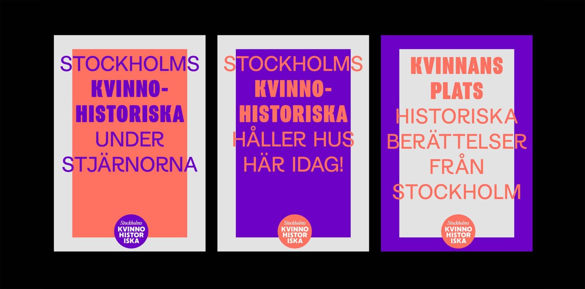
An advocate of celebrating and archiving women’s history, Sakaria Studio recently created a new visual identity for Stockholm Kvinnohistoriska (Stockholm’s Women’s History Museum). The museum collaborates with other institutions to include women’s history and content in its exhibitions. The new visual system makes a clever use of typefaces Program designed by Zuzanna Licko (Émigré) and Marguerite by Charlotte Rodhe, which represent, as Minna tells us, “two generations of women type designers, both influential in their respective design era.”
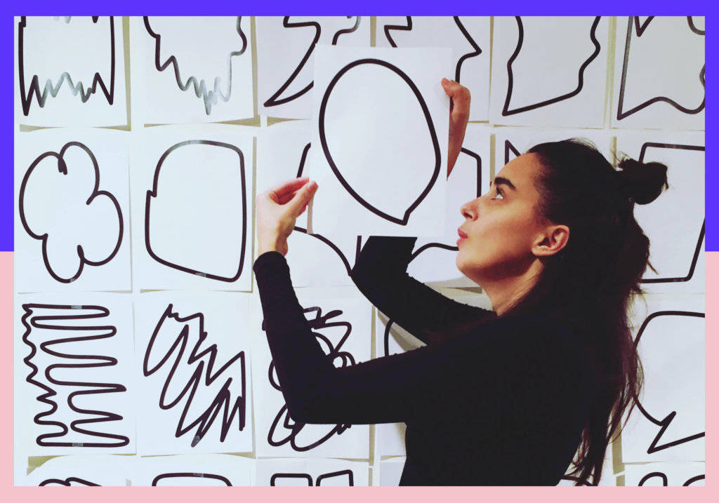
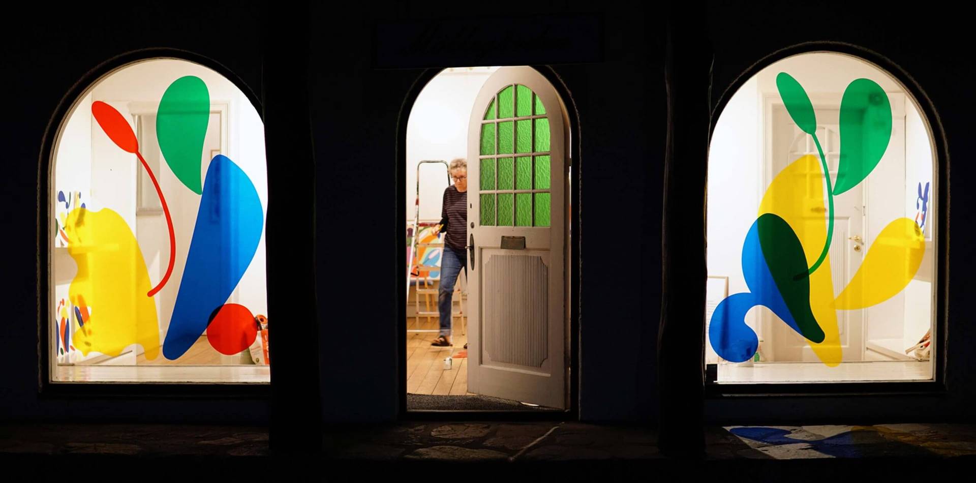
Alongside client work, Minna is also interested in creating personal projects that allow creative freedom and enjoys working on large-scale projects away from the restrictions of the screen. With intern Mikaela Cederholm, she created an expressive visual identity for her recent exhibition ‘Buds’, which grew from time spent illustrating sprouting buds during pregnancy and nursing her newborn. She tells DbyW: “we wanted to create conditions for ourselves to work manually and with randomness.” The result is a beautifully fluid identity system that reflects the instinctive, abstract shapes and forms of Minna’s original drawings.

We talked with Minna to find out more about how she navigates running a studio as a new mother, typography as means of creative expression and her approach to a visual identity project for the public art biennial Open Art.
Can you tell us a bit about your career to date and what led you to set up Sakaria Studio in Stockholm?
Initially, I wanted to start my professional career in London. I had studied for my MA in visual communication at the Royal College of Art. Carolina Dahl (another RCA graduate) and I had the same vision. We wanted to run our own independent studio for graphic design and typography, rather than being studio employees. We started out in the summer between our first and second years and made great work together. In 2015, we both moved back to Sweden, settling in Gothenburg and Stockholm respectively. Because of the distance this brought our collaboration eventually came to an end. It was at this point that I decided to start Sakaria Studio and my independent practice was born. Since then, I’ve been based in Stockholm where most of my clients are locals working in the creative or academic sectors.
What is your creative ethos as a studio and what is your specialism?
I specialise in visual identity. My goal is to enhance the characteristic traits of every client and show off personality and narrative in a visually pleasing and functional way. I think Scandinavian graphic designers often self categorise as either pro-modernist or anti-modernist. I prefer not to label myself as either. I want to be able to utilise all the knowledge out there and create the most accurate visual representation.
Can you tell us about the visual identity project for the Stockholms Kvinnohistoriska (Stockholm’s Women’s History Museum) and the decision to use typefaces by Zuzanna Licko and Charlotte Rohde?
Stockholm’s Women’s History Museum collaborates with other museums, organisations and companies in Stockholm to include women’s history in their catalogs/collections/exhibitions. So much of women’s history is forgotten or not told. One reason why is, as I understand it, because women’s lives and achievements are not archived properly. As we all know the same goes for design history. When I was commissioned to redesign Stockholm Kvinnohistoriska’s visual identity, I wanted to do my part in the archiving of women in typography, and I therefore built-in typefaces designed by women as the main player in the identity.
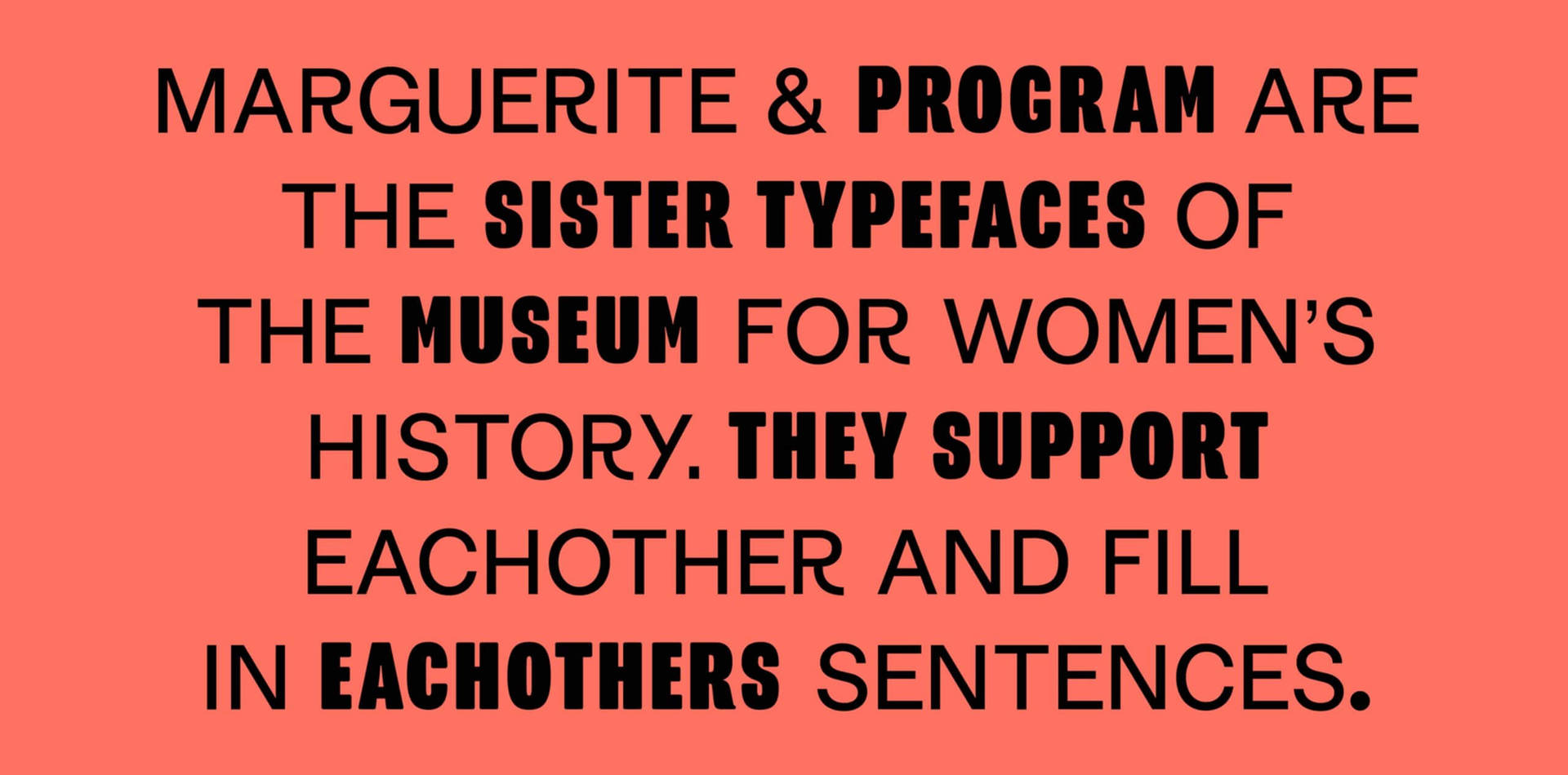
We call them the sister typefaces of Stockholms Kvinnohistoriska; they intertwine with each other and finish off each other’s sentences. For the big sister typeface, I chose Program by Zuzanna Licko/Emigre, and for the younger sister Charlotte Rodhe’s Marguerite. They represent two generations of women type designers, both influential in their respective design era. By making conscious typeface choices and naming the author in the documentation of the identity I hope to contribute to the archiving and documentation of female authorship in typography.
We also love your exhibition ‘Buds’. Can you talk us through the creative approach you took during this project?
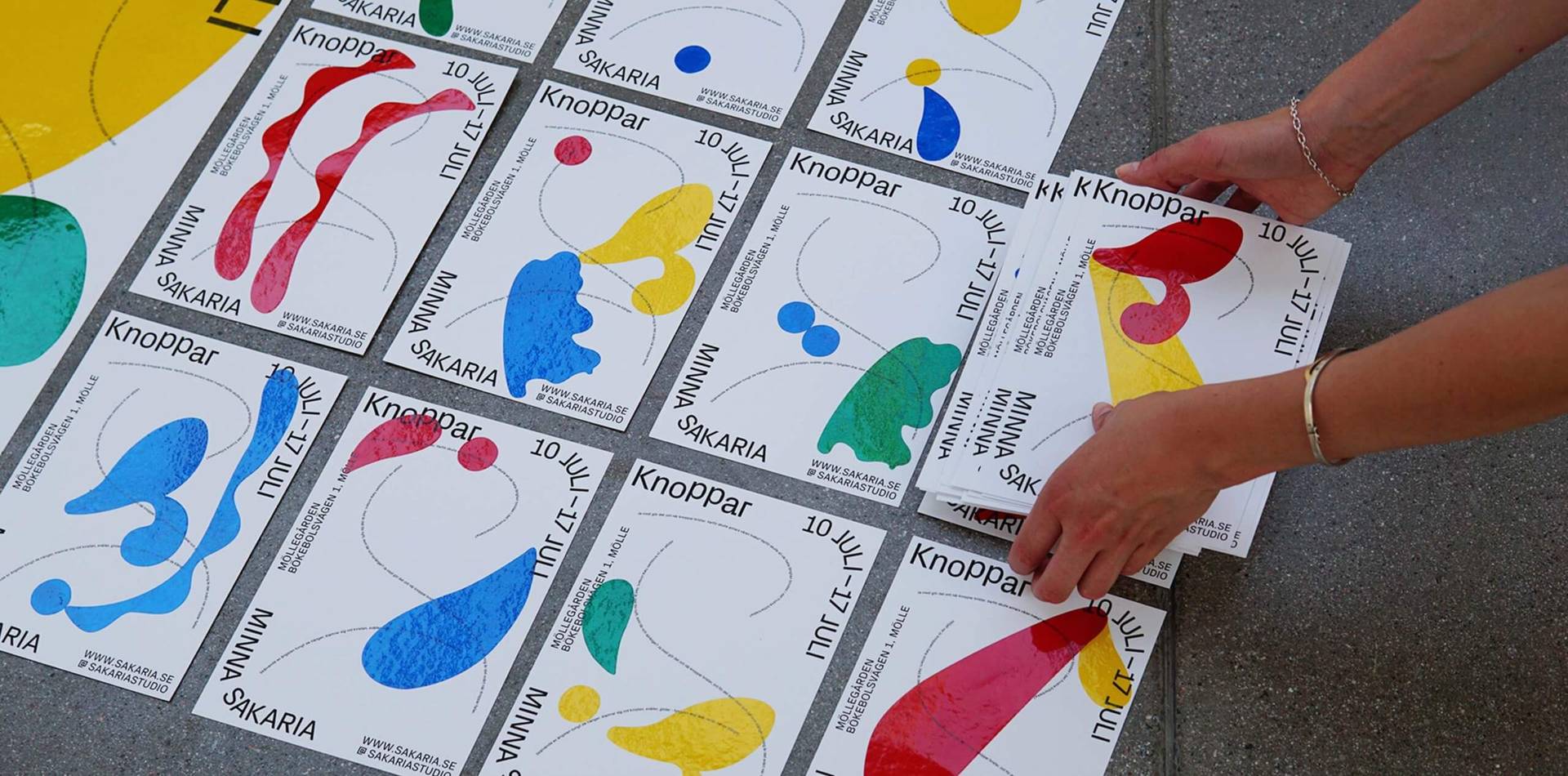
I am not an illustrator, but I needed something to do besides watching television when I was stuck in bed during pregnancy and the first months of constant nursing. I worked on my iPad and drew (very symbolically) a series of abstract buds growing from clay trays. By the time my child was 9 months I had made five paintings and was offered an opportunity to exhibit them in a small gallery.
Together with my intern Mikaela Cederholm I continued the creative process in the making of the visual identity for the exhibition. We started by designing the process, as we wanted to create conditions for ourselves to work manually and with randomness.
We extracted and vectorised shapes from the paintings to cut a bunch of stickers in different scales. During a one-day workshop we then placed the stickers intuitively onto pre-printed invitation cards and posters as well as the exhibition windows. I think graphic design when the production process is all manual is very satisfying to look at. By reducing the use of the computer in the creative process you get closer to that. I was particularly happy with the windows. They turned out looking almost like church windows, drawing people into the exhibition and creating ambience and light play in the room.
The potential of typography as a means of creative expression plays an important part in your creative work. Why is this?
Typography is the one player in the palette that can make or break the work. It doesn’t matter if everything else looks great, if the type is not right.
Beyond that I love that typography communicates in layers. Text and text-image communicate simultaneously, which enables contradiction, emphasis and redundancy according to situational preference.
Can you describe the process behind a favourite studio project you’ve created?
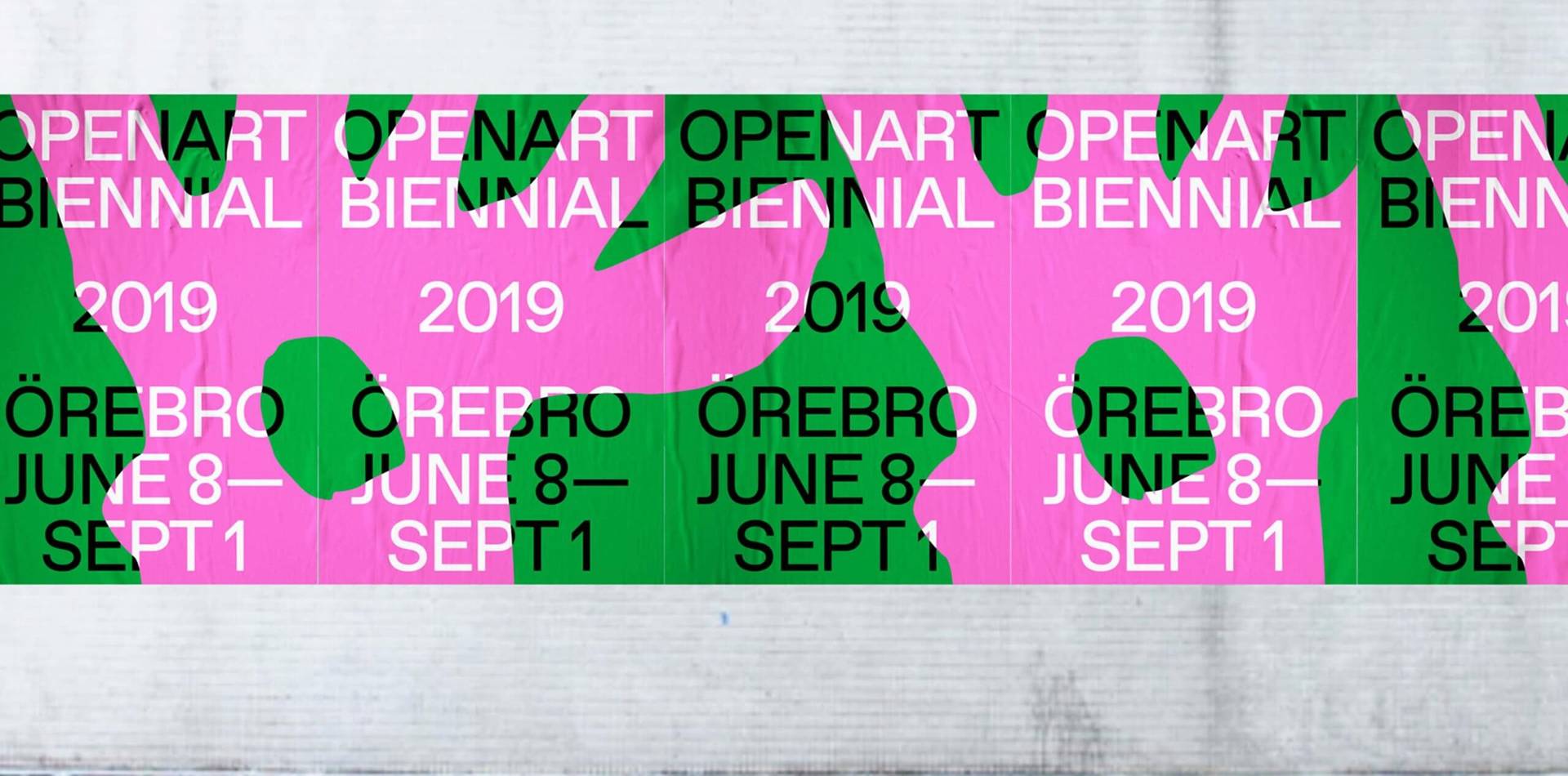
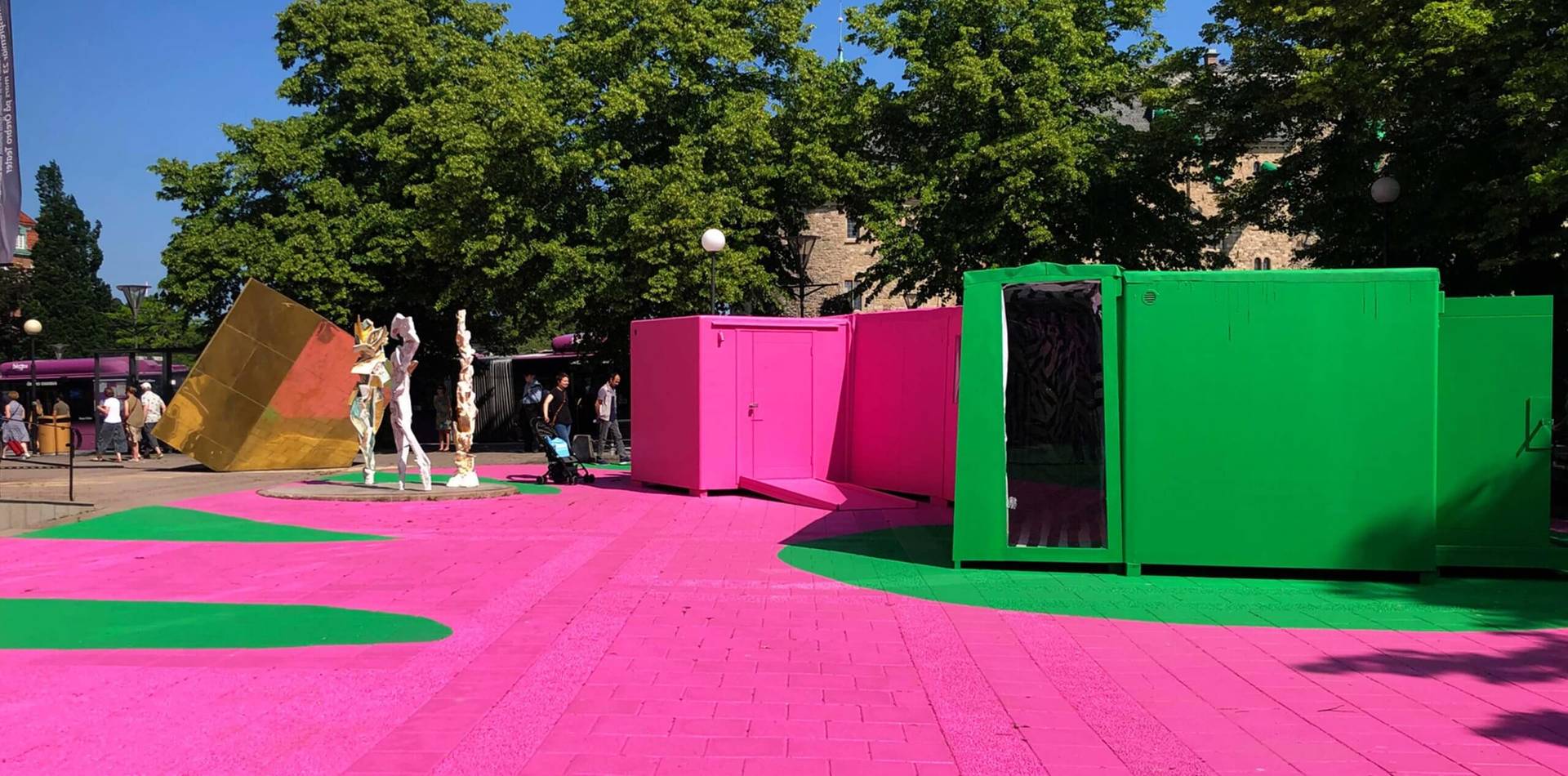
I think creative problems resemble math problems sometimes. I love that moment when the equation is solved. One example of this is the visual identity I re-designed for the public art biennial Open Art. The old logotype featuring a rabbit’s footprint was hard to read and wasn’t working very well. My problem was that it had to be retained in the redesigned version. I struggled a lot with it before I found a solution, which was to keep the footprint as an effect rather than a shape. In the new identity the shape is enlarged beyond the borders of the artwork and placed on top of the typography to leave an imprint. Conceptually it works to suggest how an art experience leaves you with an impression. That concept opened up for a lot of creative possibilities and a variety of applications. I was right in my guess that the client wasn’t bothered by the shape being applied in a different way as long as it was retained in the identity in some way.
Have you faced any specific challenges in being a woman and a design studio founder?
My biggest challenge thus far has been to combine motherhood with running a studio solo. The double responsibility of delivering on time with no one to cover for me for example, when I need to stay home and care for a sick child, weighs heavily sometimes and is something I haven’t figured out fully. It’s the first time in my life I can’t practice “thinking like a man” to overcome certain job-related issues, because in this case I physically can’t. I feel a need to talk to other women founders about how they do it.
Do you have any advice for emerging women and other marginalised genders just starting out in their design careers?
Find inspiration from others that have paved the way for you. Find strength in communities of like-minded peers and colleagues. Make sure you are getting paid properly, you can’t make great work without the means to do so.