Céline Jouandet is a graphic and type designer based in Amsterdam. She graduated with a master’s degree in typography from the Ecole de Communication Visuelle (ECV) in Paris last summer and recently moved to Amsterdam where she is now working for graphic design studios and as an independent freelance designer.
With two typefaces already to her name, Céline didn’t discover her passion for typography until a few years ago during an internship at Hartland Villa where she was introduced to the work of several type designers and discovered the possibilities of inventing her own typefaces. From there, she took part in the Love Letters workshop with Sebastian San Filippo and decided to venture further into typography by studying at Ecole de Communication Visuelle (ECV). This summer she will be part of TypeParis, a type design programme launched by Jean-François Porchez.
Although now specializing in typography and editorial design, Céline is still keen to make time for more artistic projects. She hopes to use the multi-disciplinary experience she’s gained exploring different mediums, such as scenography, motion design, publishing, and coding to elevate her typographic work. As she tells DbyW, “I would like to see my practice move away from traditional media such as paper and screen – I think my background leads me to ask myself these kinds of questions.”

We caught up with Céline to find out more about her type-focused design journey so far, her beautiful typeface project Lady Spider, and projects currently in the works.
You’ve just finished studying for a master’s in Typography at the Ecole De Communication Visuelle (ECV). Why did you decide to study typography in greater depth?
My interest in typography came very gradually in the course of my studies. There are no graphic designers in my family and it took me a while to name what I wanted to do. At first, I turned to fine arts, thencomposition and the search for balance slowly led me to graphic design. It was during my internship at Hartland Villa that I discovered that you could design your own typefaces. My mentors introduced me to the work of Neville Brody, Zuzana Licko and other type designers. It was a revelation. I took part in the Love Letters workshop with Sebastian San Filippo, which confirmed my interest in type design. Then I joined the ECV to study for a master’s in typography. At that point typography became a real passion. We had excellent teachers at ECV. The course specialises in typography but unlike other master’s programmes, it’s also quite general about graphic design. I still have a lot to learn and it’s a real pleasure.
You’ve explored many different design disciplines including, graphic design, motion design, scenography, web design, code, publishing, and typography. How has this influenced your current practice as a designer?
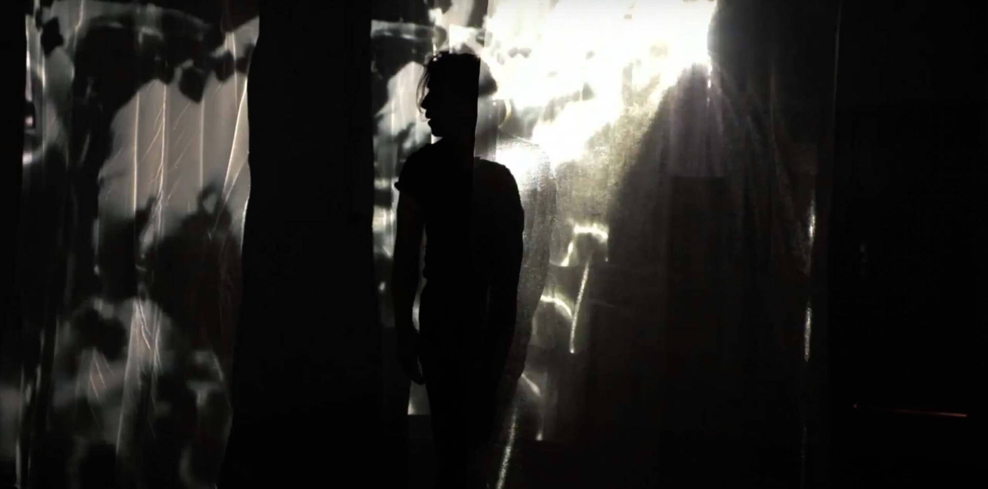
I started my studies at the Rietveld Academy in Amsterdam. I did the basic year, which is a year of discovery with a strong focus on art and performance. It was an extremely interesting experience, but I was not mature enough at the time to appreciate it fully. On the other hand, it left a strong impression on me, particularly on my desire to take risks and explore new artistic areas. I did a postgraduate degree in new technology at EPSAA just before my master’s degree in typography. It was a great playground where you could venture into new mediums. This is where I learned about code, motion design and scenography, particularly through the Hora project, a reactive audio performance that I devised with Aline Deschamps and Mathilde Selli, in collaboration with the artists Alvise Sinivia and David Drouard. This installation mixed dance, music, and reactive audio. I hope to have an experience like this again in future. I love graphic design and typography, but I want to continue working on purely artistic projects. Currently I’m asking myself a lot of questions about the use of the typography I create. I would like to see it move away from traditional media such as paper and screens and I think my background leads me to this kind of creative challenge.
Can you tell us a bit about the various internships you’ve undertaken and any key learning points and/or experiences you gained?
I had the opportunity to do a lot of internships during my studies, especially before my master’s degree. These allowed me to fully appreciate my training. When I entered the master’s programme I told myself that it was a space in which I could make mistakes and experiment even more – an opportunity that we have less time for in the professional world.
I find my motivation in concrete objectives. I needed to figure out quickly what being a graphic designer was all about, and how it could be applied. I did internships in various places — galleries, agencies, and studios — which helped me find the type of structure that would allow me to be myself. Each internship allowed me to see different working methods and personalities. I think it’s the best learning ground there is. It’s important to interact with professionals, to learn from them. I have recently started as a freelancer and I’m confident that this is what I need right now.
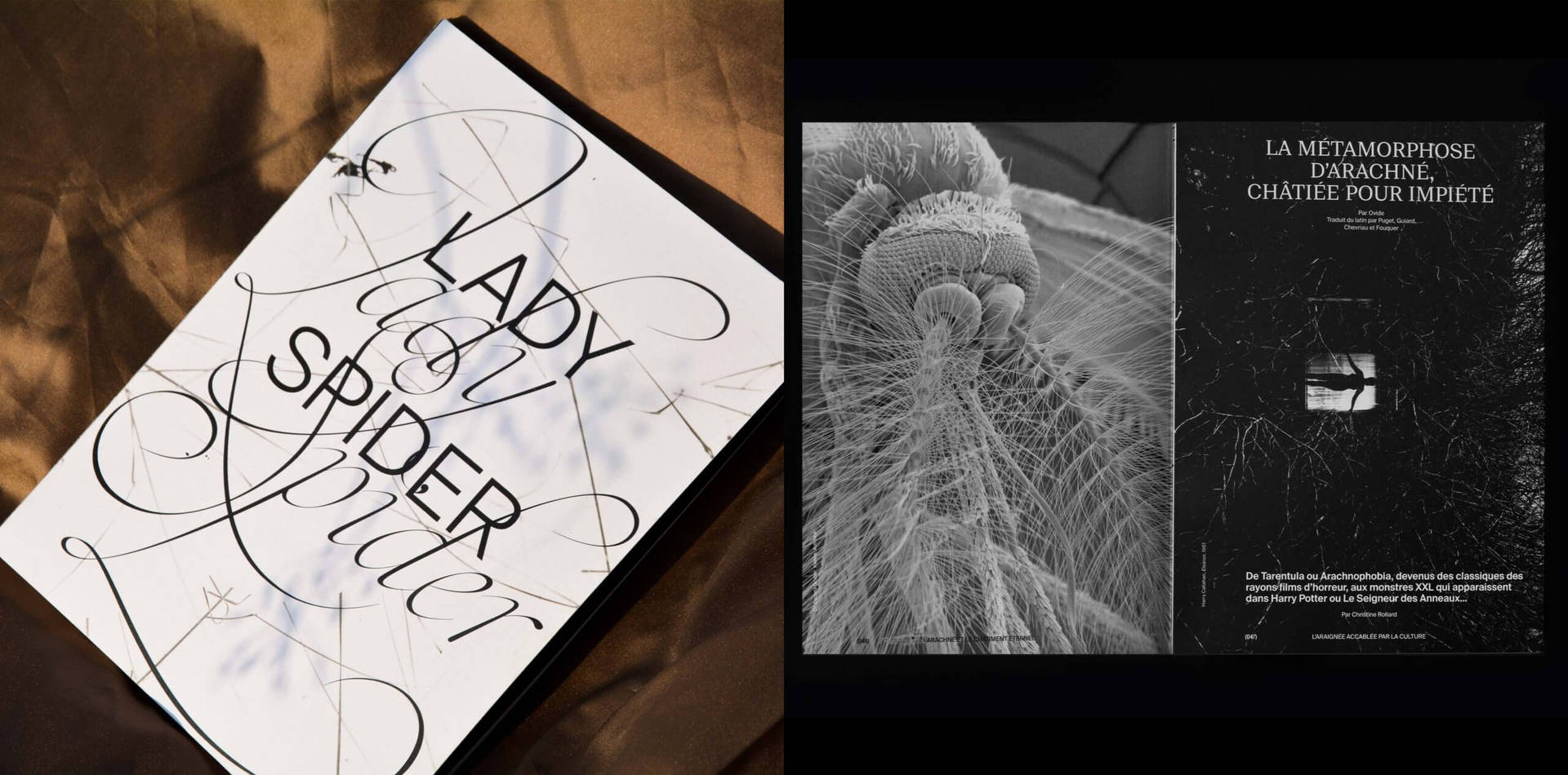
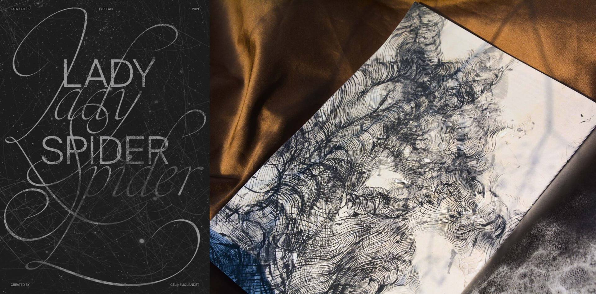
We love your diploma project Lady Spider. What is the purpose behind the project and the process of creating the typeface?
Thank you very much; this is a project that is very important to me. It began with my semiotics dissertation about how the climate crisis is represented by independent graphic designers. Among the things I observed was the strong links between femininity and the representation of nature. I wanted to end my studies with a militant project dealing with both the climate crisis and the disappearance of living beings. But I also wanted to talk about femininity. Spiders were a perfect subject for this. They are often seen as an “ugly” animal, which tend to lose out in representations of the loss of biodiversity by comparison with more charismatic animals such as the polar bear. Spiders are also often associated with a threatening femininity. They can connote entrapment, a deadly sexuality, a poisonous bite, and the spells of witches. I wanted to defend this feared and repellent animal, to better understand it, to better cohabit with it. I also wanted to give it a more accurate aesthetic form, far from the commonplace images. In popular culture the spider is indeed a tireless reservoir of fantasy and horror; but the world of the spider is actually very beautiful — a sensory, aerial world of silken threads.
“Spiders are also often associated with a threatening femininity…. I wanted to defend this feared and repellent animal, to better understand it, to better cohabit with it. I also wanted to give it a more accurate aesthetic form, far from the commonplace images.”
In researching this project I had the joy of meeting Christine Rollard, a French spider specialist. She taught me a lot of things. The type designer Julie Soudanne was my tutor for this project. It is a women’s project – run by women – in two parts: the creation of an edition gathering a corpus of texts and studies around the spider, and the creation of a typeface. The typography Lady Spider is based on the drawings of the calligrapher Maria Strick. It is a light, airy and wiry typography in which a system of links between the lines and letters resembles a web.
Do you have a favourite project that you worked on during your master’s course?
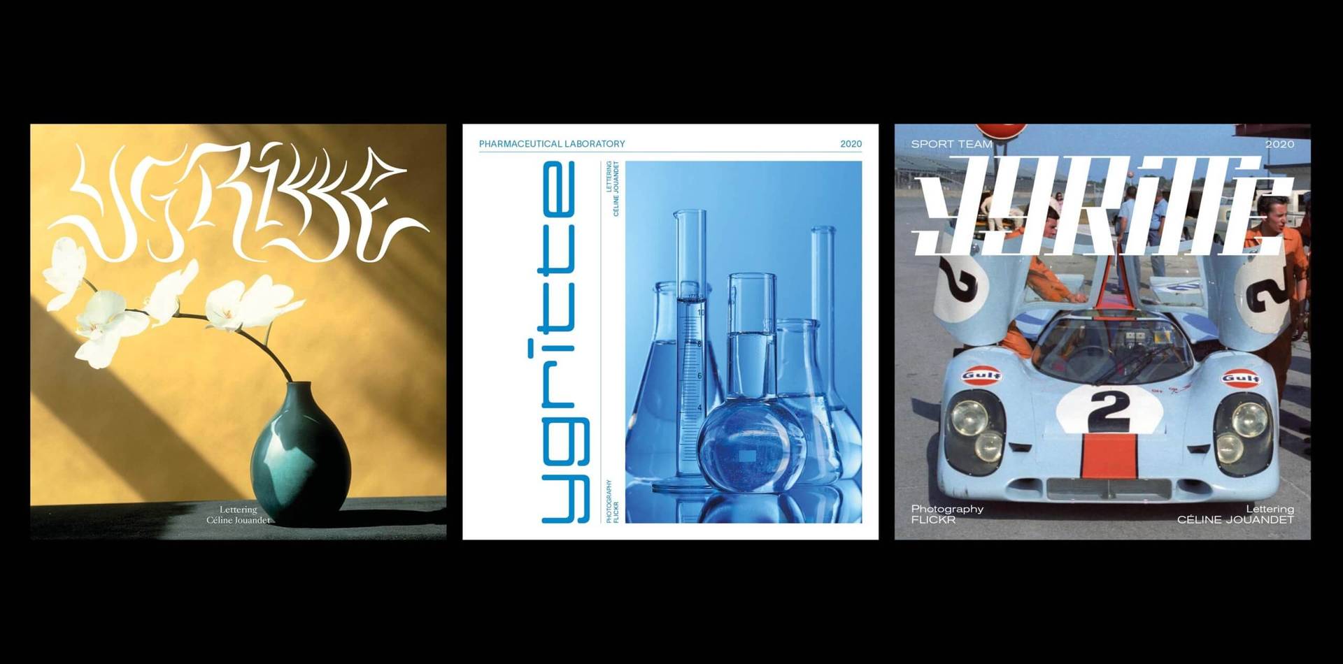
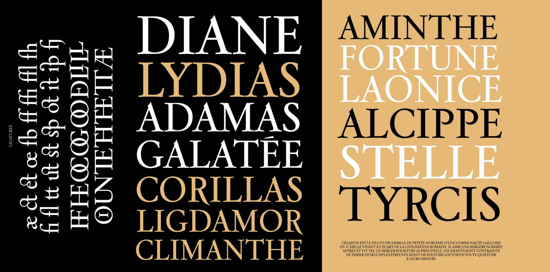
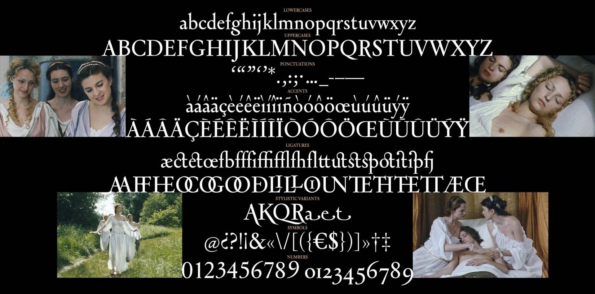
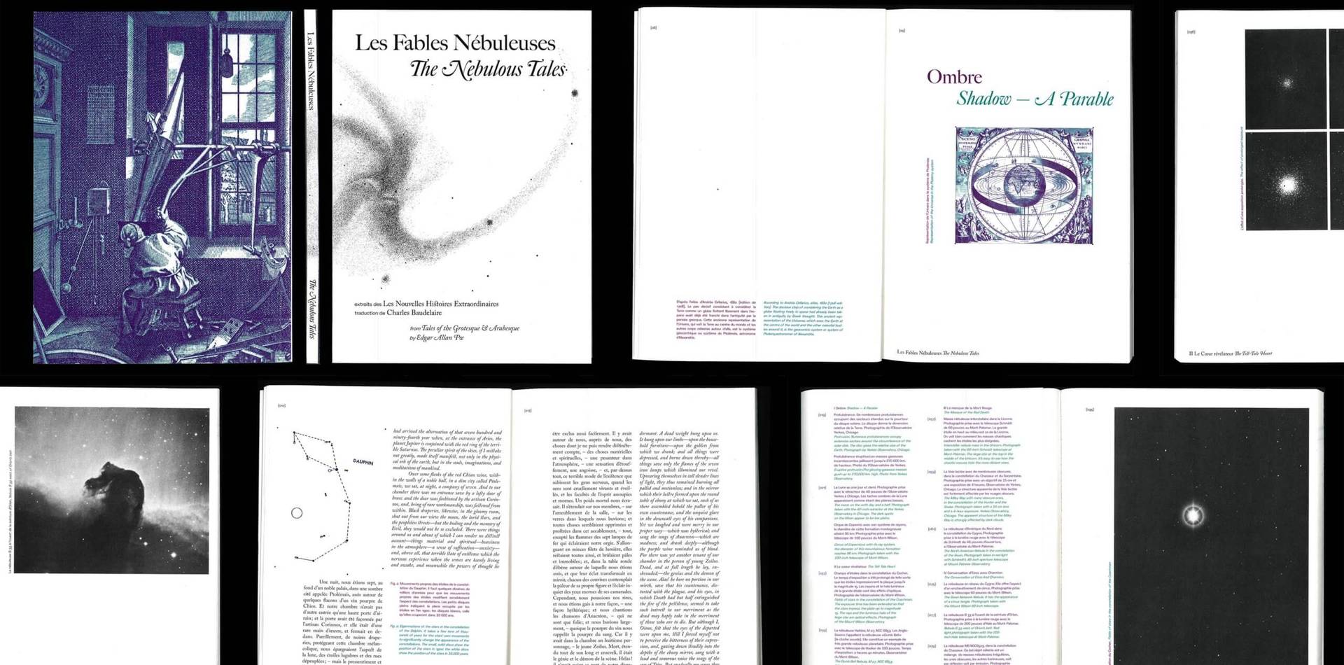
I’m proud of Lady Spider, it’s my most advanced project, and it will have a sequel. I also have a special attachment to Astraea, my first typographic revival. Astraea is a revival of Astrée by Robert Girard. For this revival, I wanted to be close to the historical inspiration of Garaldes and Elzévir, and to take the name Astrée and its universe from the book by Honoré d’Urfé. My version of Astrée offers a variety of ligatures and special glyphs for stylised capital letters. I also wanted to harmonise the specificities of the lowercase R and the capitals. My interpretation of the Astrée was punctuated by happy accidents, which ended up giving it a look that is both soft on the ligatures and sharp on the serifs. I loved working with this font and I want to develop it further. I’ve started drawing new purely decorative glyphs for it, and I can’t wait to get started on the italic version. Since graduating I’ve seen Astraea being used and applied in a few projects. It’s nice for someone who designs typefaces to see how their fonts are taken up. It suggests new ideas to develop. We used it with Chantal Hendriksen studio for a book design. I was super proud that it was chosen. With Chantal’s help, I designed typographic flowers out of it. I think that a really interesting way of developing a type face is to go outside of the linguistic meaning and apply it to other uses.
“ I think that a really interesting way of developing a type face is to go outside of the linguistic meaning and apply it to other uses.”
We not only love your typeface design but also your editorial work. How do you go about selecting typefaces for particular projects and layouts?
I am very touched, thank you. When I start a project, I learn as much as I can about the topic. I make a list of key words and sentences related to it. Sometimes typefaces come to mind because I’ve studied their history and find that they tell a story related to my topic. Otherwise, I study how the typeface shape can relate to the project. If there are several typefaces to choose from, I take three at most. And then it’s like designing a bouquet of flowers, you play with combinations, taking into account their shapes, weights, and contrast. This is the part of the project where I ask myself the most questions — making a typographic choice means abandoning another one, so there is a little mourning to do.
“If there are several typefaces to choose from, I take three at most. And then it’s like designing a bouquet of flowers, you play with combinations, taking into account their shapes, weights, and contrast.”
What things are you currently working on?
This is a very exciting time for me as I am a recent graduate and have just moved to Amsterdam. Since my internship at Remco van Bladel last summer, I’ve wanted to live there. I like the challenge of a new country and working in English to start my professional life. I think getting out of my comfort zone puts me in a better frame of mind for this. It gives me a lot of energy because everything is new, so I want to do new things. Working in English, which is not my mother tongue, forces me to have clearer ideas and go straight to my goal. I finished my internship with Chantal Hendriksen last November and have been working as a freelancer since then. I’m working on a lot of new projects at the moment, both on my own and with graphic design studios; but I’m also making time for collaborations that go off the graphic design rails. Next June I will be at TypeParis programme created by Jean François Porchez. I can’t wait to learn, and to meet new people from all around the world with a common interest in typography.
Do you have any women role models or mentors who have shaped your career?
The teaching staff of my master’s degree program were mostly women and I have to admit that this inspired me a lot. I just finished an internship with a woman, Chantal Hendriksen which has been quite rare in my past experiences. It is difficult to project oneself without a role model and having examples of talented and supportive women is extremely inspiring.
Do you have any words of advice for creatives considering a career in graphic and typeface design?
It’s advice for all creatives I think: you must just go for it and have confidence in your work. There will always be things to learn, and our work can always be improved. That should be good news rather than something to worry about. But you must be confident, patient and forgiving to yourself. I also learned something recently that I think is important. You must really enjoy yourself and have fun when you design as your enthusiasm will shine through.
Visit:
Follow:
- Instagram: celine.jouandet