Emily Atwood is a multi-disciplinary designer based in New York City. She graduated with a BFA from Laguna College of Art & Design (Laguna Beach, California), before working as Digital Product Designer and then interning with Paula Scher at Pentagram – successfully working her way up to Senior Designer. She recently left the team to work independently, teach and complete Type@Cooper’s Extended program.
Emily believes that designers play a vital role in society as communicators, acting as visual interpreters of concepts and stories. Typography is often at the centre of her practice and letterforms become a powerful tool that convey poignant meaning and intention. Her passion for type started at a young age and runs in the family, from her muralist great-grandfather and cousin to her ceramicist mother who produces type focused work. As Emily tells us words, ‘carry so much influence when we use them; they can be life-giving and can bring hope, and sadly they can also bring destruction and despair’. Her interest in studying type in more depth at Cooper Union comes from her experience working as a brand designer, where she often found herself, ‘customising type or commissioning a custom typeface for an identity’. Knowing how letterforms are constructed is a crucial part of creating ‘a recognisable language that gives voice to an idea or one that can create a sense of ownership’.
Working with world-renowned designer Paula Scher – a woman she describes as a ‘trailblazer when it comes to carving your own path as a woman in the design industry’ – compounded Emily’s love for type and gave her a deeper understanding of how to use it. As she tells us: ‘The biggest takeaway was learning how to use typography in a myriad of different ways and to truly understand its capacity to come alive on the page and to transform itself into a recognisable visual language that conveys meaning.’
Most of the visual identity projects Emily worked on whilst at Pentagram were type-base, including campaigns such as, ‘How are you really?’ for the Mental Health Coalition and ‘The Bush 2020’, a promotional campaign for women’s body care brand Flamingo. For the latter, she describes her approach as, ‘making typography the hero’, which allowed ‘the copy, cheeky allusions to American political phrases, to read more powerfully. The variable nature of the type speaks to a woman’s right to choose how her pubic hair should be treated, anywhere from bare to bushy.’
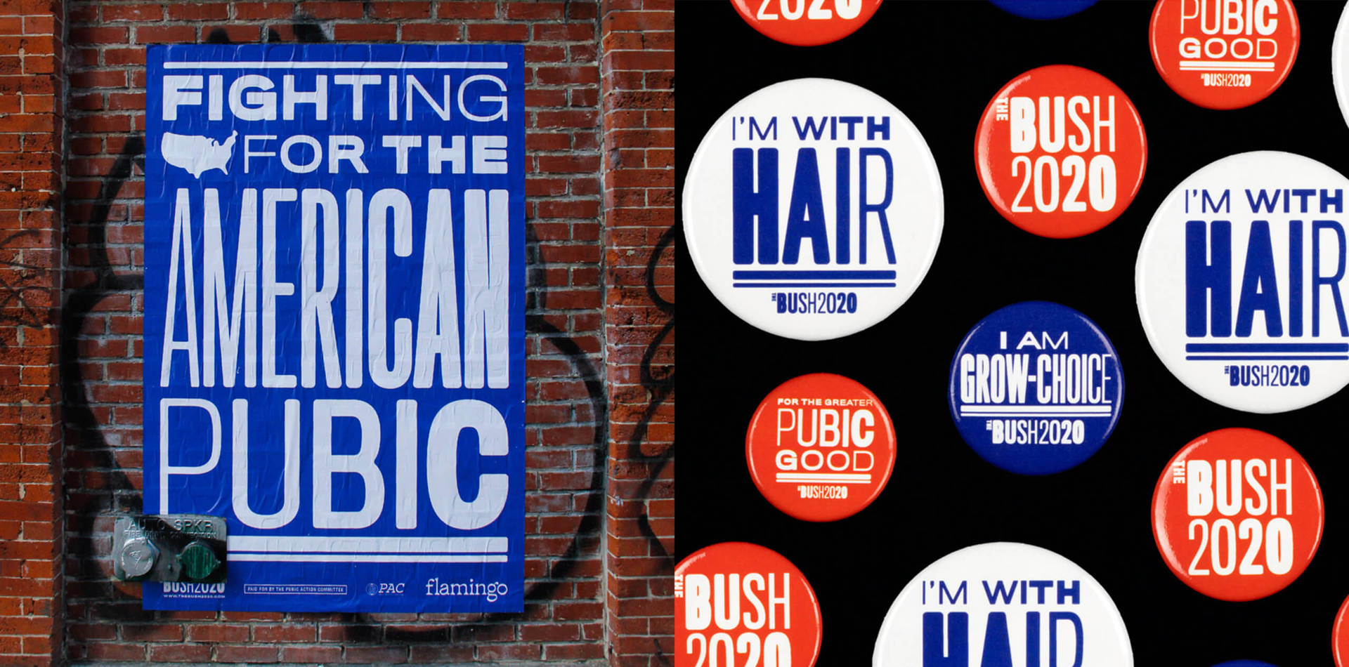
The Bush 2020: “We are grow-choice!” is the rallying cry of ‘The Bush 2020,’ a promotional campaign for women’s body care brand Flamingo that doubles as a “Pubic Service” for vaginas everywhere. Pentagram collaborated on the bold and humorous campaign, which combines tongue-in-cheek taglines with graphics inspired by political campaigns, playing off the idea of choice at the core of the Flamingo brand.
In Emily’s personal projects there is also a strong focus on communicating through typography. The poster series ‘Deconstructive to Constructive’ is a reflection on the way words can convey multiple meanings depending on how they are constructed on a page. Emily tore apart negative news headlines and reconstructed them into something more hopeful, reflecting on the importance of having alternate perspectives on complex topics currently prominent in the media.
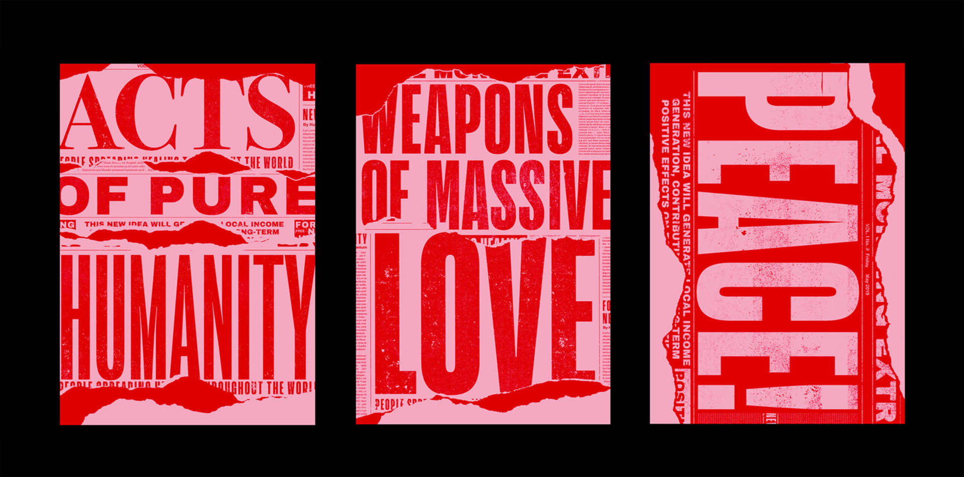
Destructive to Constructive ‘Better Headline Series’: ‘Destructive to Constructive’ is a small typographic poster series that is aimed at the horrific news headlines that we are confronted with on a daily basis; the constant acts of pure evil that are highlighted. These posters pose a question to all: What if we could make a better news headline?

We caught up with Emily to find out more about her experience working with Paula Scher, the power of words and typography and how being a woman has impacted her career.
Can you tell us a bit about your career path and how your role as a designer at Pentagram came about?
I discovered Graphic Design towards the end of my time as a student at Fordham University in the Bronx, NY, where I was pursuing an interdisciplinary art degree. At that point, New York City started to become an endless supply of inspiration — anything from subway signage, ripped posters, neon signs, type in motion and graffiti. Even the emotions that come with living in such a city, informed that energy. This first introduction to design ignited my love of typography and brand identity.
After graduating, I realised that I needed further education, specifically in Graphic Design and Typography, in addition to building a more robust portfolio. That is when I found out about Laguna College of Art + Design, where after 3 years, I eventually received a BFA in Design and Digital Media. A lot of people criticised me for choosing to go to LCAD saying, “If you really want to work at a Pentagram-like agency, why would you leave NYC when you could go to SVA or Parsons?” However, going back home to study in California felt right and LCAD’s small environment seemed like the perfect place for me to learn. During my time in design school, my projects started to become these hybrid brand and digital pieces, and my focus started to drift into more of a tech headspace and away from the type-centric work that initially drew me to design. As a result, I was hired straight out of school as a Digital Product Designer at a digital agency and worked primarily on the visual design for mobile and TV interfaces. This seemed like a terrific first opportunity, but I did feel I was missing some of the aspects of design that actually thrilled me.
One morning before work, I saw that Paula Scher had launched a new identity via Pentagram’s Instagram page. I followed a few of the designers’ profiles listed underneath the project, and not an hour passed before there was an email in my inbox from one of Paula’s Associate Partners asking if I would like to interview for an internship. By pure chance and timing did I have an opportunity to move back to NYC and work for Paula Scher at Pentagram. Suddenly, I found myself in the space of typography, form, and identity that I had been yearning for. I’ve spent the past 3 years working my way up to Senior Designer and have worked on incredible projects, most of which were primarily developed between just Paula and me.
I have recently left Pentagram to work independently as a designer. I’m also involved in the Type@Cooper Extended program and teaching a Brand Identity class remotely for Laguna College of Art + Design. Being a design educator brings new lessons in design and most importantly I have an immense appreciation for the instructors I had in design school and how much they gave to us as students.
Were there any key learning points you gained working under Paula Scher?
Yes, there were quite a few things I learned from working under Paula and there were many nuggets of wisdom she gave me that have been invaluable to how I work now. The biggest takeaway was learning how to use typography in a myriad of different ways and to understand its capacity to come alive on the page and to transform itself into a recognizable visual language that conveys meaning. Learning how to be more decisive was also key, not only because we worked at such a fast pace, but also because she knew that if we were forcing an idea to work, it probably meant the idea was no good. This allowed us to move on to other ideas quickly and it gave me the conviction to know when something was working and when something wasn’t. Observing how Paula would sell ideas to clients was always like watching a master class. She gave me a better understanding of how to get inside the client’s head and how to curate a story around an identity that would lead the client to a place of understanding.
Notation Text – Type@Cooper: an in-progress text typeface that is currently being developed by Emily as she completes her certificate in Type Design through the Type@Cooper Extended program. Notation is designed for sheet music notation and editorial use. It was originally inspired by early written music that was developed using a broad nib pen as well as by the style of contemporary music copyists. Its subtle chiseled features embody more of a tension found in Contemporary Classical Music. This text face will be expanded into an entire family of weights and styles this summer.
You’re currently a student on the Type@Cooper Extended Program and typography is usually at the core of the work you create. Where does this interest in type come from and what drew you to study typography in greater depth?
I believe that my interest in typography really stems from a love of words and the weight that they carry on a page. From a young age I was fascinated with literature, history, archaeology, anthropology – with how humans communicated and expressed themselves. Early writing systems such as cuneiform, hieroglyphics and history of calligraphy were especially enticing. I was struck by this intersection of beauty and communication whenever I would look at historical typography or the typography that was all around me. Additionally, I have an interesting artistic lineage in my family that has been incredibly influential. My mother, who is largely responsible for introducing me to art and art history, is a ceramic artist, whose work is quite typographic and figurative. I always tell her she is a secret typographer. Also, on her side of the family, my cousin was a muralist who was part of the Los Angeles East Los Streetscrapers, and was one of the leaders of the Chicano art movement, during the 70s. My great grandfather, was also a muralist in Los Angeles during the 1920s. I was surrounded by this love of typography at a young age, and it’s a passion that has been handed down in my family that has now taken a completely new form in me.
Typography is often at the core of my work because of the power of words. They carry so much influence when we use them; they can be life-giving and can bring hope, and sadly they can also bring destruction and despair. My interest in pursuing type design specifically also came from my experience working as a brand designer. Almost every project I have worked on ends up in this place where I am customizing type or commissioning a custom typeface for an identity; knowing how letterforms are constructed has proven to be crucial to this. Additionally, the ability to construct a recognizable language that gives voice to an idea or that can create a sense of ownership is powerful.
Empowering women through design and challenging stigmas are themes that you often explore in your work. Could you tell us about a stand-out project of this nature that you’ve worked on and say why it’s important to you?
A standout project for me, that was truly an honor, was the chance to design the identity for the National Women’s History Museum, which is set to have a home in Washington, D.C. in the near future. There were many challenges that I felt confronted with, when I learned I would be leading this project. One being, the obligation to represent women’s history well, because it is a rare space where this type of history is being curated. Secondly, finding a way to capture that history and give it a framework that will communicate the story of women’s accomplishments of the past, present and future. The final solution is a typographic container that resembles archival folded print material in the form of a “W” and an “M”, that is a vehicle for storytelling in print, digital, and physical applications. Naturally, it felt right that Paula would be given this project given her contributions to the design industry as a woman, but it felt truly humbling that I would also be tasked with such a responsibility. In a small way, it felt like I had a chance to contribute my voice and perspective to women’s history.
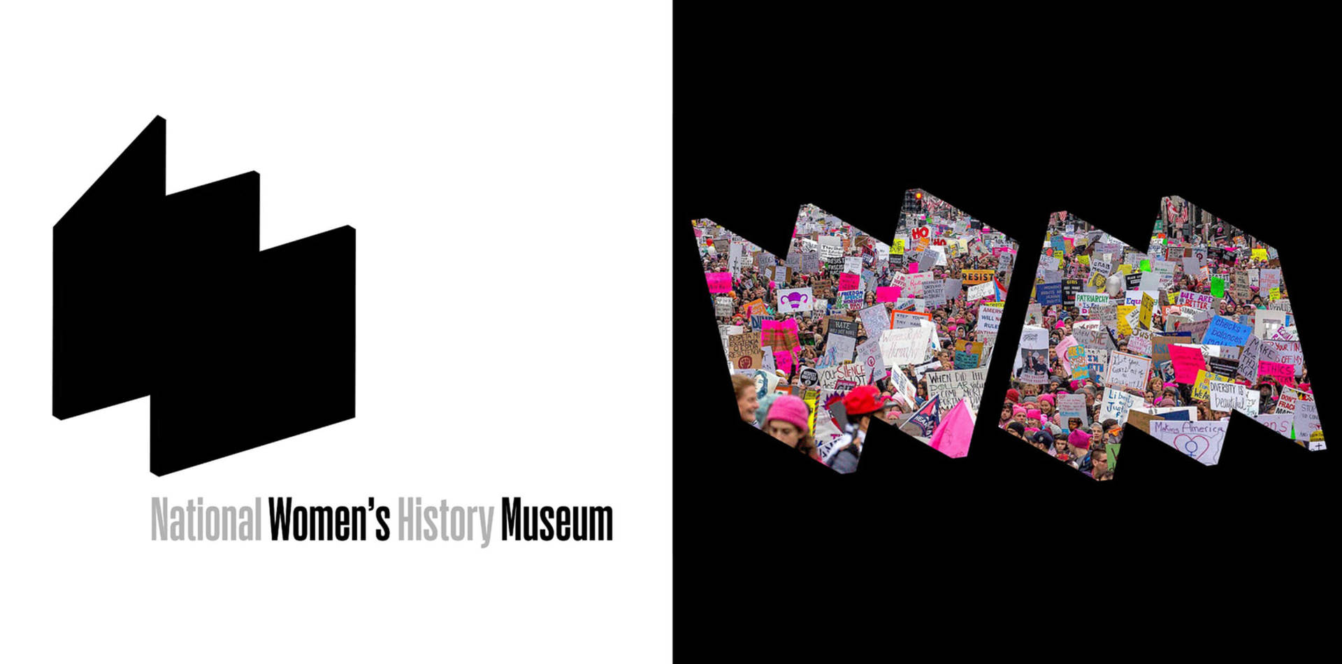
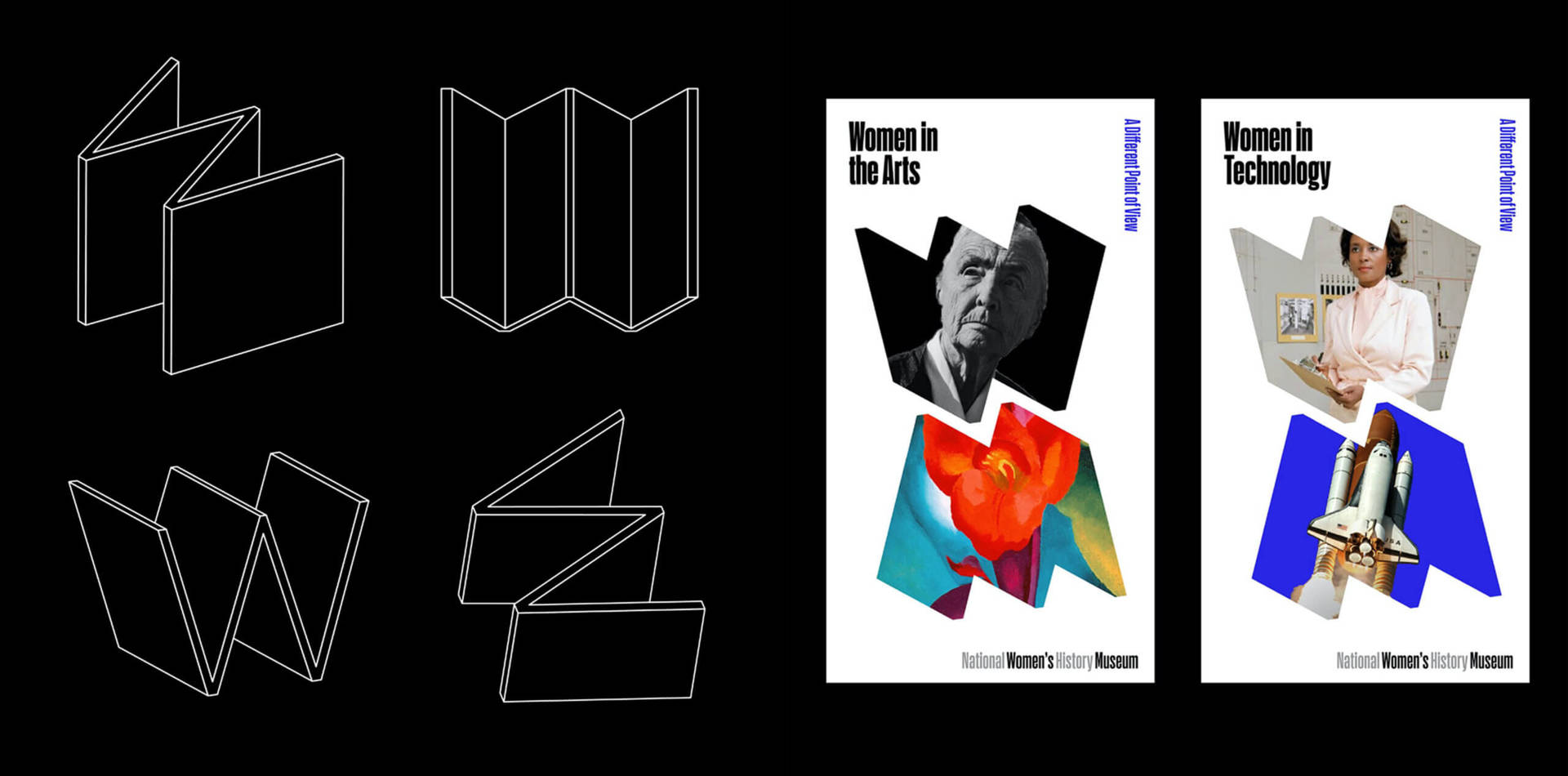
National Women’s History Museum Identity: The National Women’s History Museum is dedicated to telling the stories of women who transformed the US, displaying the collective history of American women, and offering a more complete view of US history that will educate, inspire and empower. Founded in 1996, the institution does this through a growing, state-of-the-art online presence as it looks forward to a future physical museum. Paula Scher and I designed a dynamic new visual identity for the Museum that can evolve with the institution. The bold and contemporary identity centers on a folded “W” symbol that evokes a movable placard or display system, an apt metaphor as the virtual museum moves toward hosting exhibitions in physical spaces—and eventually finds a permanent home of its own.
‘The Bush 2020‘ campaign is an impactful type-led project you worked on at Pentagram. Could you talk us through where you found inspiration and the creative approach that you took to this project.
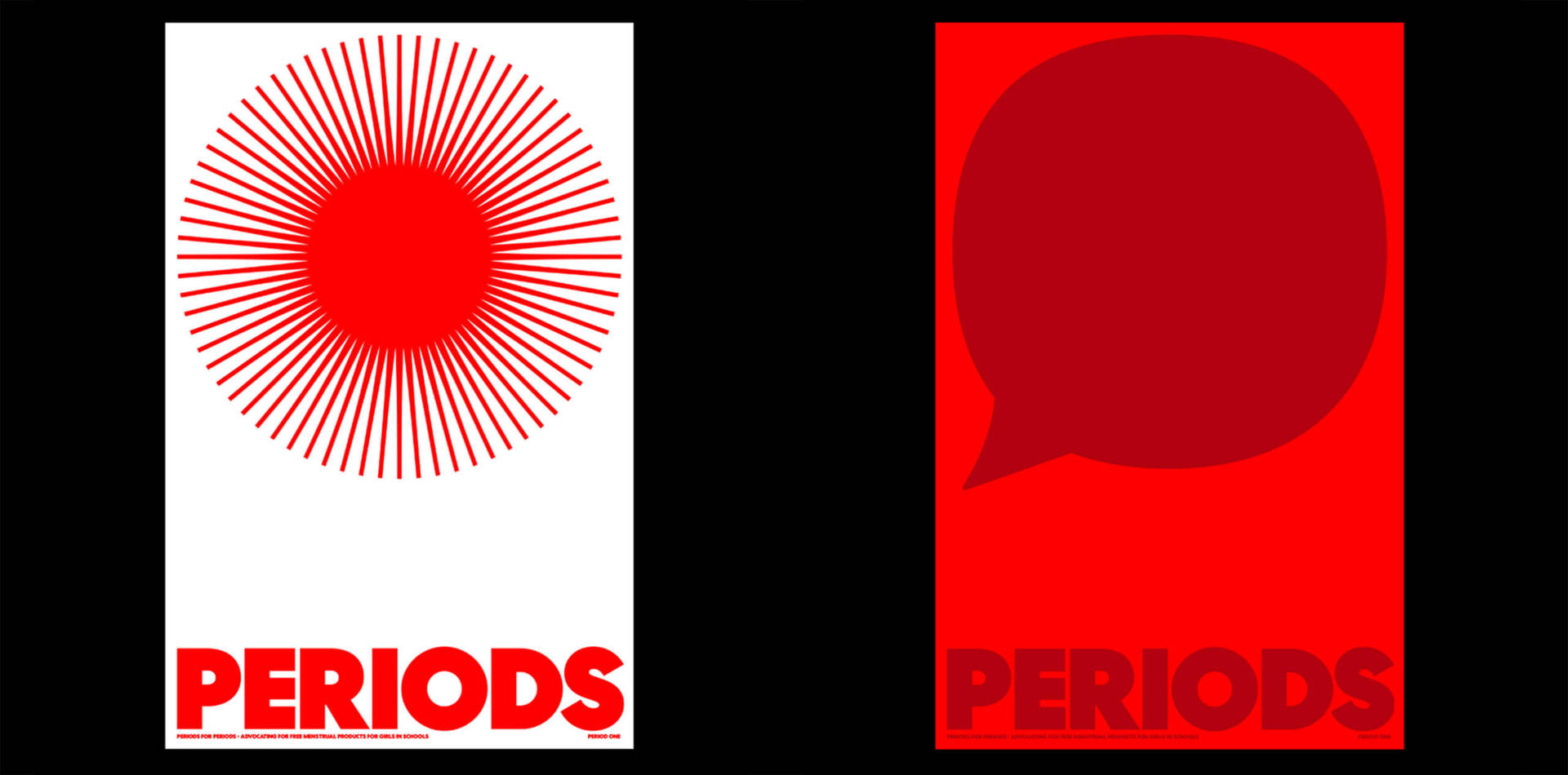
The Bush 2020 campaign project is a unique project because it addresses a subject that isn’t often given much of a voice, namely a woman’s right to decide how her body should look. Because this was a satirical “political” campaign, we pitched an entirely typographic campaign inspired by the historical and political equity of American Wood type. Making typography the hero would allow the copy, cheeky allusions to American political phrases, to read more powerfully. The variable nature of the type speaks to a woman’s right to choose how her pubic hair should be treated, anywhere from bare to bushy. I believe that projects like this helped to garner similar opportunities such as designing a few display periods for the “Periods for Periods” campaign – a campaign, whose goal is to move people to demand free period products for girls in school across North America. I was just one of many female designers who took part in this effort.
We love your projects ‘Destructive to Constructive’ and ‘How are you Really?’, both of which are a reaction to current affairs. What were the intentions behind your creative approach and how do they reflect your thoughts on your role as a designer?
My ‘Destructive to Constructive’ poster series was a personal response to mass shootings and the irrational acts of hate we see in the news; unfortunately, it resonates at this very moment. The idea came to me quite easily, as it was the feelings of despair prompted by each news headline that spurred me into action. When I read these headlines, Ican feel the tragedy through the page; the physical toll of it, the power of the language that communicates these senseless acts is gut-wrenching. For me, it really was a question of how I could create an emotional response that was opposite. In these moments of darkness and discouragement, we all dream of and wish for a world where such acts don’t happen. This poster series was born out of that yearning. I asked myself, “What could a more hopeful headline look like?” I realized that the combination of words and phrases that were initially connected to tragic news would be rearranged into something constructive.
In a similar light, the ‘How Are You Really?’ campaign was born out of this idea of trying to promote a sense of empathy. Paula was approached by Kenneth Cole, to design the visual identity for his mental health initiative, The Mental Health Coalition, has a goal of destigmatizing mental health through messaging and a platform for people to connect and share their stories. As a result, we developed a very purist symbol that could stand for this feeling of abnormality when one struggles with mental health, a square peg in a round hole. We integrated this logo into typography, which calls attention to its presence. But you also start to see the mark repeated, therefore, dismantling the idea that mental health is rare and confirming that it is something most people struggle with. The image and color system were inspired by the spectrum of fluctuating emotions we can all feel on any given day. The main tagline of this campaign “How Are You Really?” and it is such a simple question, but I don’t think we ask it or hear it being said often enough. A good chunk of this project including its launch happened during the Spring of 2020, when New York City was the epicenter of the Covid-19 crisis. It was devastating and traumatic time at the beginning of the pandemic, when so many of us were feeling the first effects of isolation and asking this question to others was more important than ever before.
These projects are just two examples of howdesigners have the ability to call attention to issues, to make people see, to compel people to action through how we position ideas and words on a page. The ‘Destructive to Constructive’ series repositions despair into hope with the intention of providing viewers with an alternate perspective. The ‘How Are You Really?’ campaign brings a poignant question to the forefront through typography that spurs people on to care and to check in on others. This ability to point out ideas and issues to an audience are not only a capacity of designers but should be seen as a responsibility.
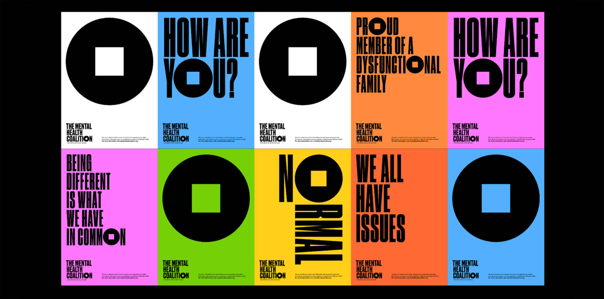
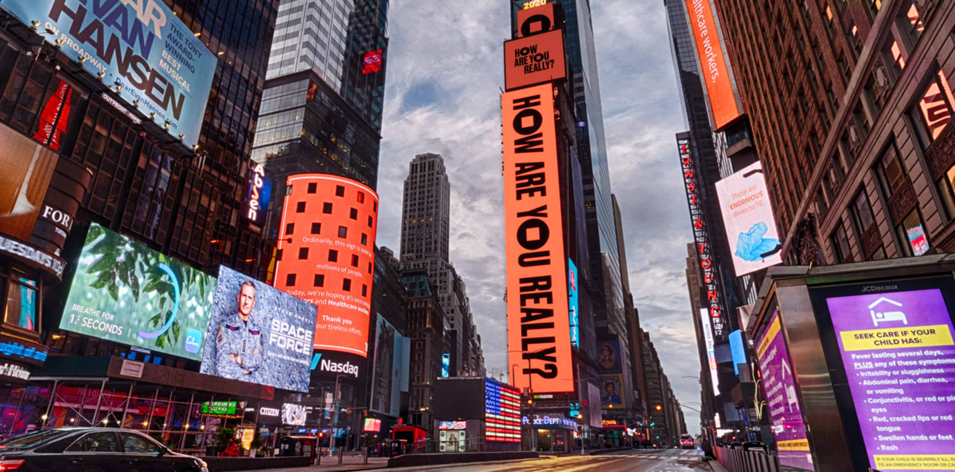
The Mental Health Coalition / How Are You Really? Campaign Identity: According to the World Health Organization, one in four people will experience a mental health condition at some point in their lives, a situation likely to worsen significantly as a result of the Covid-19 pandemic now affecting millions. Founded by the social activist and fashion designer Kenneth Cole, The Mental Health Coalition is a collaborative effort that unites the leading US mental health organizations, creative and media platforms, and passionate advocates and celebrities to work collectively to destigmatize mental health conditions and address this pervasive public health crisis.
Has being a woman impacted your career?
I would say that I have experienced more positives than negatives. I do know what it is like to be a woman working in a male-dominated workplace. I remember feeling incredibly isolated, especially because I was at the start of my career. I felt as though I didn’t have much of a voice or presence. On the other hand, I also know what it is like to work for an influential boss who is a woman, Paula. She has been a trailblazer in carving her own path as a woman in the design industry. To watch her conduct herself in meetings, selling ideas and persuading clients was inspiring to a young female designer working for her. Actually, being the sole female designer on her team proved to be beneficial when projects such as “The Bush 2020” or branding the “National Women’s History Museum” came around. Those projects would naturally be appropriate for me to lead, and it felt empowering to be able to work on those projects with someone who is as influential as Paula. We have a long way to go, but the present day is proving to be the best time to be a woman in this industry where platforms such as Design by Women are highlighting and broadcasting our work ,making people more aware that we need more women in positions of creative leadership.
How do you think we can encourage greater diversity and inclusion across the creative industries?
I believe the encouragement of greater diversity and inclusion in the creative industry has to be a team effort; everyone must participate and amplify the voices of those who have been denied a platform to speak or express themselves. Each and every one of us must also look inside ourselves, unlearn and rewire how we think about those who are different from us. The strategy often seems to be just “hire or include more women, more LGBTQIA+, more black people, more indigenous or people of color,” when companies, platforms etc… should really ask themselves, “Does our culture currently offer an environment where these people would like to exist? Is it safe for them to be here?” We succeed in creating an environment that encourages greater diversity without first addressing and confronting our own culture and values, its flaws and shortcomings. There is some “heart work” that needs to occur in the creative industry to allow for diversity and inclusion.
Are there any female role models or mentors who have shaped your career?
I would be remiss if I didn’t first mention my mother Annette Atwood, who first inspired me to see, love and pursue art. My design professors at Laguna College of Art + Design, Dana Herkelrath and Catharin Eure were some of my biggest champions, who played a formative role in my education and growth as a designer in school and to this very day. Lastly, when I was in design school I did a “Designer Profile” presentation in my Graphic Design 1 class on Paula Scher, and from that moment the energy of her work has been an enormous source of inspiration. Additionally, the opportunity to work for her has been a catalyst for other career opportunities. She continues to be a support to me, for which I am grateful.
Do you have any words of advice for women considering a career in the design industry today?
I would say that we need you, your perspective, and your voice!
Can you recommend 3 other female creatives currently working in the design industry who you find inspiring.
- Mary Kate Henry: Mary Kate is an extremely talented Graphic Designer who is currently working for Eddie Opara. She just recently launched a new site called “Resource Resource” that not only highlights sustainable design in the creative industry but is a catalyst for dialogue about climate change and what we can do as designers to combat it – @marykatehenry @resourceresource
- Sarah Kay Miller: Sarah Kay is a Data Viz Designer currently working for Giorgia Lupi who has an inspiring knack for communicating human behavior through data visualization. Her work is so thoughtful and perceptive – @thesarahkay
- Zrinka Buljubašić: Zrinka is a talented Type Designer based in Mexico who co-runs Dual Type. She is also an alumna of the Type Media program in The Hague. Not only do I admire her stunning typographic work, but also how she carries herself with such strength and confidence. She has led a few of our workshops and critiques at Type@Cooper and has been incredibly generous with her knowledge. I hope to be half the type designer that she is someday – @zrinzrin
To see more of Emily’s inspirational work follow:
Visit:
Article by Laura Bertinelli
Laura Bertinelli is one of the wonderful DesignbyWomen collaborators.