Currently working with Matt Willey at Pentagram, Chantal Jahchan is a Lebanese-American designer and writer based in Brooklyn, NYC. Graduating with a BFA from Washington University in Saint Louis just a few years ago, Chantal interned with Michael Beirut at Pentagram before freelancing for Eddie Opara and Order. Her work has been recognised by established design institutions and publications such as, It’s Nice That, The Type Directors Club, Graphis, IxDA, and Adobe.
Much of Chantal’s practice is inspired by language and communication, influenced by her cultural background and experience of moving to the US at a young age. Typography and literature are often at the forefront of her work, which she uses as a tool to explore and comment on social and cultural issues. In 2019 she gave a keynote talk at Typographics based on her thesis book project ‘En Route’ where she explored ‘Lebanon’s history, identity, and visual culture through the lens of vernacular typography’ and ‘challenges readers—Middle Eastern and Western alike—to reconsider what visual modernity means.’
Passionate about contributing to causes she believes in, Chantal is also a collaborator of 1on1, a non-profit organisation elevating the narratives and experiences of Arab and Muslim Americans. After the devastating explosion in Beirut last year, she also raised over $16k for Lebanon’s Disaster Relief Fund and the Lebanese Red Cross through a t-shirt campaign with Everpress. Since then, she has continued to work on projects such as WePresent’s Manifesto series for which she designed a poster for Susan Abulhawa, a writer, activist, and founder of Playgrounds for Palestine, documenting her 10 rules for living. Most recently she has produced graphics for Prints for Palestine.

We caught up with Chantal to learn more about her design journey so far, her interest in written and visual language, and her commitment to design projects that raise awareness for causes she believes in.
Can you tell us a bit about your career path and how you got to your current role, working with Matt Willey at Pentagram?
I graduated from Washington University in St. Louis a few years ago with a BFA in graphic design and a minor in writing. I cut my teeth interning for Michael Bierut right out of school. I was afforded an incredible amount of trust as I played a major role in projects like the branding of One Metro New York (OMNY) for the MTA. After seven phenomenal months on Michael’s team, I was hired as a freelancer to help Eddie Opara’s team design a massive four-volume masterplan for Sidewalk Labs’ new “smart city” in Toronto. I bounced around a bit after that, freelancing at a Brooklyn-based studio called Order at first and then independently.
That brings us to January 2020, when Matt Willey reached out to me about potentially working together. He had just made the switch from art directing at the New York Times Magazine to joining Pentagram as their newest partner and was putting together a small team. My first day working with Matt was actually the day Pentagram went remote, so it’s been an exciting challenge figuring out how to work collaboratively and grow the team over the past year or so. We have lots of exciting branding and editorial projects in the works, and I’m looking forward to sharing those soon.
Your thesis project ‘En Route’ sounds fascinating. Could you tell us about the intentions behind the project and what you discovered through the process of creating it?
En Route was my undergraduate senior thesis book. In short, it’s an exploration of Lebanon’s history, identity, and visual culture through the lens of vernacular typography. The process began during a routine trip to Lebanon to visit my grandparents, when I started to document the typography around me in hopes of provoking people to rethink their criteria for beauty and “modernity.” But after having conversations with a couple of Lebanese type designers, a photographer, and an architect, I realised that it was more important to shift my focus inwards. The book became a meditation on the different ways that we, the Lebanese, interpret the implications of our history for our post-war identity and visual culture. I go more into depth about nerdy type details and Lebanon’s history during the Typographics talk I gave in 2019.
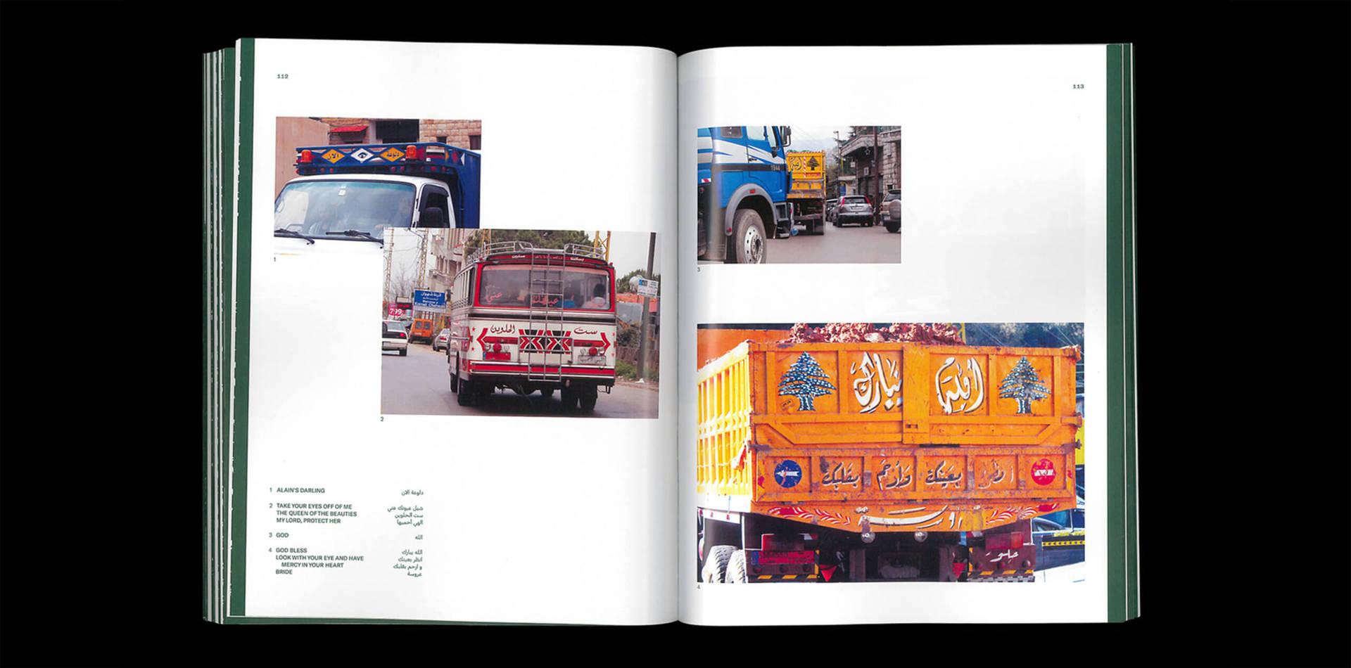
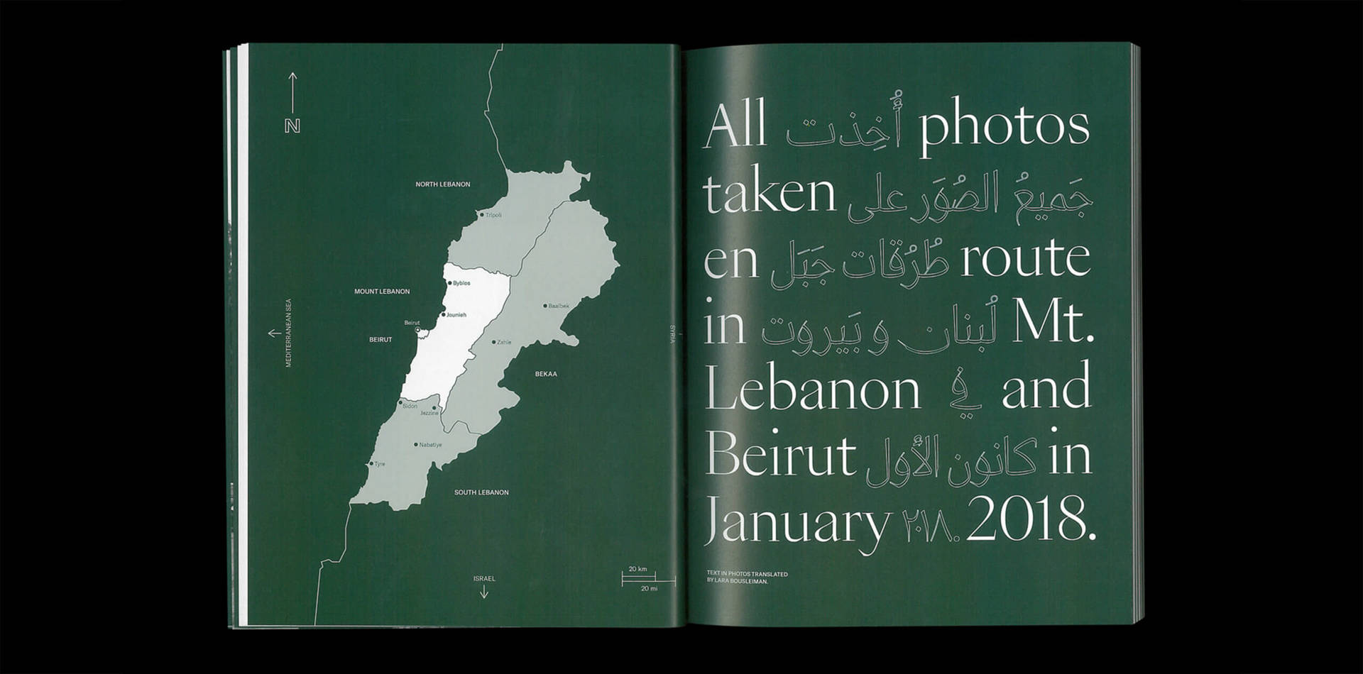
En Route: explores the rich history of Lebanon’s relationship to language, identity, and the revolution of Arabic type design. Through interviews with various Lebanese professionals and photos of vernacular typography in Mount Lebanon, this book challenges readers—Middle Eastern and Western alike—to reconsider what visual modernity means.
Typography and type design often seem to be at the core of your work. Where does this interest come from and how does it inform your creative process?
I was born in Lebanon and moved to the US at a young age. I attended an American preschool where I experienced a bit of culture shock as I transitioned from French and Arabic to English. I actually went selectively mute for a few months until I was sure I could speak English properly. Since then, I’ve had an immense appreciation for language as a tool for verbal and visual communication. So my work naturally centers on the power of language, usually through typography. For the most part, in my creative process I focus more on type and composition rather than on imagery. What a word means and how it looks are of equal importance to me. It feels weird to say it like that—to imply that the look of a word could possibly eclipse its meaning for me—but it’s true.
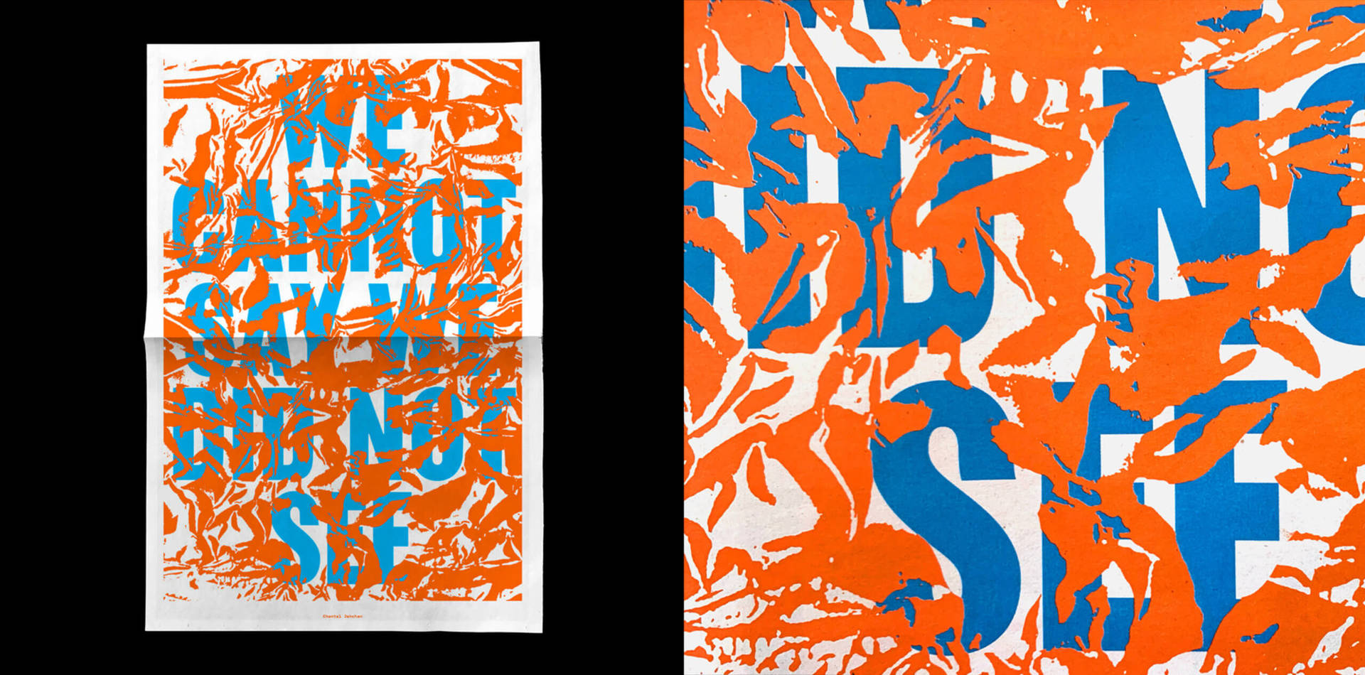
Separated—Separados: A catalog of visual responses to the situation of migrant children separated from their families at the Southern U.S. border. Project curated by Shira Inbar. My contribution features a texture pulled from the “space blankets” the detained children wear to keep warm in the camps, which conceals the words “WE CANNOT SAY WE DID NOT SEE.” All profits donated to Save the Children.
You have many wonderful projects in your portfolio that focus on raising awareness for issues you believe in. Could you tell us about a stand-out/favourite that you’ve worked on and why it’s important to you?
I’d have to pick the Beirut t-shirt.
When I heard about the port explosion in Beirut last August, I felt hopeless. I was worried about my family in Lebanon and heartbroken for all the victims. My instinct was definitely not to create a t-shirt. But the day after the explosion, Everpress reached out and asked if I’d like to design a t-shirt to sell on their platform to fundraise for Beirut disaster relief.
The process was a bit of a rush because we wanted to get the fundraiser going as soon as possible. I tried a few different approaches in the twenty-four hours I had to create the graphic, including one where I typeset song lyrics from Fairuz’s “Li Beirut,” a famous ode to the city. But I ended up going with something simpler, something everyone could wear with pride—the word Beirut, in typeset English and hand-lettered in Arabic. In the end the time restraint was a blessing because I had to be decisive. I chose to print the graphic in a deep green color reminiscent of theemblematic Lebanese cedar, which is the motif of our flag and has represented life and renewal since biblical times.
When the t-shirt went up for sale on August 6th, it immediately gained traction on social media. The response was really heartwarming. After a couple of limited-run campaigns, we sold around 1,200 t-shirts to people in over 40 countries. We raised $16.8k to donate to Impact Lebanon’s Disaster Relief Fund and the Lebanese Red Cross.
The project was immensely important to me because it allowed me to help a cause I care deeply about by leveraging a skillset that sometimes—on my worst days—can feel self-serving and insignificant.
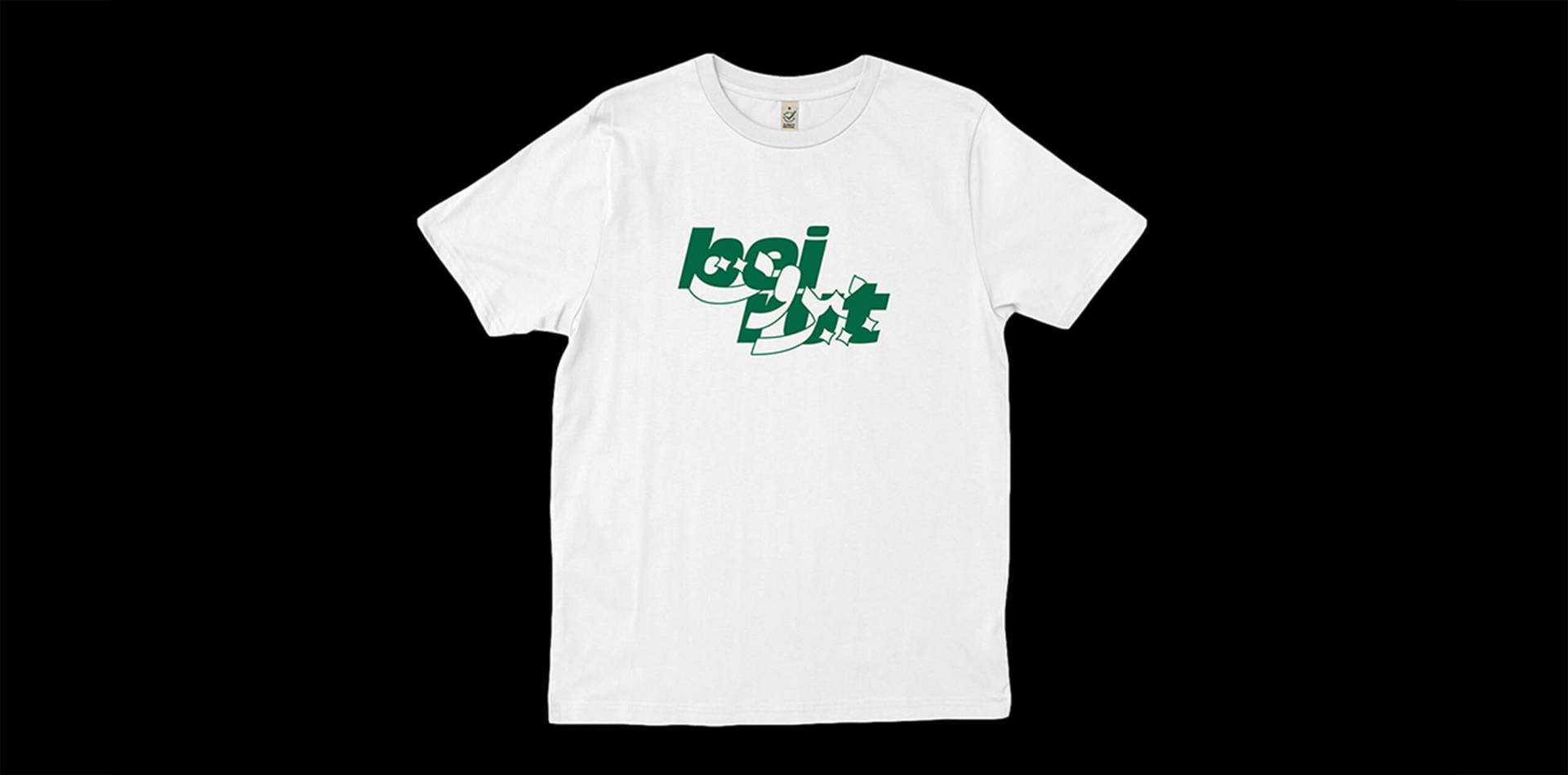
Beirut Disaster Relief Shirt: T-shirt with custom lettering to raise money for disaster relief in Beirut after the devastating explosion on August 4th 2020.
We love the project you created for the WePresent manifesto x with text by Susan Abulhawa. How did this project come about and what your creative approach did you take?
WePresent asked me to participate in their Manifesto series, which invites activists to write 10 rules to live by in order to help spread their message. I was commissioned to design a poster highlighting a manifesto written by Susan Abulhawa, the founder of Playgrounds for Palestine, a non-profit organization dedicated to upholding the right to play for Palestinian children.
I took inspiration from the bright colors found on playgrounds, the endearing handwriting of children, and the idea of play as an essential part of childhood. Each of Abulhawa’s rules began with a key word or phrase, which I typeset in an overlapping letterpress style as a nod to Sister Corita Kent’s printmaking work. I hand-wrote and scanned the corresponding descriptions for each rule. I actually wrote them upside down to produce a messy, child-like scrawl. Each of the descriptions has a color-coded number that corresponds to its appropriate key word.
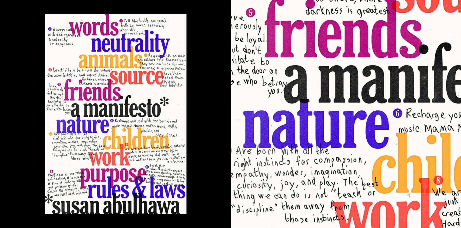
A Manifesto by Susan Abulhawa: Poster design for the WePresent Manifesto series featuring a manifesto written by Susan Abulhawa, founder of Playgrounds for Palestine, a non-profit organization dedicated to upholding the right to play for Palestinian children.
If you could go back to the beginning and start your career again what would tell your younger self?
Don’t feel guilty about making decisions for your own wellbeing. That could mean saying no to projects, switching jobs, or taking time off.
Do you have any words of advice for women considering a career in the design industry today?
This advice is geared more towards women who are entering (or already in) the industry. Don’t be afraid to ask for what you think you deserve, specifically when it comes to compensation. The worst that can happen is someone says no or negotiates the number lower. It’s always worth asking–I’ve never regretted doing so.
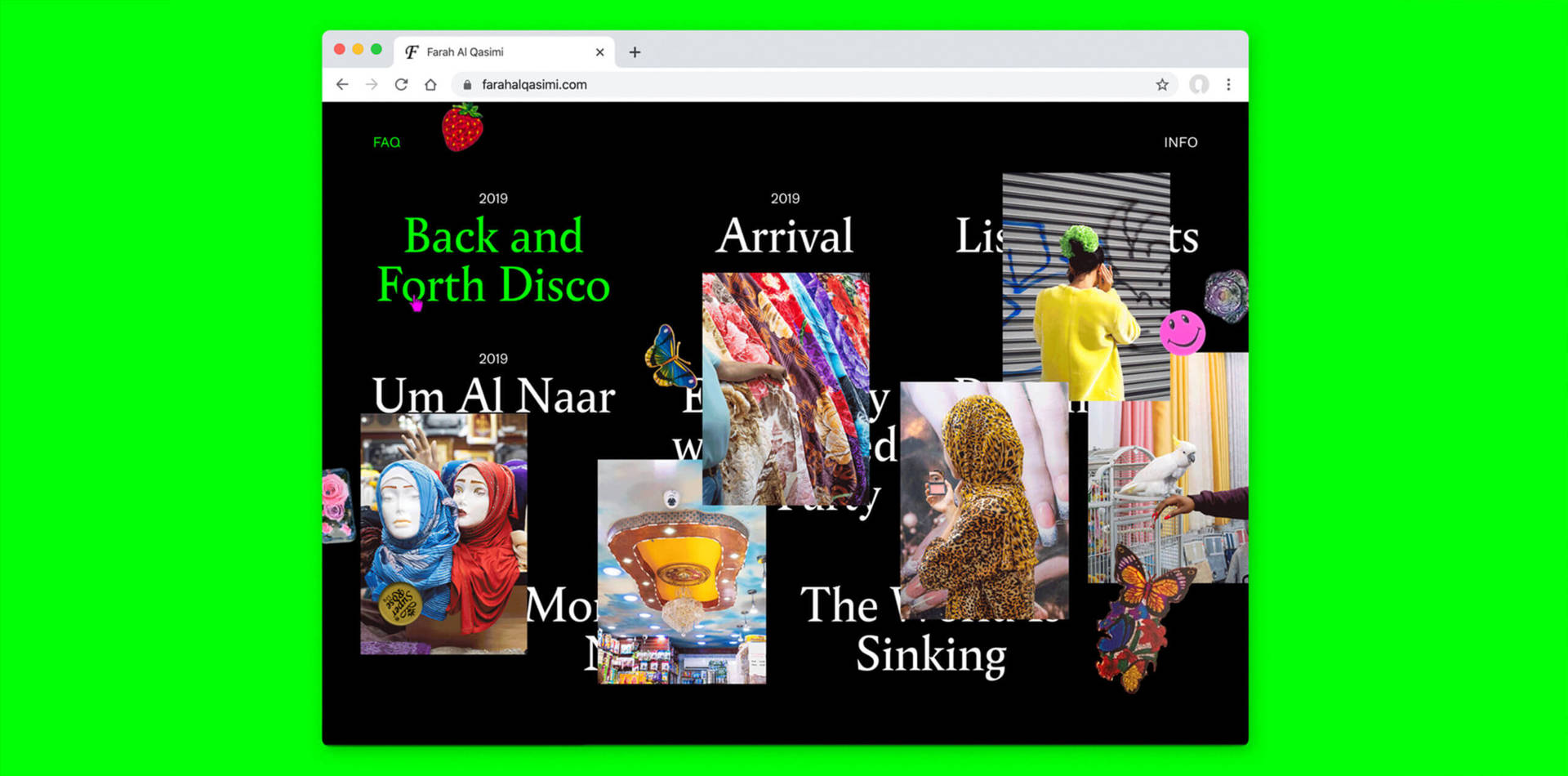
Farah Al Qasimi Website: Designed and built a portfolio website for photographer Farah Al Qasimi, whose work explores postcolonial structures of power, gender, and taste in the Gulf Arab states. Farah’s work subverts codified expectations of how images are constructed and understood. The layout reflects this with overlapping images and stickers that can be rearranged by the user.
Which female creative has most inspired you and why?
There are many, but if I had to pick just one it would be Anni Albers, particularly her gouache textile sketches. I really enjoy her imperfect construction lines that peek through the gouache and her use of deceptively simple geometry and color. I’m also drawn to the strength of her work as compositions across various different mediums.
Can you recommend 3 other female creatives currently working in the design industry who you find inspiring?
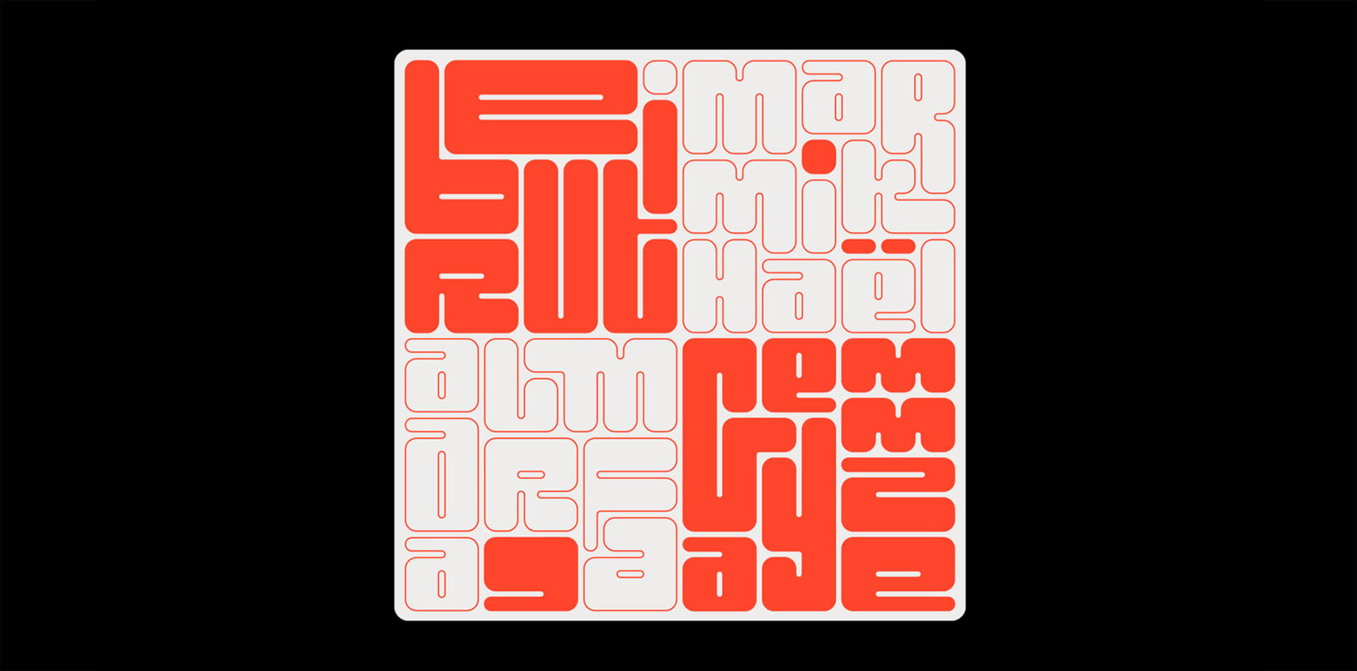
Al Marfa’a Sticker: Sticker designed to raise money for Studio Safar, a Beirut-based design studio that lost everything in the August 4th Beirut explosion. Custom lettering is based on a square grid, inspired by a historic Arabic calligraphy style called Square Kufic. Made possible by Femme Type and Bristol-based print studio GreyJam Press. 100% of profits going to Studio Safar.
To see more of Chantal’s inspirational work follow:
Visit:
Article by Helen Tong
Helen Tong is one of the wonderful DesignbyWomen collaborators.