
Vanderbrand is an award-winning, full-service creative agency based in Toronto. Founded by Creative Director, Julie Vander Herberg in 2008, the world-famous studio produces an impressive range of work spanning brand identity, art direction, environmental design, packaging, and interactive design. With previous clients including some of the world’s leading companies in real estate, architecture, corporate, culture, technology, hospitality, and retail sectors.
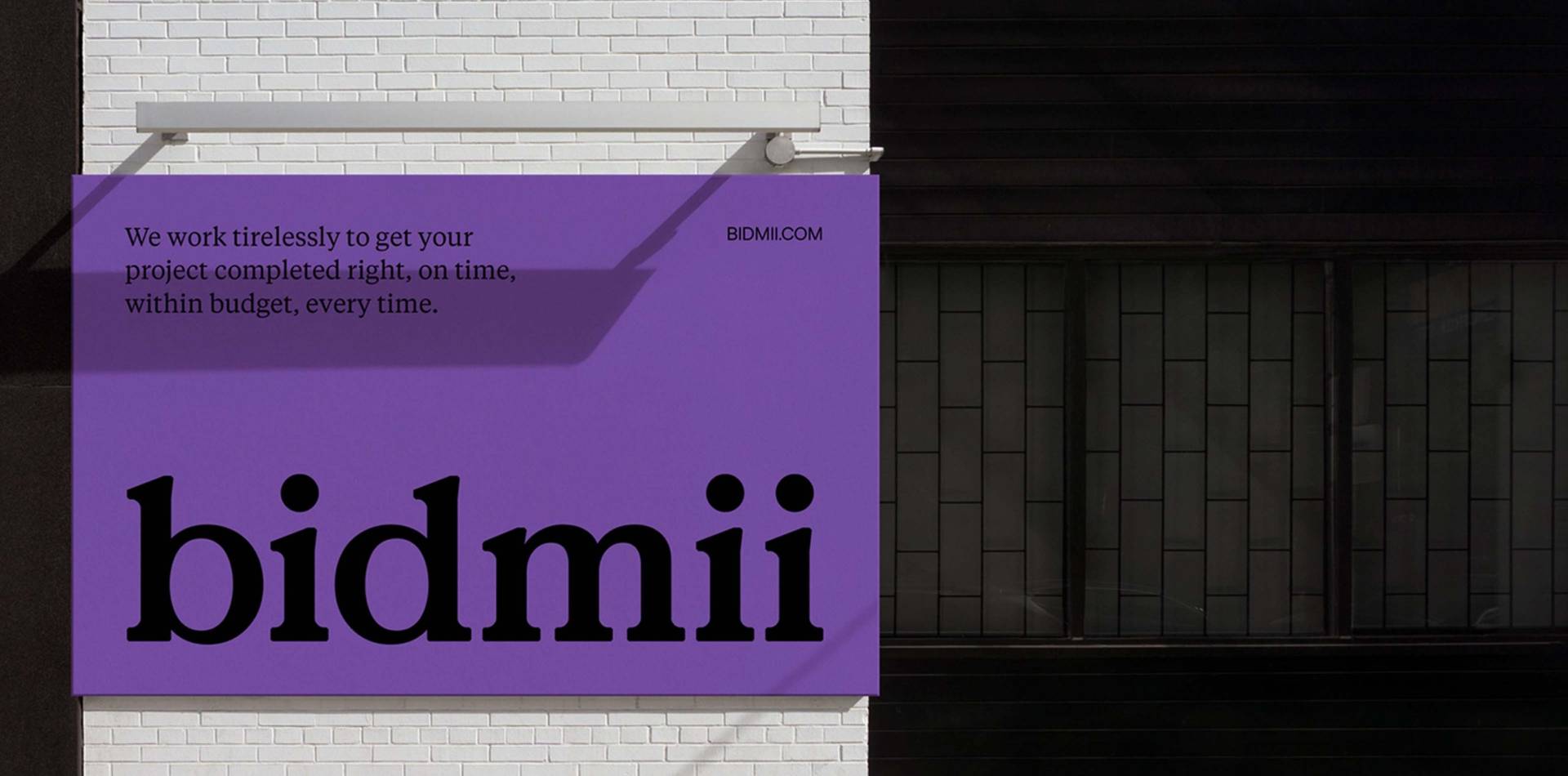
We recently caught up with Vanderbrand’s Senior Art Director, Melanie Hong, to find out about the studio’s recent visual identity project for home improvement specialists Bidmii. They’ve created a vibrant, dynamic, and flexible visual identity system based on Bidmii’s core values — integrity, inspiration, and innovation. Improving user experience for the all-in-one app was a crucial part of the project, with the identity effectively making use of a bold colour system and strong typography, to improve the efficiency of Bidmii’s digital products.

Could you tell us a bit about how you approached the brief set by Bidmii, what research you initially undertook and the project process?
The team at Bidmii approached Vanderbrand because they sought to create a new narrative for the home improvement industry, by re-imagining the relationship between homeowner and contractor. We asked ourselves, “how can we create a brand that would set up a foundation for a collective of people where there can be comradery and trust?” We initiated our research by looking at other brands within their competitive landscape and eventually found inspiration in companies that bring a community of people together. We looked to brands like Discord, WeTransfer, Skype, and Zoom.
Where did your concept for the logo come from and how did this evolve to the final outcome?
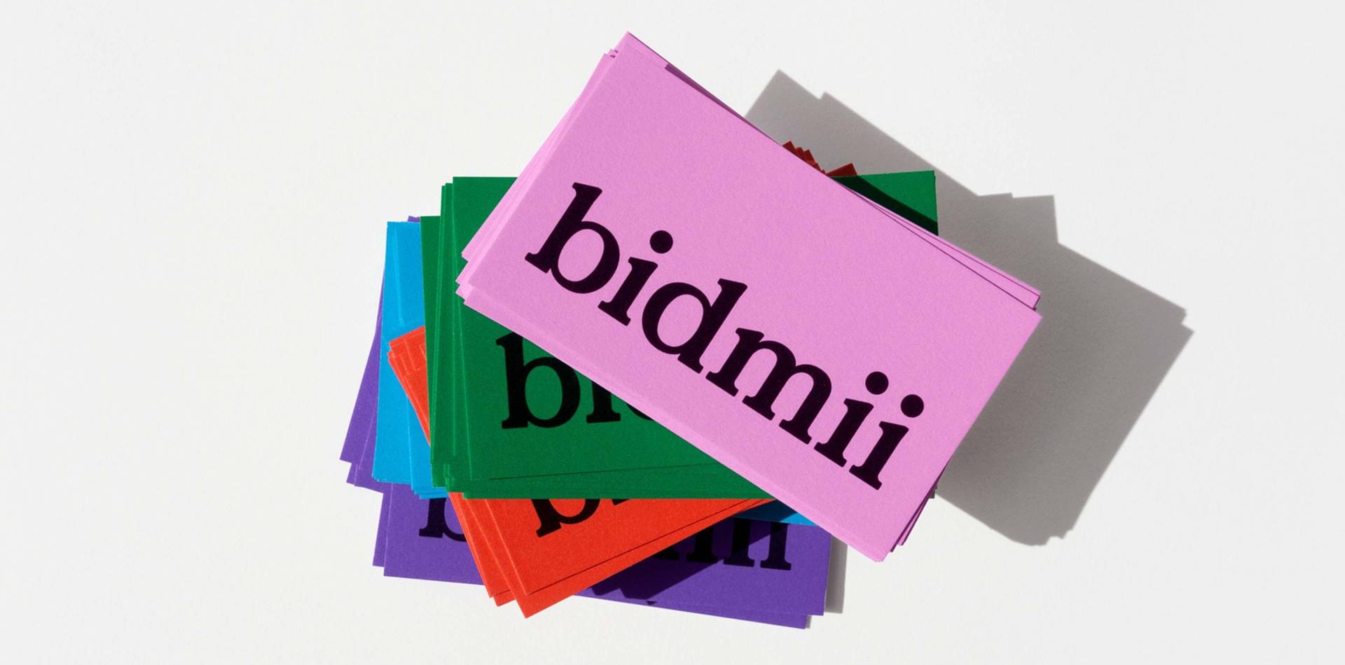
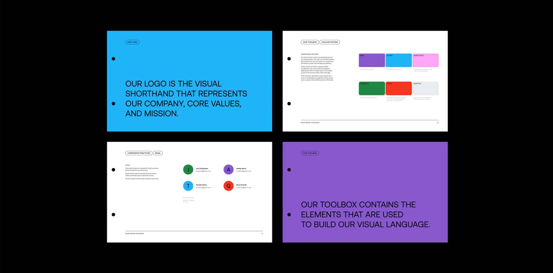
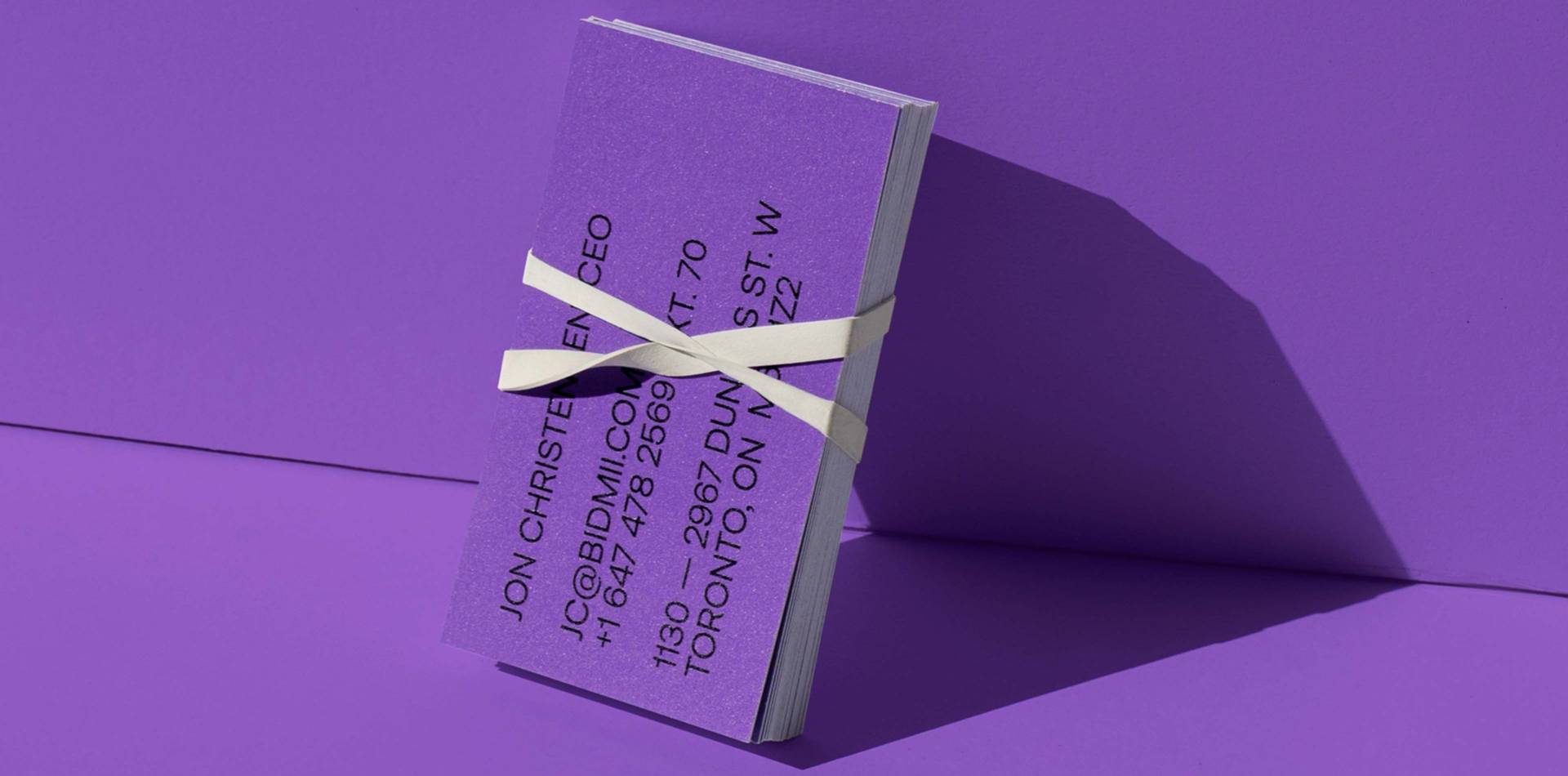
Bidmii shared some of their initial assets with us, including their onboarding deck which spoke to the company’s core values. From this we learned that within the word Bidmii sit the ‘Three i’s’. These not only represent Bidmii’s core values – integrity, inspiration, and innovation — but also serve as the building blocks for their ‘Build Your Ask’ tagging system. Utilizing the titles of the lowercase ‘i’ within the logo, these forms become the framework for tags that bring systematic efficiency to the platform.
We asked ourselves, “how can we create a brand that would set up a foundation for a collective of people where there can be comradery and trust?”
Were there any challenges and how did you overcome them?
Bidmii is a revolutionary all-in-one app designed to simplify the process of bidding and paying for home improvement jobs; making life easier for homeowners, contractors, and realtors. Therefore, user experience was our number one priority. It needed to be effortless, straight-forward, accessible, and inviting. We provided the Bidmii team with a toolkit that would do exactly that.
The ‘Build Your Ask’ tagging system is dynamic and flexible, allowing homeowners to identify and describe their project, with little room for error or miscommunication. Contractors are then able to sort and filter through projects, even implementing saved or preferred tags, eliminating unnecessary sorting time or clarification discussions. In addition to the ‘Build Your Ask’ tagging system, we introduced two typefaces into the visual identity typographic system that would provide layering within the app. Aeonik is highly legible and functional, while Tiempos is more personable and conversational.
“…user experience was our number one priority. It needed to be effortless, straight-forward, accessible, and inviting.”
Why did you decide to use a colour system as an integral part of the identity?
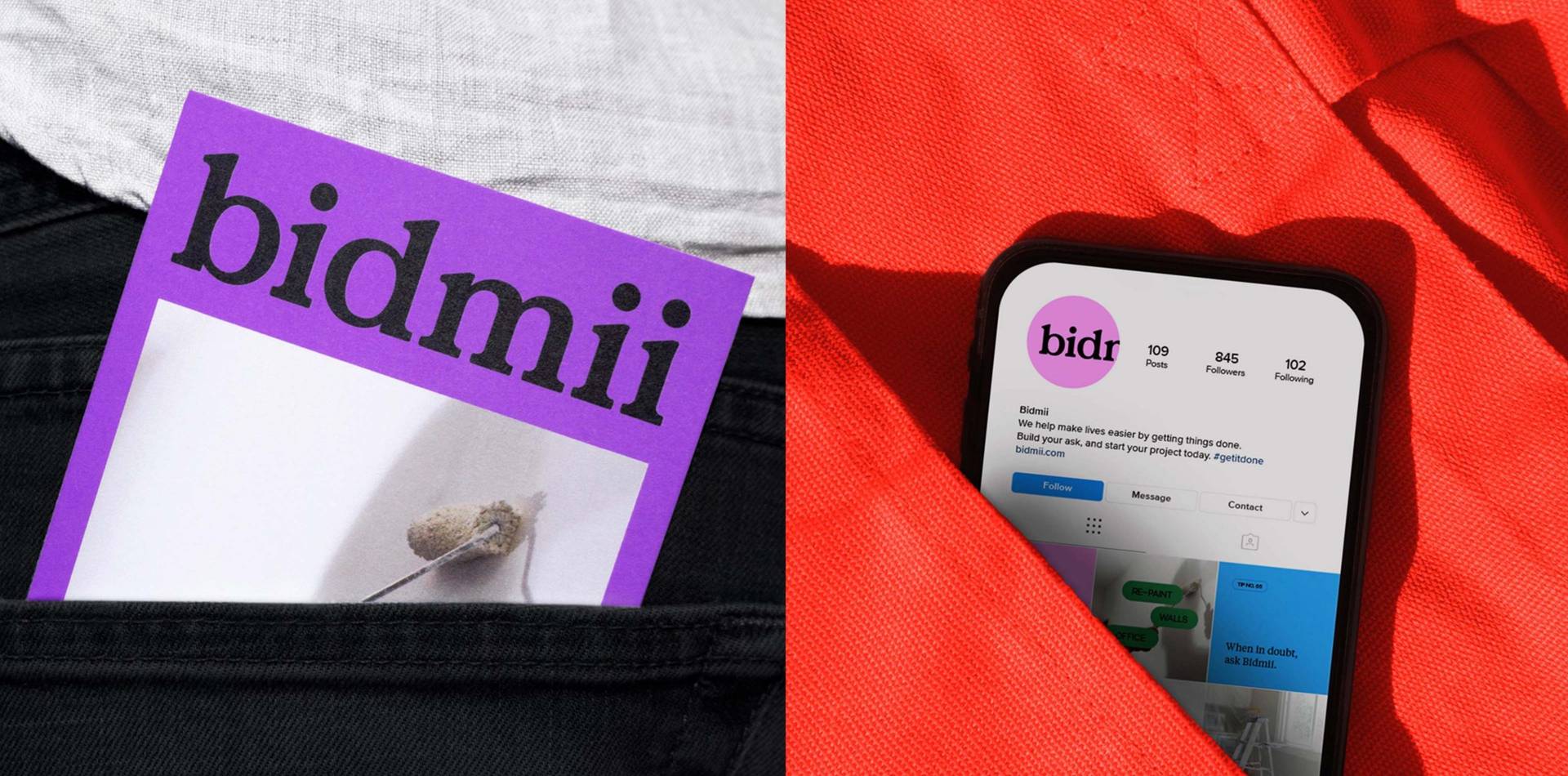
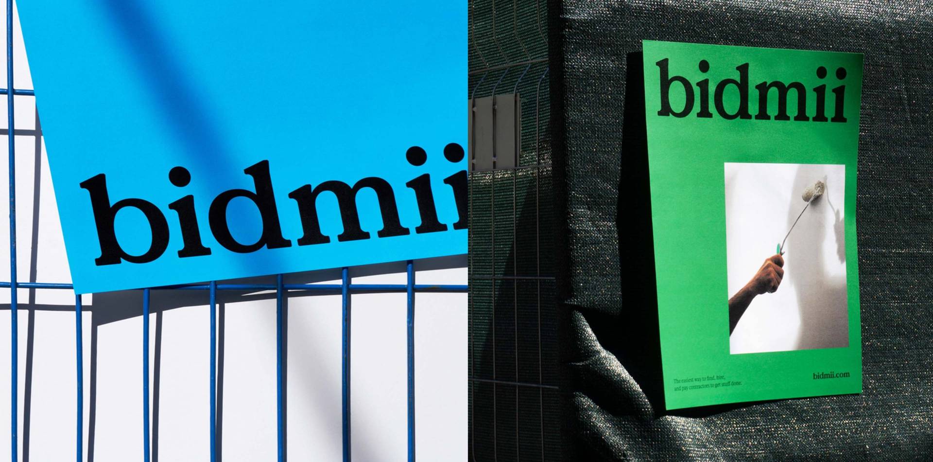
The Bidmii colour palette brings a systematic efficiency to the brand that translates into a better user experience. By giving each hue a distinct meaning, new users are easily able to digest the information on the platform, while repeat users can analyze their dashboards with ease. Homeowners and contractors alike may balance many projects at one time — each in a varying state of completion. Using colour as an identifier ensures clarity for all parties.
What was your favourite part of the project?
Not only is the Bidmii colour system an integral part of the user experience, but it also aims to inspire homeowners to start posting projects of their own. Working from home has become an integral part of everyday life, these vibrant colours encourage people to see their homes in a different light and realize the full potential of their spaces.
“Using colour as an identifier ensures clarity for all parties.”
Design Agency:
Founders:
Julie Vander Herberg — Founder and Creative Director
Client project:
Bidmii
Services:
- Visual Identity
- Art Direction
- Digital
Follow:
Visit:
Article by Mary Hemingway
Founder : DesignbyWomen.