We recently caught up with Studio Emmi founder Emmi Salonen to find out about her new branding project created for the Finnish Institute. The bold, fun, and flexible visual identity system supports the Institute’s mission of creating a positive impact in society and marking their 30 years milestone.
Could you tell us a bit about how you approached the brief set by the client and the project process you went through?
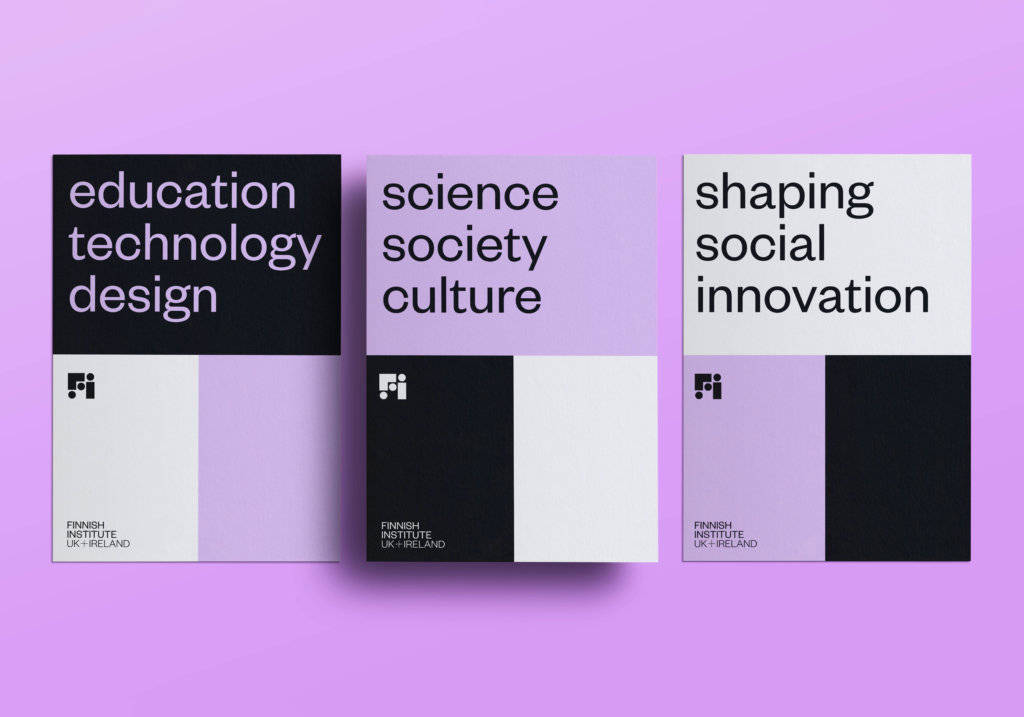
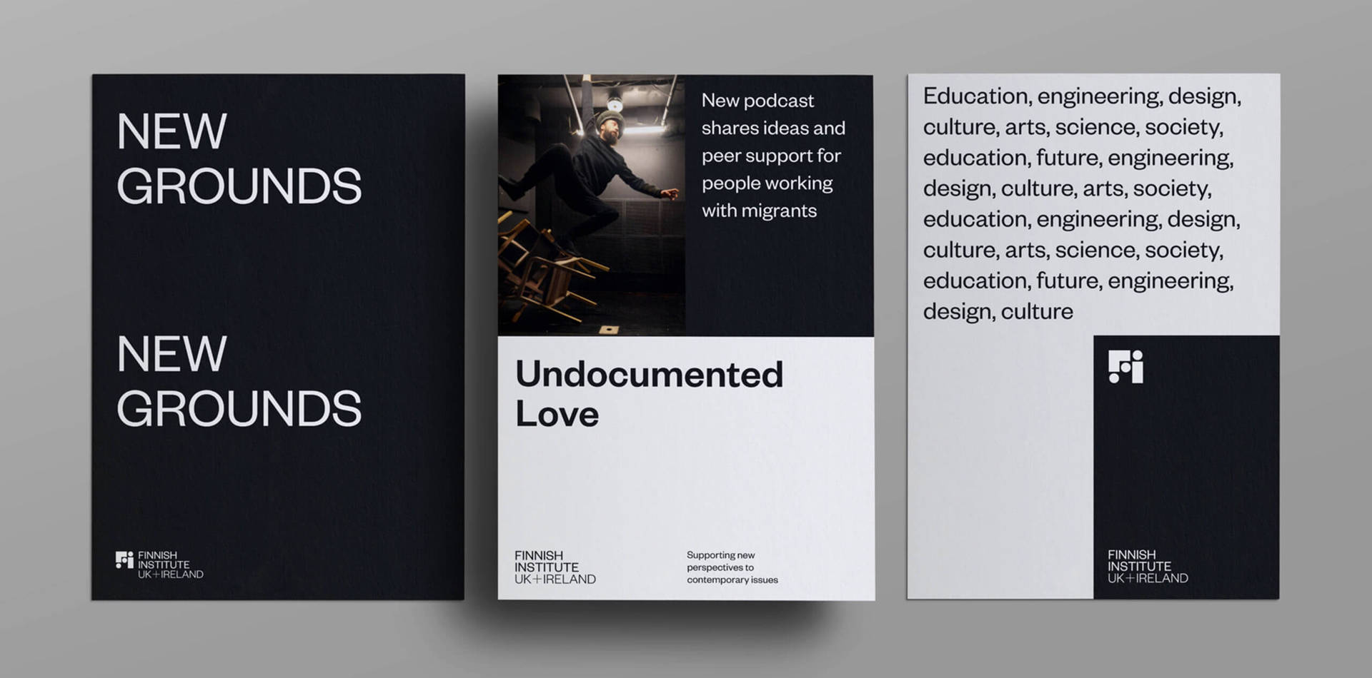
Finnish Institute in the UK and Ireland is an expert on Finnish culture and society. They identify signals of change in the fields of art, culture and society and support new perspectives on contemporary issues. Marking the milestone of the Institute turning 30 years, they commissioned me to create their overall visual identity, expressing values of diversity, inclusivity, and boldness in making the world a better place through culture.
After being selected from a group of designers, I spent a morning getting to know the client in person at their offices and then continued this remotely. I focused on their working processes and needs for the future – I have a set of questions I normally go through on an identity project, which vary from ‘What visual elements to avoid?’, to ‘What does success mean to you?’. I enjoy starting the design process by just listening, and taking in as much as I can, immersing myself in their business.
Where did your inspiration for the project come from and what research did you initially undertake?
I started the research process by looking at what the other Finnish Institutes in Europe look like. Most of them feature the country or focus on the colours of the flag; blue and white. I wanted something that stood more for the partnerships they build, shaping the future of art, design, culture, science and social innovation together – rather than country of origin.
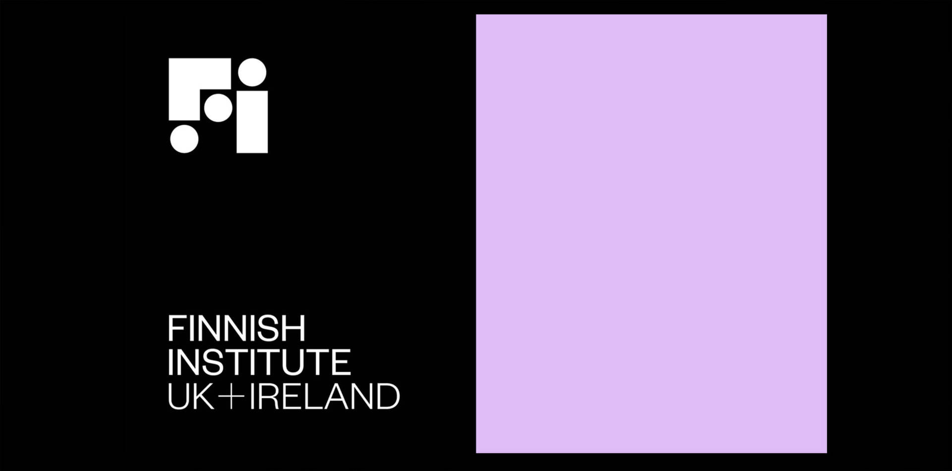
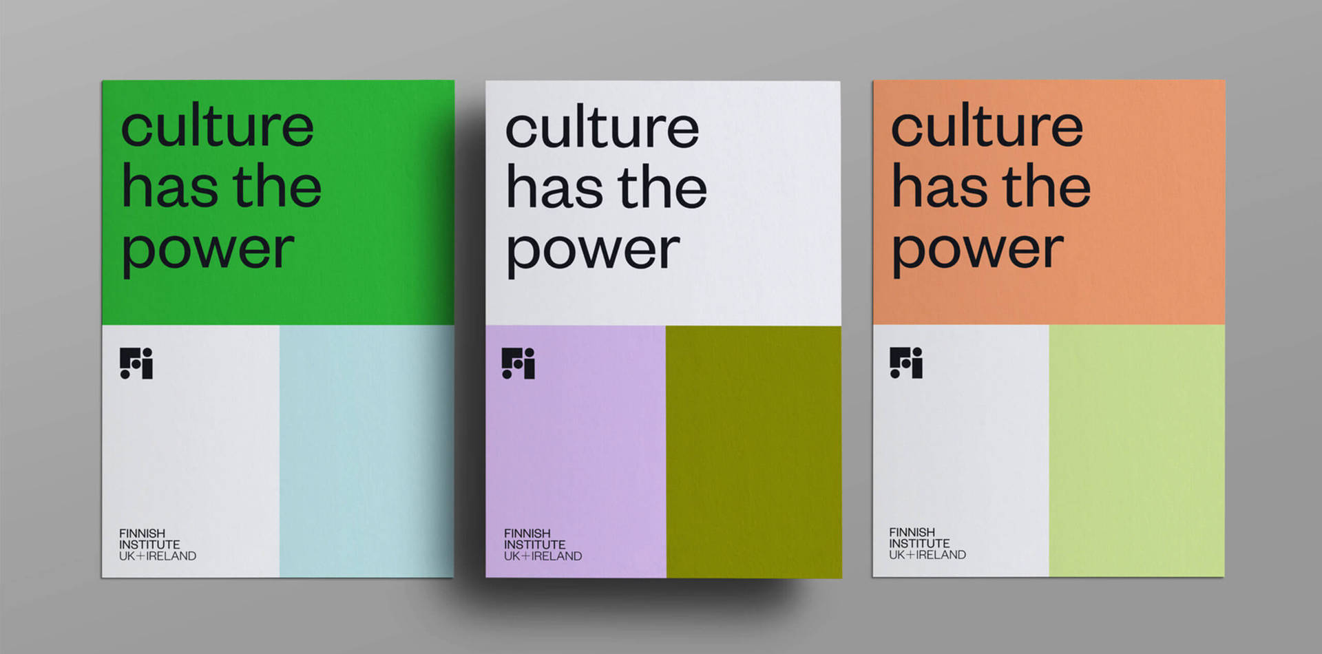
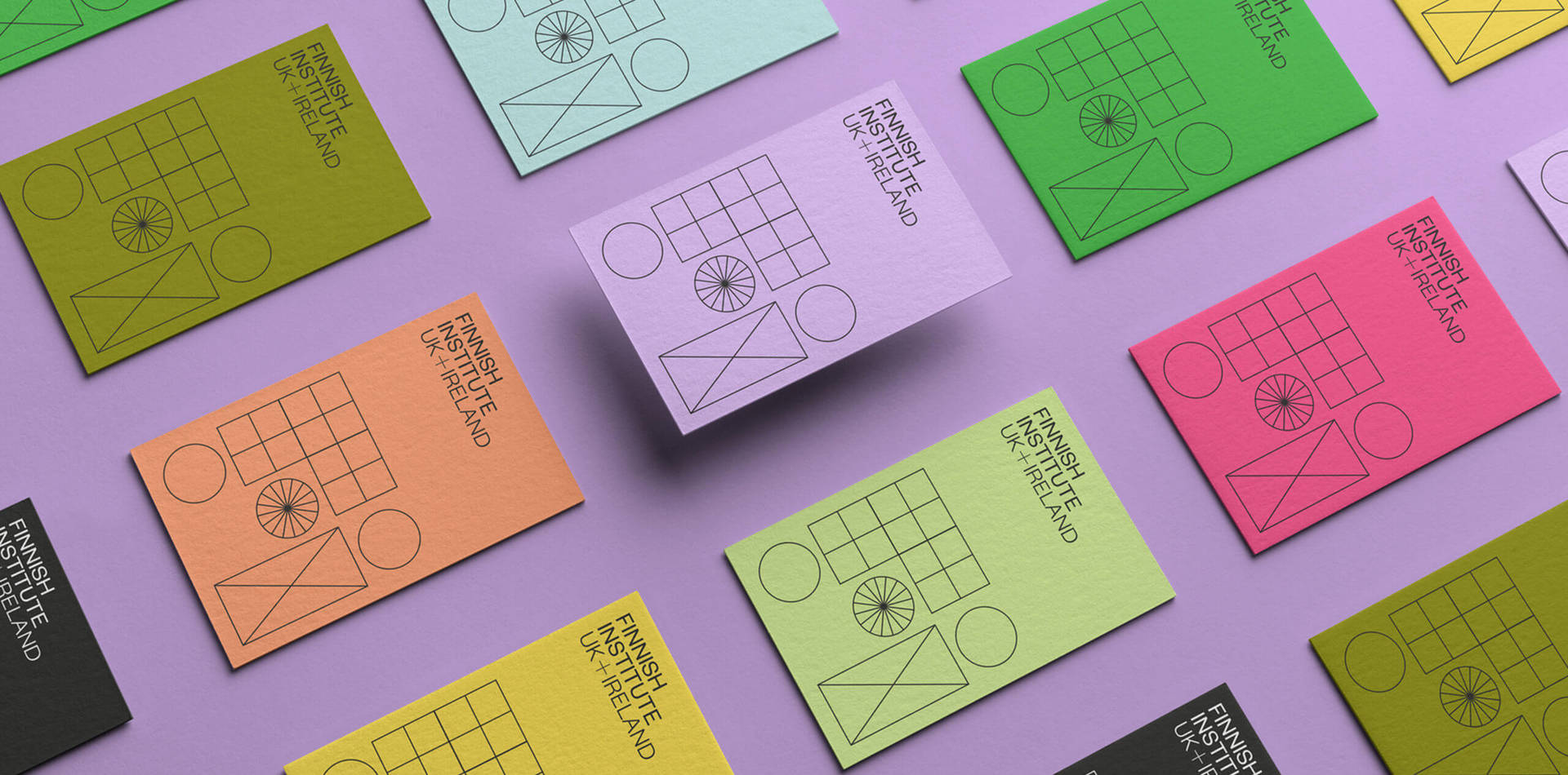
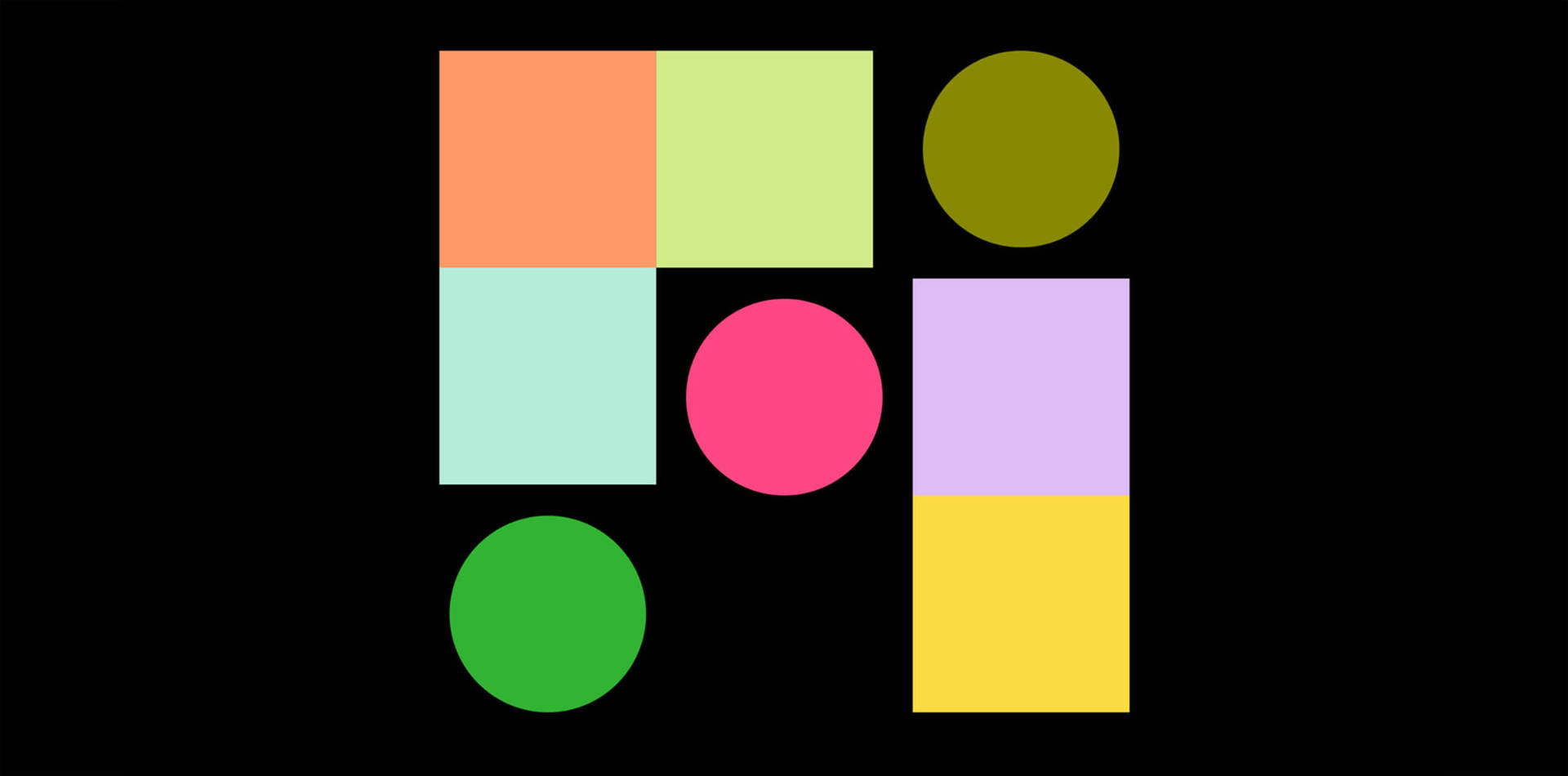
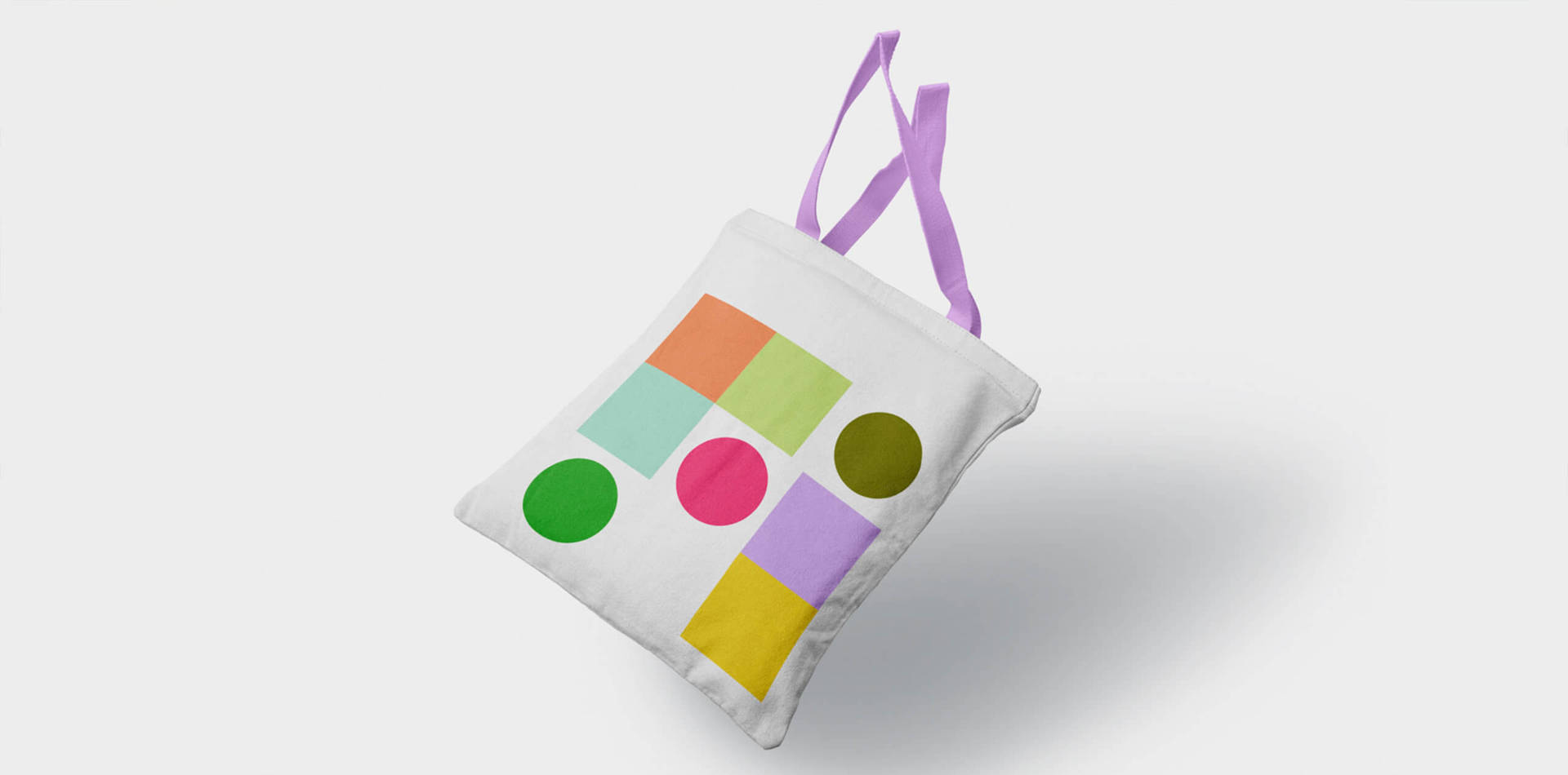
I came to this from different angles, viewpoints. Togetherness is what we went with in the end, but other themes were Connectivity and Progress. Each of the routes was presented together with a very different visual language, one was a more digital focus, one very bold and stern, and Togetherness was all about slotting in together and finding your place as part of the bigger picture. Creating ground for a multiplicity of new ideas. Hence the logo comes with both a patterned and multi-coloured version.
Were there any challenges and how did you overcome them?
The biggest challenge, in the end, was how to create brand guidelines and simple rules for use, when the identity is so rich in colour and pattern. It took us a few rounds to simplify the guides, reducing the colour palette and stripping down any extra elements for the in-house documents.
I truly enjoyed working with the wider team, and during the weekly virtual Friday meet-ups, we had to stay on top of a rather long list of deliverables.
What was your favourite part of the project/ part you’re most proud of?
I love colour, so my favourite part was playing with colours and choosing the final palette. I’m most proud of us all working on it together with such joy through lockdown and multiple stakeholders in the UK, Ireland and Finland.
I enjoy building sustainable, long term relationships with my clients. I strive for everyone not just to get on, but to feel part of the solution. This is how we can push the designs further and make sure they work, even after we as designers hand the files over.
What the client said:
“We love the new bold identity Studio Emmi has created for us. It reflects well our new strategy and emphasis on inclusivity and diversity. The work process and collaboration was easygoing, yet structured and clear. Emmi understood our needs almost intuitively, and translated our brief into a flexible design system that allows us to use the identity elements organically in the future.”
– JAAKKO NOUSIAINEN, Director
Design Agency:
Studio Emmi
Founder:
Emmi Salonen
Client project:
Finnish Institute
Services:
- Brand Identity
- Marketing Material
- Brand Guidelines
- Social Media

Follow:
Visit:
Article by Mary Hemingway
Founder : DesignbyWomen.