Shape of Words was originally conceived by friends Emma Judd, Alice Sherwin and Harry Bennett as a way to share interesting and eclectic insights and celebrate the often hidden processes and concepts behind the creation of visual work. Inspired by Bruno Munari’s idea of ‘investigating things in their isolated form, as well as appreciating the way that context changes them,’ they wanted to find a way to show the individual work of each contributor and highlight the narratives and parallels they discovered by bringing together.
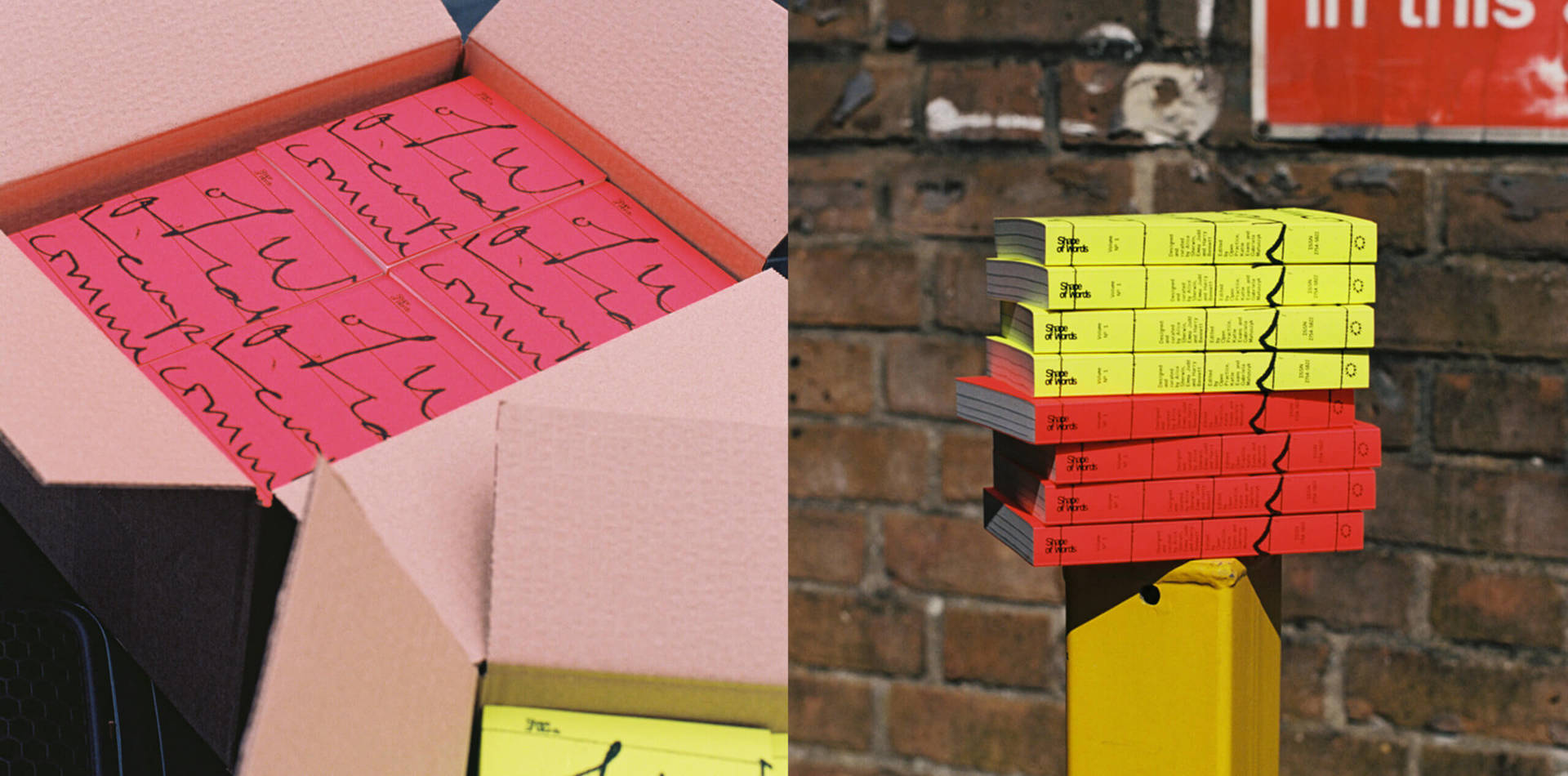
Featuring 30 amazing contemporary artists and designers including, Raissa Pardini, Morgane Vantorre and Laura Csocsán and many more…, Shape of Words takes the form of a book that is intended to be ‘collectively greater than the sum of its parts’. The book contains a series of curated thoughts, imaginings, tweets, and observations, that reflect on the ideas that are shaping the practice of design today, they describe it as a, ‘curation of loosely related things that might otherwise never brush up alongside each other.’ The contributors come from a wide variety of disciplines, career stages and parts of the world and their submissions heavily influenced the final format of the book with the cover reflecting the editing process by highlighting the physical marks that were sent back and forth to get the project done.
We talked with Emma Judd and Alice Sherwin to find out more about the inspiration behind the project, who was involved in the project and the process of self-publishing a book during the pandemic.
What inspired you to create and publish Shape of Words?
Back at art school, we were disillusioned by the idea that whilst visual work was celebrated, the interesting and eclectic insights, process and concepts behind the work were often hidden. So, we wondered, how could we share this, all whilst creating something which was collectively greater than the sum of its parts? The answer was even simpler — a book.
We returned to the idea during the pandemic, looking for something interesting to create together in a time where we were all apart. Cue all of us getting COVID at least once, new jobs, exciting freelance projects, moving flats and the complications of self-publishing, it’s taken longer than we expected. But now, here we are, Emma, Alice and Harry, three mates who met at uni finally making a book together.
Shape of Words has since hugely evolved and is now a collection of 30 brilliant contemporary practitioner’s thoughts, imaginings, tweets and observations, reflecting on the ideas that are shaping designing and making today — a curation of loosely related things that might otherwise never brush up alongside each other, that you can keep together in your pocket.
“Shape of Words is collection of 30 brilliant contemporary practitioner’s thoughts, imaginings, tweets and observations, reflecting on the issues and ideas that are shaping designing and making today.”
Why did you choose the Bruno Munari quote as inspiration for the title?
We were interested in Munari’s idea of investigating things in their isolated form, as well as appreciating the way that context changes them.
“Not only does each letter of a word have a shape of their own, but all its letters taken together give shape to the word.”
In our case, this reflected our aspiration to platform each individual contributor, as well as finding interesting narratives, parallels or dichotomies when they were brought together and collectively bound.
Who is involved in the project and what was their contribution?
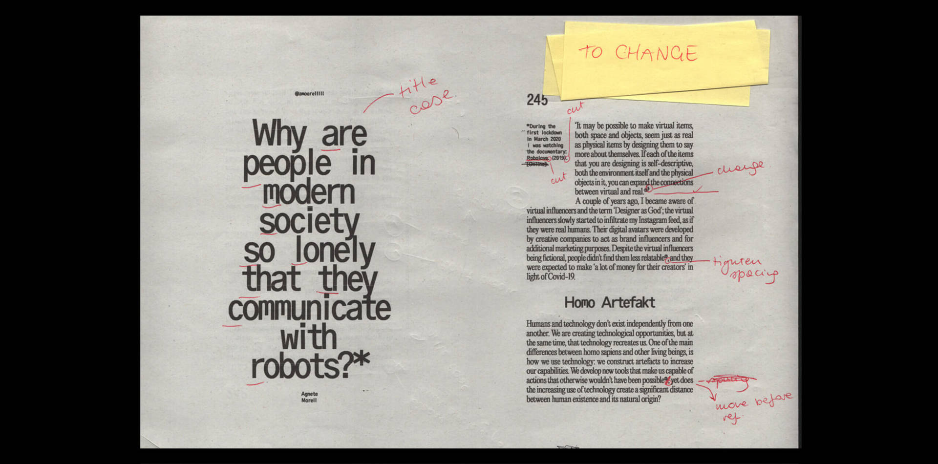
Shape of Words was extremely collaborative. Whilst we designed and curated the book with Harry, there were a lot of other incredibly talented people involved along the way who meant that our little idea actually became a reality. The lovely Open Practice (Katie and Gabriela) were our very brilliant, very knowledgeable editors, combing through everything that was submitted, linking everything together in an order that actually made sense, and spending many many hours on zoom with us pointing out where there was a double space! Kevin from ME Print created a million dummies and print tests in order to create something brilliant that we could (just about) afford to self-publish. And, now that it’s a real thing, the wonderful Elliott Moody of The Brand Identity is stocking it for us. You can buy it here https://the-brandidentity.com/store/product/shape-of-words 🙂
But, most importantly, our contributors! All 30 brilliant people have made this book what it is and we are so excited and grateful to everyone involved: Mane Tatoulian, Matt Asato-Adams, Lukas Keysell, Michela Zoppi, Grace Lister, Meghan Doran, Monique Jackson, Rene Matić, Holly St Clair, Thea Bryant, Lily Gale, Rosie May, Adam Higton, Snootie Studios, Nikolas Wrobel, Dinamo, Charlotte Rohde, Ciarán Birch, Raissa Pardini, Floriane Rousselot, Morgane VanToore, Laura Csocsán, Rose Allert, Romina Malta, Okocha Obasi, Clarice Tudor, ICBQ, Agnete Morell, Olivia McEwan-Hill, Anna Ottum and George Creese.
How did you find and select the contributors for the book?
Different disciplines. Different career stages. Different life experiences. Different parts of the world. We didn’t want people to all come from the same studios in London. The disparate nature of the creatives featured means that Shape of Words houses the team at Dinamo’s desktop screenshots, alongside an in depth essay on dis-equality in design by Meghan Doran, all brushing up next to a series of photographs by Anna Ottum. It’s this eclectic collection of people that gives Shape of Words its unique perspective.
What can we look forward to seeing in future publications?
Honestly, we don’t know just yet! But, it would be great if there wasn’t a pandemic in the middle of it. We might get it done quicker that way!
Can you tell us a little bit about the concept behind the design and format of the book?
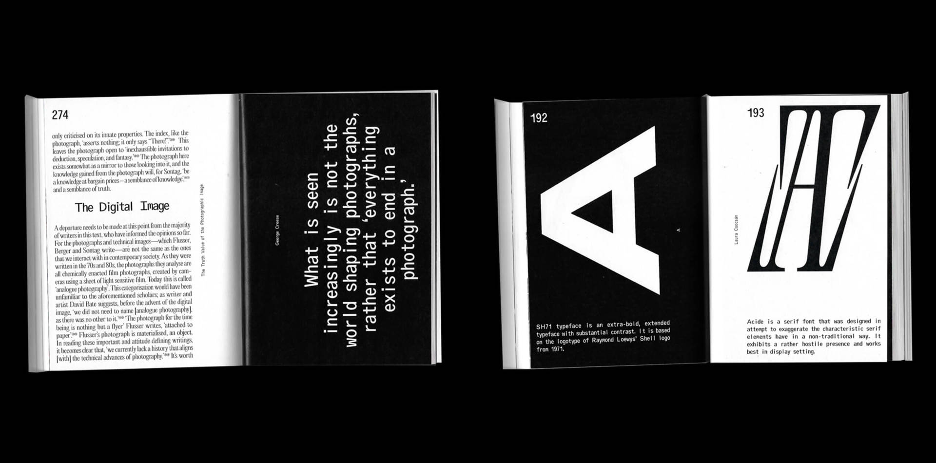
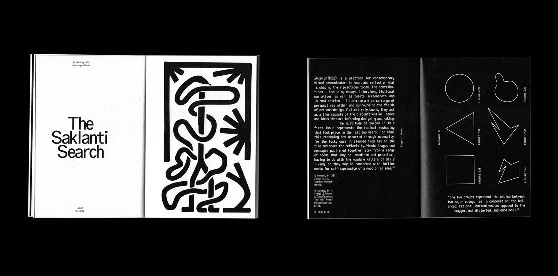
In terms of design, we were heavily informed by the content of each submission. Due to the varying lengths of content, ranging from 5 words, to about 5,000, we designed a system where the publication responded to this. Longer, essay-like submissions used Editorial New by Pangram Pangram, now a firm favourite in the design scene, to create a structured read, whereas in shorter entries we used Oracle by Dinamo, and fully leaned into the beautifully awkward monospace, allowing for more expression, and breaking of our grids.
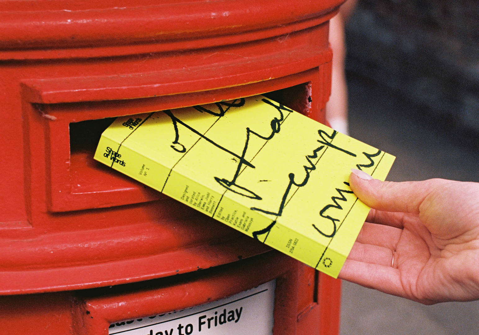
The covers reflect the editing process — the highlighting and physical marks that we sent back and forth to get the project done.
Buy the book:
Credits:
- Designed and curated by @emsjudd @alicesherwin_ and @harold__bennett
- Edited by @openpractice_ @kleevans @gabrielam_m

