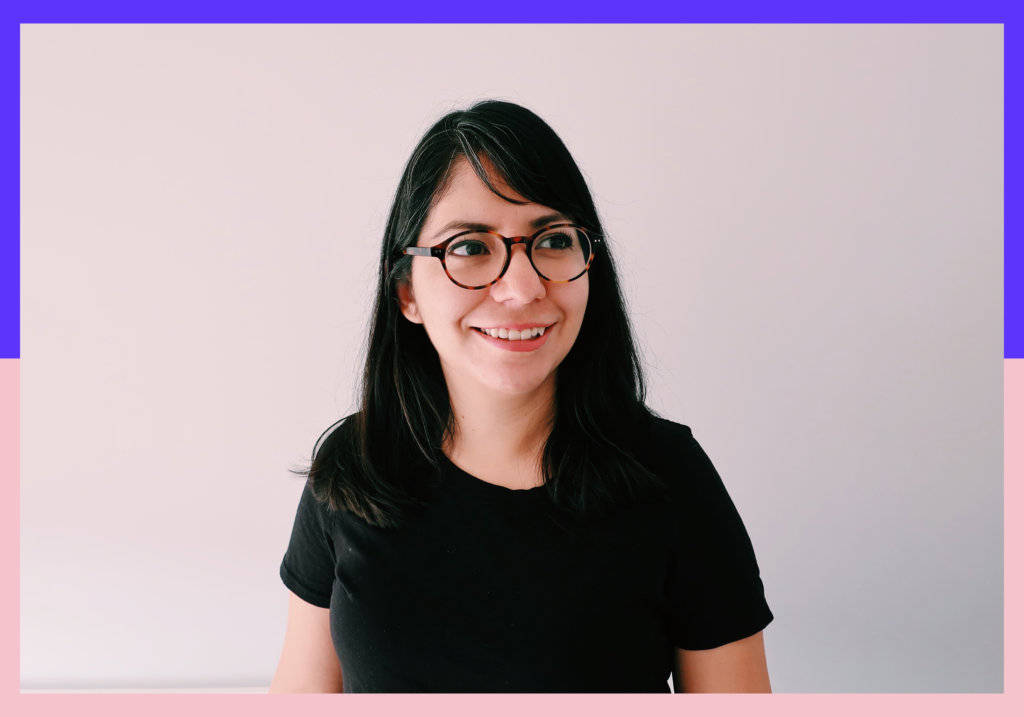
Rebeca Anaya by Camila Cardeñosa
For everyone who loves letters, Rebeca Anaya’s work is a visual pleasure to the eye. Delicate strokes full of personality that make her work both unique and seductive.
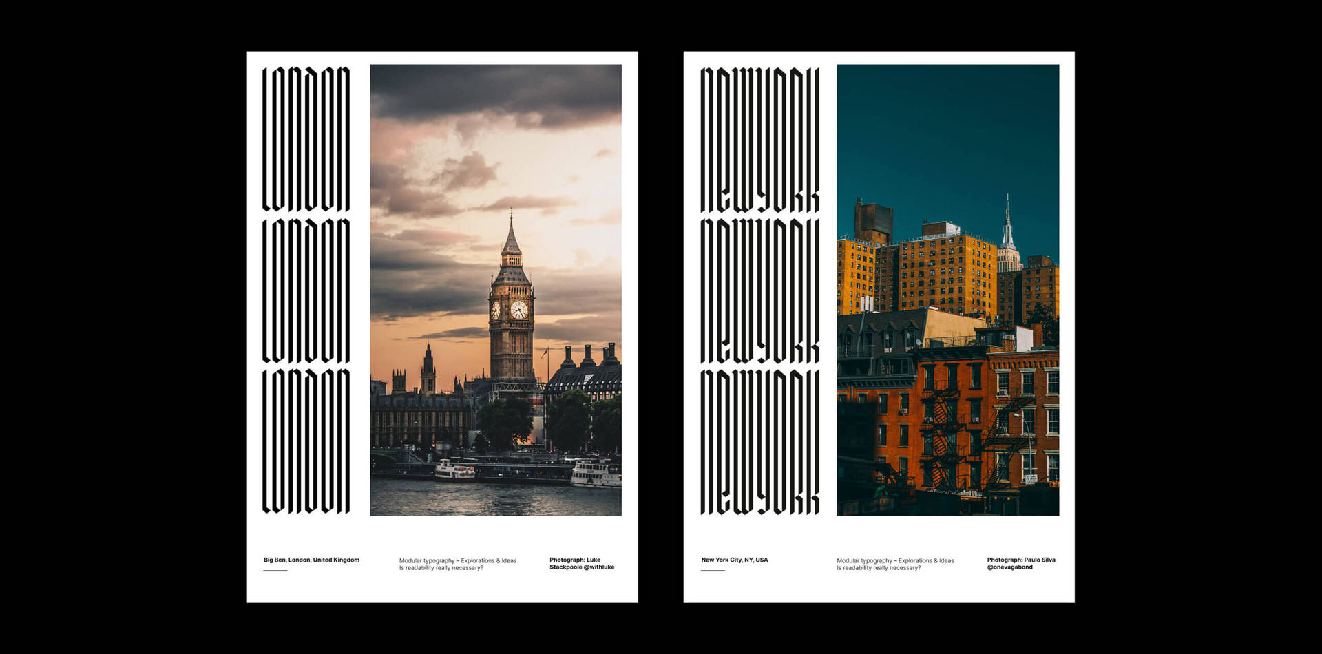
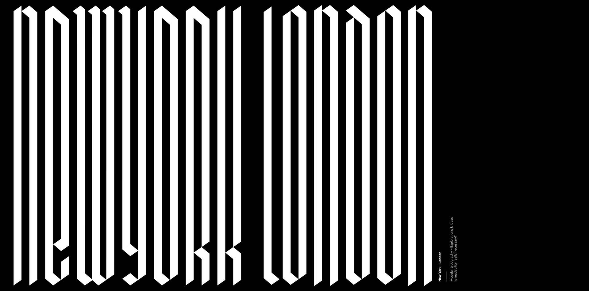
Rebeca is a Mexican graphic designer and lettering artist who is passionate about all things letters. Currently working from her hometown as a freelancer, her clients include The Washington Post and Slack among others. She created personal project Typebasics, a website and instagram feed through which she aims to share basic concepts about typography in a friendly and accessible way with anyone interested in learning more about type. She also teaches a course on Domestika about how to vectorise lettering projects.
We talked via Zoom, and I was surprised that the first question was initiated by Rebeca—asking about my life as a freelance designer. That initial question was the first indication that she is a person who is always ready to support and listen to others. On hearing my answer, she advised me not to compare myself to other creatives and shared some advice she received from her husband when she started working as a freelancer: “value the slow time. Go for a coffee or a walk or visit an exhibition. Enjoy it.” We spent time during our chat, sharing thoughts about our anxieties, insecurities and worries that come up in the life of a freelancer, that nobody tells you about.
We have both been surprised by the constant insecurity that many creative women feel, which is one of the many reasons why Rebeca created WhatsApp group Times New Women with a group of fellow female typographers, offering constant mutual support. The group is somewhere members can feel safe to openly talk about design and type, but also about fears and anxieties: “We are all of different ages, some are still students… We like to share projects we are working on and ask for feedback and give tips. It takes away the fear of showing it to a client or sharing it online.” Aware of the importance the group is for their practice they have also just launched @tnwoman_ on Instagram and a Slack channel, where they offer a safe, free space for women to talk about and share their work and thoughts around type design; organize type crit sessions and talks where female typographers sharing their experiences.
I felt that our chat was an extension of this group, two women talking about design and sharing tips about the freelance life—supporting each other. It was full of hints and advice that I hope everyone reading this interview will find useful. As Rebeca so aptly puts it: “We’re all in the same boat.”

When did you realise that you were interested in type and design, and that you wanted to work as a designer and lettering artist?
Actually, there was no magic moment! It was a process. I have always been a creative person. For instance, when I was a child, I liked to spend my time drawing.
Initially I wanted to study art history. I was interested in projects focused on art research. Later, when it was time to choose a professional career, I realized that art history would be too complicated for me at that time. I thought Graphic Design matched my interests more closely. Gradually I started learning more about typography. I think that seeing the work of people like Jessica Hische, Matteo Bologna, Louise Filli, and Ken Barber, among others inspired me to focus on letters and to understand how a career could be built around them.
Can you tell me about your career so far. What steps got you where you are now?
When I started seeing lettering or typography projects by some designers whom I admire, I realized that I wanted to be like them. Ha!
I started drawing small pieces of lettering for some clients of the design agency where I used to work. These were small pieces that I now realize had much space for improvement. Sometimes they were not even considered in the budget of the projects, but were something in which I invested my time to see how far I could go.
Later, when I saw that the clients were responding well, and I realized how much I enjoyed the process I decided to apply to the Type Design Program at Cooper Union in New York. Taking that program was the best decision I ever made, because it allowed me to learn more about the process of type design and use it in my own work and drawing process. Since then, it has been a continual practice. Sometimes I try new things or styles that scare me a little, but at the end these new styles have opened new doors and new opportunities for me.
It is is important to mention that in addition to the courses I have done in lettering or typography, I have also taken courses in “freelancing”. From these courses I feel that I have learned how to deal with clients, how to sell proposals, and how to charge — which is something that wedesigners don’t know how to do. In my opinion, it is where we can sometimes encounter obstacles.
I read in an interview recently that you are working on Smith Sans, your first typeface. Can you tell us a bit about this process.
Yes! When I finished the Type program at Cooper Union I was scared. I came out thinking that type design was not for me. I felt that I was still “too green”. I felt as well, that the standards for developing a font were far beyond my reach. It took me a few years to overcome my fears, and realized that everything is a learning process. EVERYTHING. You are the one responsible for making that process work.
It took me a while to understand that it’s not a problem if I don’t get a super complex typography family, or if I don’t know how to program to make it a variable font. I work with what I can do. I learn at my own pace, and explore what I like, what interests me, and keep my process going.
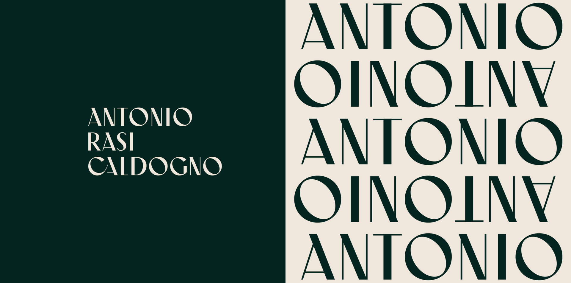
Understanding this was a huge eye-opener. It took me several years, to reopen the type drawing software and start working again with a “let’s see what happens” attitude. I made some explorations that later took shape as “Smith Sans”. It was a very organic process. I think that encouraged me to continue working on it.
The initial idea for the font came up from a logo I designed for an architectural firm. The logo was rejected, but I really liked the shapes and the aesthetic of the letters and decided to start working on it as a font, so it wouldn’t be a dead project.
Has being a woman impacted your career?
Yes. At first, being a woman make me feel insecure. I noticed that there were very few women working on type, which made me feel that typography design was for men. My reference points were great American and European font makers who were men., But for some time now I have seen more women working on type projects, doing super cool things. They have become a very positive influence on my work and a huge source of inspiration.
A lot of people in the creative industry suffer from imposter syndrome and are highly doubtful of their abilities. Have you experienced this and if yes, how do you handle it?
Everyday! I think being surrounded by content all the time influences our way of thinking. Very often it is difficult to see it all without comparing ourselves. It is something that happens to me day and night.
When I see something I like, immediately have thoughts like “I couldn’t do that”. Sometimes, when a big project comes along, I immediately think “Why did they contact me? Someone else could do it better. I’m not the right person. My style is not that good, etc.” It’s sad, but it happens a lot. When these thoughts rise up, it helps me to remember that everyone is at different stages in their career. Maybe today I can’t do X or Y things, but probably if I practice I will be able to do it.
Another thing that also helps me a lot is being surrounded with people who are in the same industry. This is super important. They give me objective and clear feedback, which greatly enriches my work. Additionally, it is important to remind myself that I am not the only one who is going through this. It is very common. The solution, in my opinion, is to come together and help each other to improve and grow.
What process do you prefer when working on your lettering projects, paper and pencil or digital?
Both. They are different ways of working and each has its advantages. For example, I really like sketching using the iPad because the process is so much faster. You can edit super easy and that allows you to make thousands of variations.
The pencil process for me, someone who has a really bad pulse, takes a bit longer. But I really enjoy it. I feel that drawing using pencil and paper allows you to think very well about your next move. It shows more about how you are feeling.
Which female creative(s) inspires you most?
I am very inspired by the work of Louise Fili, Sindy Ethel, Enriqueta Arias, Frida Medrano, Novia Jonatan, Alejandra Ballesteros, Haley Tippmann, Fer Cozzi, Morgane Van Torre, Cecilia del Castillo and many others.
Lately, I have found a lot of inspiration in a group of typographers and letterist friends. We became friends after a typographic event It inspires me a lot to see how hard everyone works. We are always discussing ideas or things that happen in the industry.. I think we have created a very real and authentic community of respect and admiration. The members of this group are: Monica Mungia, Jassiel Rivera, Nitzchía Diaz, Romina Hernandez, Sandra Morales, Tamara Segura, Aspacia, and Karly.
What projects are on your bucket list?
I have two dream projects:
- To work with a museum or an art gallery. I would very much like to make a piece of lettering for an art exhibition.
- To design a tourist guide with only lettering. For example, I would draw the name of the attractions with typographic styles that represent those places.
If you could go back and start your career over, what advice would you give your younger self?
Don’t be afraid! Do new things, have fun, explore. Not everything has to be perfect, and you don’t have to please anyone but yourself. Well, sometimes your client too!
Top 3 inspo picks:
- Fer Cozzi, Type designer @fercozzi_letras
- Louise Fili Graphic designer @louisefili
- Morgane Van Torre @gagane_
Follow:
Visit:
Article by Camila Cardeñosa
Camila Cardeñosa is one of our collaborators who has written and curated a series of inspirational features showcasing Spanish speaking women designers based in Latin America and Europe.