We recently had the pleasure of talking with Moscow Mule founders, Marina Kondratenko and Anna Kabanina, to find out about the studio’s recent branding project, created for Russian tableware and interiors brand: DVKB. They’ve created a bold, clean, and flexible visual identity based on a modular system, which is a metaphor for constructing interior environments and effectively communicates DVKB’s core values of – honesty, openness, and democracy.

Could you tell us a bit about how you approached the brief set by DVKB, what research you initially undertook and the project process?
At the end of 2020, the creators of DVKB (formerly known as Redneck Ware) decided to change their name and business model towards selling their products to private clients instead of only restaurants and cafés. The DVKB team approached us with the goal of redesigning their identity and coming up with a new strategy, that reflects their core values: honesty, openness, and democracy.
When we start working on a project, we initially create lots of sketches and undertake research into different directions, to ensure we capture the right tone-of-voice and mood. Our process for the DVKB project was no different. We initially explored several directions, which started with more experimental ones but later shifted towards a more timeless and cleaner one, inspired by the Swiss international style. This shift was an intentional because DVKB are bold and democratic in their approach and aim to create reasonably priced products that will fit in any home. Therefore, the identity system needed to be flexible and comprehensible to a large audience.

“When we start working on a project, we initially create lots of sketches and undertake research into different directions, to ensure we capture the right tone-of-voice and mood.”
Where did the concept for the logo come from and how did this evolve to the final outcome?
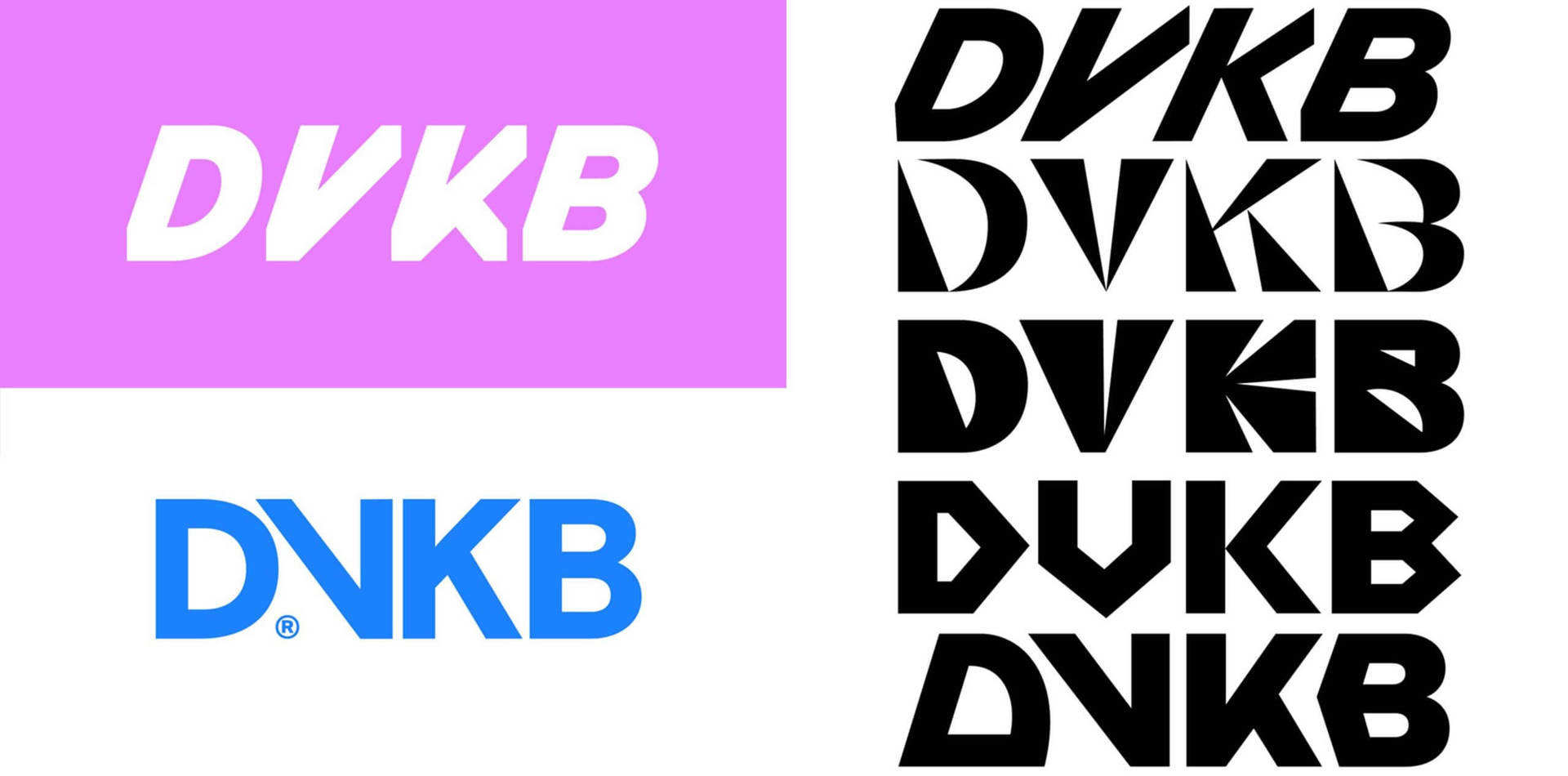
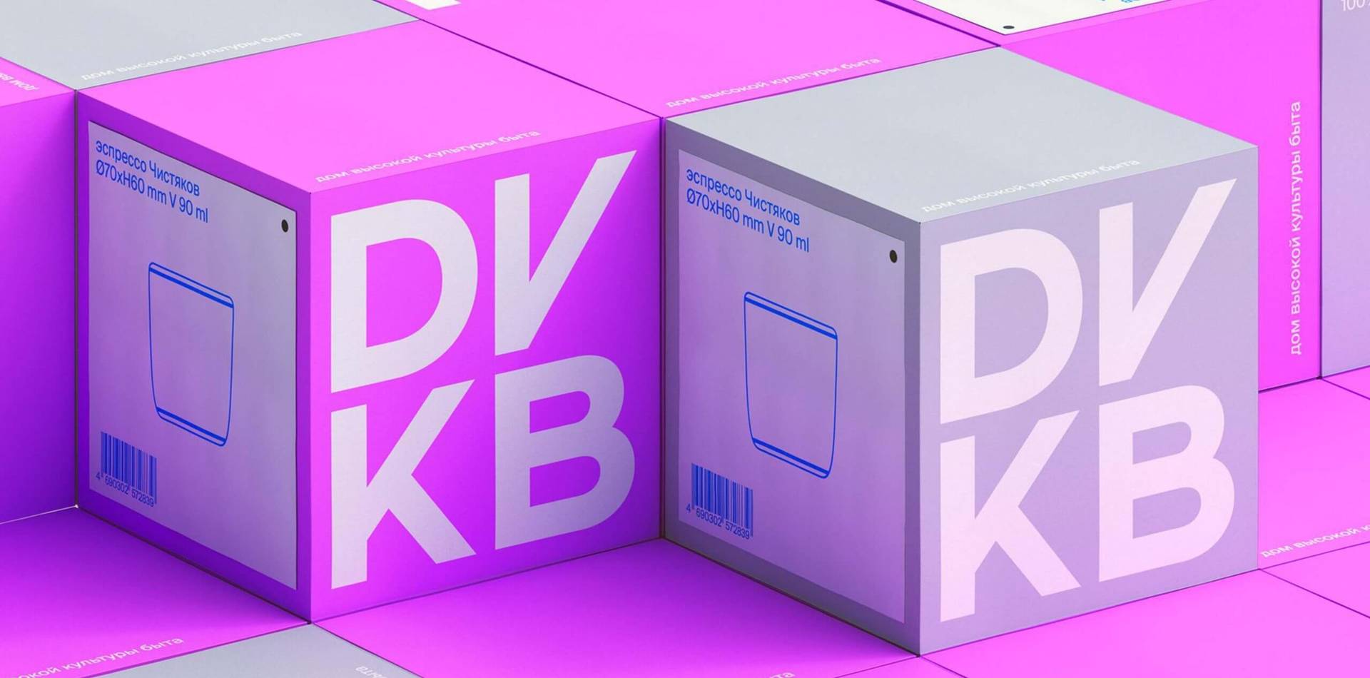
Our task was to create a powerful and memorable logo that would become the main style-forming element of the visual identity. We wanted to create a solid and recognisable symbol that would works in both large and small scale, for example, on an embossed cup. Therefore, the logo had to be bold and one of the limitations was that we couldn’t use thin lines or too many small shapes.
Initially, we were inspired by Swiss modernist typography and in many ways DVKB brand is inspired by the Swiss style in general. At first, we drew more eccentric, decorative logos and then simplified them because the client gravitated towards a more neutral form. However, we wanted the logo to look unique, so we decided to make one of the letters stand out—the solution had to be simple but effective.
The option DVKB initially liked the most was the one with the pointed letter V, but the direction was a bit too confusing because the letter V, in some cases, could be read as an N. We tried to shift the emphasis from the letter V to other letters, but the logo started to look too playful, and that was something we needed to avoid. Eventually, we had to go back to the original version but made a simple adjustment by reflecting the letter V.
“Initially, we were inspired by Swiss modernist typography and in many ways DVKB brand is inspired by the Swiss style in general.”
Were there any challenges and how did you overcome them?
There were some challenges that weren’t related to the project itself but to the situation we found ourselves in the beginning of 2021, due to the global pandemic. It was a time filled with uncertainty because we’d just founded our new studio and our team became smaller.
Nevertheless, we kept working with DVKB’s team and for the most part the process went smoothly. Initially, DVKB wanted to grow their business quickly, but after the pandemic hit, they had to readjust their plans to the new reality. We also had to adapt to the situation and adjust our processes to create some sort of MVP (minimum viable product) version of the identity. We had to get creative with the resources and materials available to us and our client but, at the same time, not compromise on the quality.
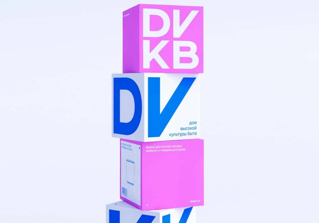
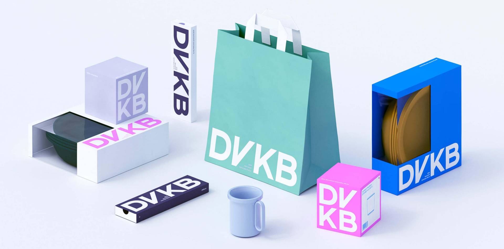
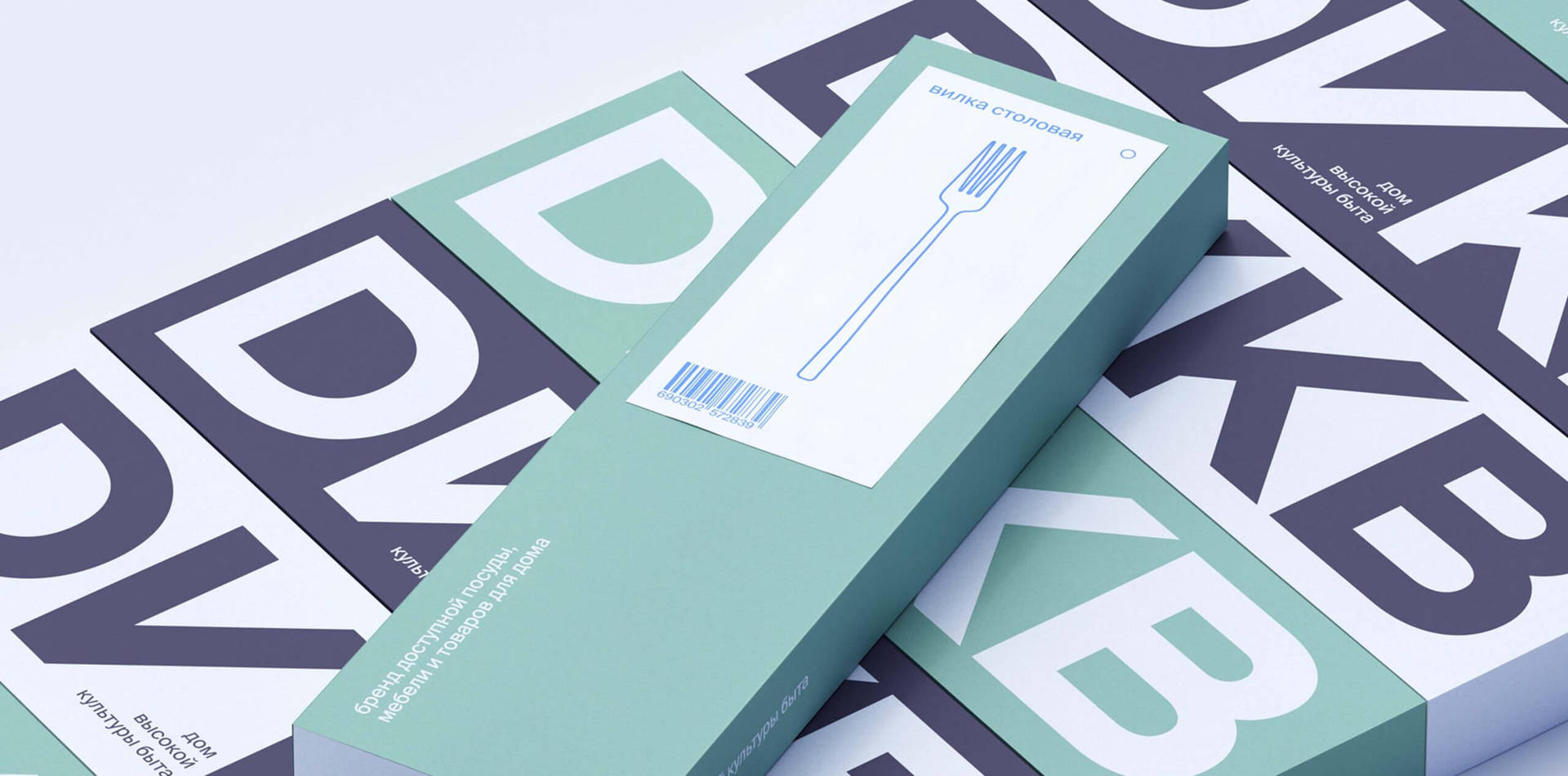
An example of this, are the boxes we designed based on the visual identity concept, intended to be used as custom retail packaging; requiring a big budget because they’re expensive to produce in Russia. This led us to research cheaper options to be used at by the brand at pop-up events and marketplaces in the short term, and created wrapping tissue paper, tape, and stickers that could be produced locally.
Why did you decide to use a modular system as an integral part of the identity and packaging design?
One of the reasons to use the modular system was practicality. The system allowed us to create a flexible and scalable identity that could be reproduced by DVKB’s internal team. It was very important because their designers and marketing specialists would apply it throughout multiple channels, including social media, print, and digital design. Especially when it comes to producing packaging, this type of system adapts easily to different shapes and sizes.
Another reason was the desired perception the brand wanted to portray to its audience. DVKB wanted to avoid associations with ‘crafty and arty’ objects, that is why they gravitated towards a product design direction. The modular system was a great way to embody the essence of the refreshed brand, inspired by modernist design principles, such as functionality, minimalist aesthetic, and innovation.

“The modular system was a great way to embody the essence of the refreshed brand, inspired by modernist design principles, such as functionality, minimalist aesthetic, and innovation.”
What was your part of the project you’re most proud of?
We think the part we are most proud of was seeing how the new design empowered our client. We follow closely their work and see their development; we are growing as they’re growing. It’s very satisfying to see our identity in use and how other people interact with it. It is really rewarding to see that our work finds a place in people’s hearts and for that we are very grateful.
Design Agency:
Founders:
Marina Kondratenko and Anna Kabanina
Client project:
DVKB
Services:
- Brand Identity
- Art Direction
- Digital Design
- Packaging
Follow:
Visit:
Article by Mary Hemingway
Founder : DesignbyWomen.