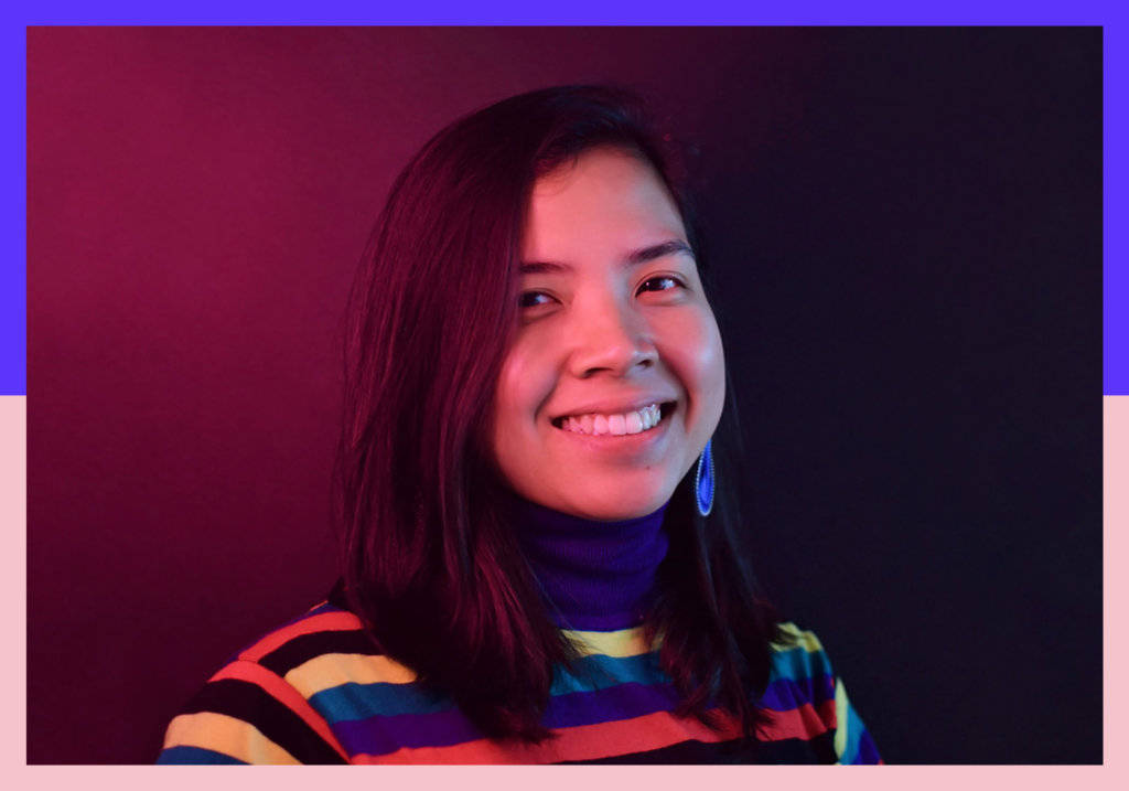
Graphic Designer Kookie Santos’s work is characterised by its experimental approach, quirky boldness, expressive use of type and an innate playfulness and curiosity.
Based in Manila in the Philippines, Kookie grew up as the only creative kid in a family of bankers. She acknowledges how lucky she has been in having the support of her family when she followed her creative instincts and enrolled on a Fine Arts course at college. This was followed by an Information Design major at Ateneo de Manila University, where she immersed herself in creative and visual design, finding inspiration in the work of type-based designers such as Louise Fili and Jessica Hische, who sparked a lasting love for typography. She also met the fellow creatives behind Serious Studio, where she worked for eight years after graduating, becoming a Creative Director and eventually partner.
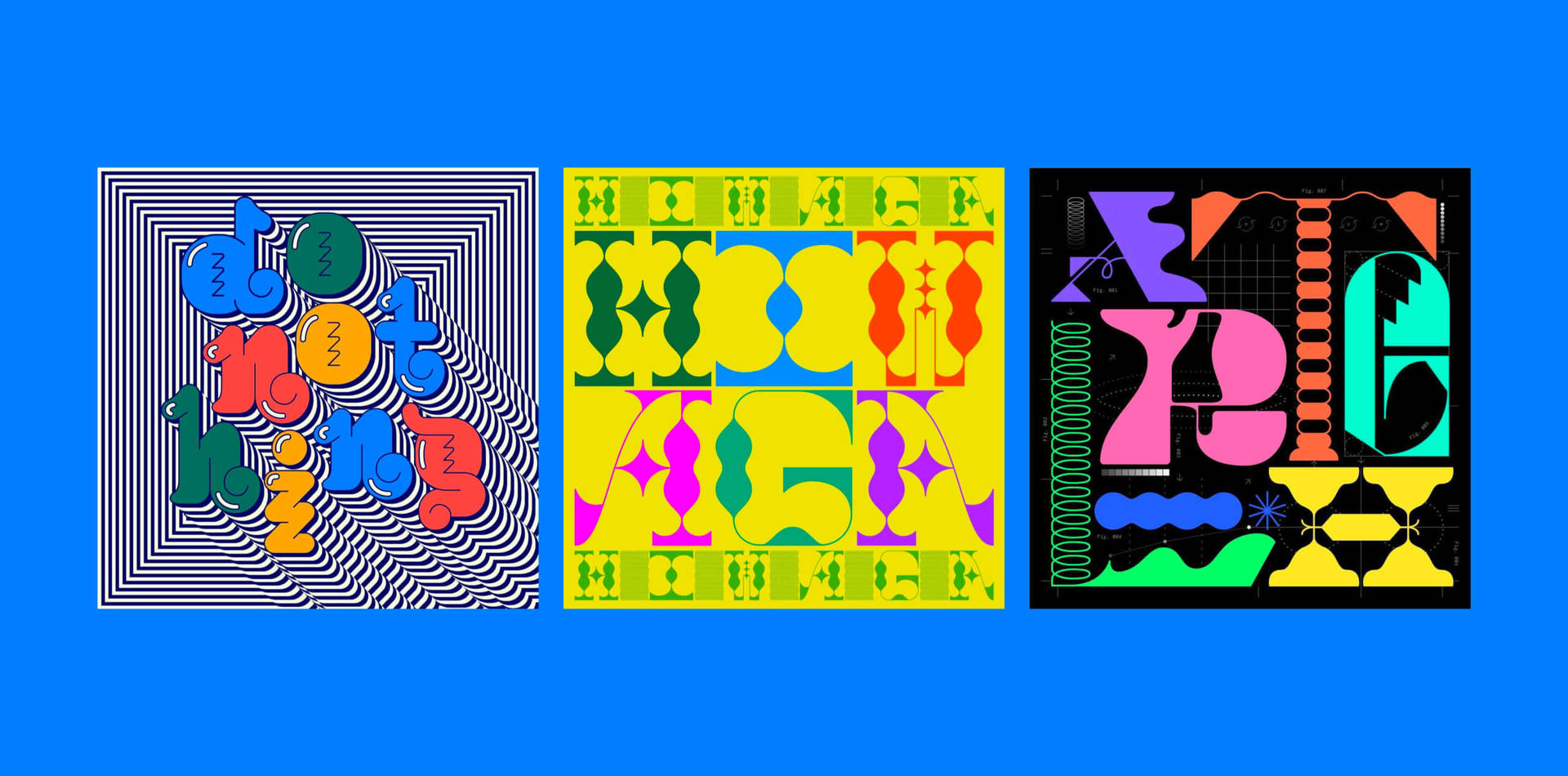
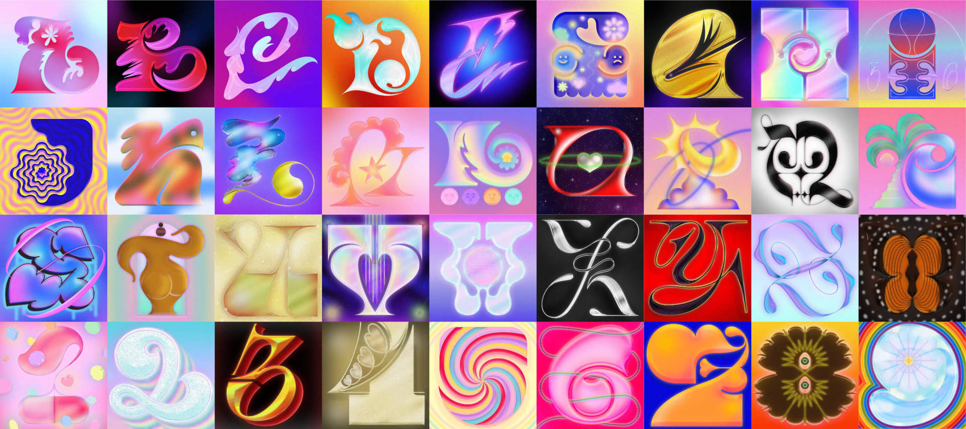
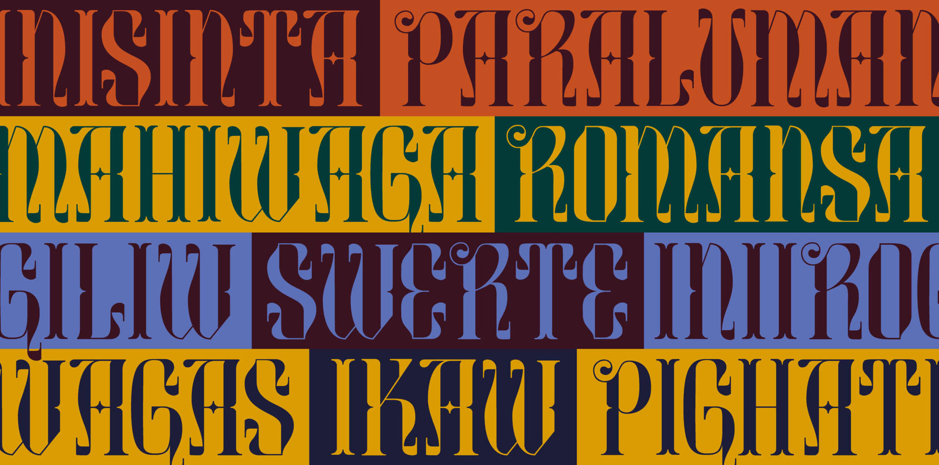
Kookie’s fascination with type is grounded in its ability to express the power of words. She is particularly interested in display typefaces because of how ‘unapologetically expressive they are… exploring the bounds of readability and legibility through play and experimentation, making people take a little bit more time to linger and pay attention… what they’re reading’. In 2021 she made the decision to leave her position at Serious Studio and embark on her own independent design career, She took part in 36 Days of Type, which allowed her to play every day with different techniques and styles. Kookie describes this project as a way to strengthen not only her creativity, but also her confidence, in the work she creates. The outcome is a series of fun, vibrant and experimental designs that gave Kookie the space to truly represent her inner voice and spirit. After working as a Creative Director for so many years, she believes taking a break to spend time exploring and experimenting is a crucial way to develop her creative practice.
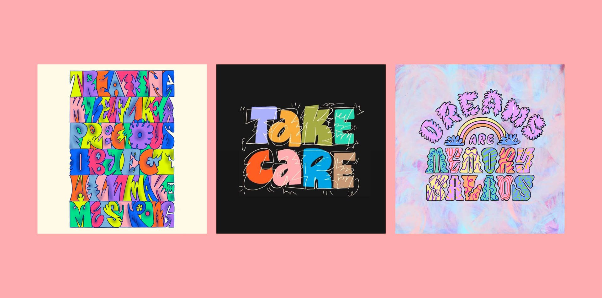
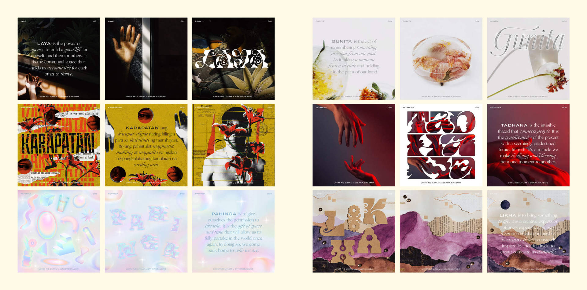
Collaboration and community are other important aspects of Kookie’s work. Living in Manila, a large city with a supportive and thriving creative community, she has discovered an ongoing discussion around representing Filipino talent. Incredibly proud of her Filipino heritage and wanting constantly to engage with this flourishing creative community, Kookie started a series titled Lihim ng Liham (the secret of love letters). The series focuses on the hidden secrets of the Filipino language, which she ultimately describes as a ‘love letter to the Philippines’. Collaborating with different artists working in various media, the outcomes is a beautiful series of visuals that combine display typefaces with photography, illustration, art and collage.
A personal connection with a project is crucial to Kookie, as she tells us: ‘When it comes to approaching a new project, whether it’s commissioned work or personal work, I make sure that in some way, I find a personal connection… I believe that for a project to connect with people, the maker’s personal touch must be felt in it in some way or form. It sounds cheesy, but the way to get attention from humans is to make your work feel like it was made by a human. Otherwise, it can be distant, disconnected and even unfamiliar.’

We talked to Kookie to discuss her fascination for letterforms and communication, the inspirational Filipino creative community and to find out more about how she finds inspiration from play, fun and her inner child.
How did you first become interested in working as a graphic designer?
Ever since I was a child, I’ve been drawn to making things. I never really knew where it was going to take me or what it was going to do for my future. I just knew that making, drawing, creating was something I did with ease and with pleasure.
Having accepted early on that perhaps something this much fun would only be a hobby, I didn’t expect that I would get the opportunity to work as a graphic designer. I come from a family of bankers– my whole immediate family, all 5 of themfrom my parents to siblings—have worked in banking. Being brought up in this environment, it was easy to assume that creative things don’t have much of a place when it comes to a ‘successful’ career. I remember that when I was in my senior year of high school, my friend’s mom told me that my good grades in school would be ‘wasted away’ by choosing a Fine Arts course in college.
Through all of that, my family has always been supportive of my creativity! They encouraged me to keep drawing and when choosing courses for college, encouraged me to take Fine Arts. At the time, I didn’t mind having no career for this kind of skill so long as I would be able to be creative..
I studied at Ateneo de Manila University as a Bachelor of Fine Arts, majoring in Information Design. Suddenly, I was in a place where I felt that creativity was a valid skill and that I was amongst people who lived and breathed design. It was a place for us to learn from each other. This was my first experience of the joy in community and belonging with other creative people. It was an environment that allowed me to learn and experiment. The guidance of hands-on professors, the sense of belonging that I cultivated with my peersf — these were starting points for my becoming a graphic designer.
My first graphic design inspiration was Jessica Hische. I remember seeing her work for the first time and being opened up to the idea of creative work as a career.
Describe your career path and how you got to where you are now.
When I left college in 2013 I didn’t have much of a clue about what I wanted to do for a job. I thought to myself, I might as well take a few months of time off so that I can pursue some creative projects before I venture off into the ‘real world’ of work. It was whilst dabbling with a personal alphabet project, peers from my school noticed my work and invited me to be a graphic designer in the design studio that they were setting up, fresh out of college. That is how I got to be part of Serious Studio and how I eventually became a partner and creative director there.
A big part of my career has been shaped by my experience at Serious Studio. Starting a studio with my two co-founders, I learnt so much about the design and branding industry through building it with them. Without a guidebook on how to run a design studio, we set our own rules and standards. We learnt from, each other and the countless client projects we experienced as a team. Whilst it was frustrating a lot of times not to have a clear path to follow, it was precisely because of this that we were able to build the studio the way we did.
Being part of such a fast-paced and flexible environment was something that I really loved, and it allowed me to continuously push the standards o excellence. .. The design industry is constantly growing and evolving. What made sense and what felt right in the past may be different to today. It is about graciously accepting change. I also learnt that being one of the leaders in a studio doesn’t mean that you need to have the answers for everything. In fact, the more that I asked for help from my peers, the better that I was for the team.
Right now, I am currently taking a few months off since I transitioned out of Serious Studio. It was a leap of faith to decide to take a rest, and to discover what’s next for me in my career. I don’t want to necessarily limit myself to one medium or one expertise. Instead, I want to be able to branch out. I’m currently: refining my personal type design practice; revisiting the joy of hand building with clay; looking for opportunities to teach and speak; aspiring to write and share knowledge and want to revisit illustration. I believe that these things do not have to work against each other. I believe that branching out into these different forms of creativity allows me to learn and enrich my work. I look at them as different sources of creative play that I get to enjoy in different ways.
How have you developed your visual style throughout your career and have there been any pivotal moments?
This is a difficult question as I’m still in the process of getting to know my visual style better! But I think that being able to comfortably and confidently research things that I like and naturally attract me helps. I look back on the times when I’ve created work that I’m happy and satisfied with, and it always goes back to a feeling of play and a sense of flow.
“I like to think that my visual style is creatively directed by my inner child. When I create, I try to let my logical mind take the back seat and let the subconscious part of my mind take over.”
Somehow, I always find myself injecting joy and a little bit of humour into my work. I don’t want necessarily to limit my style to a specific visual repertoire, but I want it to be dynamic in feeling. I aspire for my work to expressively sing, dance, or laugh. When I think about my work as these modes of creative expression, my work has more freedom to play and roam around.
Nowadays, I’m more accepting of that side of me. But it wasn’t always that way! There was a time when my work would be perceived as too ‘kiddie’ and ‘cutesy’, and inevitably I became shy about characterizing my work in this way. I tried exploring styles that are considered ‘cooler’ or more on trend and refined and while the result did get more ‘approval’, there was something about it that felt contrived. It ticked off the rules of what is considered clean and simple design and yet it didn’t totally feel like me.
At one point when I felt creatively blocked and was struggling to produce anything good , out of sheer frustration I decided to create for myself without rules, logic and thought. By the end of it, I was satisfied with my work, which was my ‘Take Your Time’ graphic. This was a clear turning point for me where I allowed myself permission to do the work that I like and pay less attention to what other people might think or say.
All in all, the best thing about journeying towards exploring my visual style is that I can use myself as a compass. It’s as if getting to know my visual style is getting to know myself in the process.

Where do you get your inspiration from, and how do you approach a new project?
Seeking inspiration is usually associated with looking out, but I usually start by looking in. I believe that our inner worlds are a rich repository of knowledge and creative inspiration. Our minds have an amazing capacity to connect glimpses and chunks of memories, knowledge, and images into a wide and interconnected universe of inspiration . This crazy combination of things makes it unique to yourself, which to me, makes a project more deeply personal and exciting.
“I usually gravitate towards dreamy and surreal images. They feel delicious, warm, vibrant, and welcoming—a world that you would like to enter in.”
I like taking inspiration from things that are silly, that have a bit of humour in them, recognizable but surreal and dreamlike. Perhaps it’s because these are things that we don’t think of everyday so that seeing those odd things makes us stop and pay attention.
When it comes to approaching a new project, whether it’s commissioned or self-initiated, I make sure that I find a personal connection with the project in some way. I believe that for a project to connect to people, the designer’s personality should be expressed in some shape or form. It sounds cheesy, but the way to get attention from humans is to make your work feel like it was made by a human. Otherwise, it can be distant and disconnected.
For me, the project is a physical, mental, emotional, and spiritual process—so it’s important to be able to set objectives as a source of stability for times of confusion and doubt. But rather than setting objectives that are quantitative, I like them to be more subjective e.g. What qualities and feelings should be evoked when looking at this project? This process helps me to ensure that I keep in touch with my original intention and remain aware of how it’s intended to make people feel.
Tell us about a standout project that you’ve worked on and why it’s important to you.
My standout project so far is my recent 36 Days of Type series. It’s an important project for me because it represents where I am at creatively right now. When I made the decision to transition out of Serious Studio, I wanted to develop my personal work and style through projects like this. Long-term projects require more patience and the perseverance to commit to something daily, regardless of my mood on that day. Most importantly, the deal that I made with myself is that I would do it on my own terms and not question the style I felt like creating.
I didn’t plan out a consistent and uniform project: the criteria I set myself was to make letters dance. And when one dances freely, it is unplanned, free-flowing, and spontaneous. They move around to their own rhythm and their environment. Each letter had a personal story to tell.
The 36 Days of Type project was also a process of learning and unlearning. It took a lot of curiosity to try things out, even things that I wasn’t comfortable with. What design rules can I question and challenge? Who sets these standards of beauty and the aesthetic? How do I perceive what is good or bad design? Is there really such a thing? I think it’s how you want to use your tools, your medium and your talents to best express what you want to put out in the world. That’s a liberating and humbling thing to know about design!
Lastly, while it was a deeply personal project, I felt like it was a communal one too. It surprised me how a sense of belonging and camaraderie grew just by going through the project together with other designers..
Here in the Philippines, I was able to form new connections with other designers. It was good to be getting that mutual support, and it helped me get through the project knowing that we were all experiencing it together. There was excitement and support whenever a local designer would get featured in the 36 Days of Type feed, and it happened quite a lot! Even in the digital space, a supportive environment could be felt!
Type plays a huge role in your work. Can you tell us how you developed your interest in typography, and the principles you follow when integrating type and graphic design in a project?
My fascination with type started when I was in college. My graphic design professor, Mike Parker, played a huge role in introducing me to a world of type. There was a typography homework where he required us to lay out the lyrics of a song we liked, expressing the emotion of the song through type. It was an abstract exercise, but I can attribute to it his belief that good design can exude feeling, mood and emotion. He would also give us design exams where we were supposed to make our own typefaces! At the time, I was new to using all these Adobe design tools, so I was forced to learn and get to know my tools so as to be able to create a typeface. My journey to type started with learning by doing. That’s when I knew that type was a communication tool that I could use to express the abstract and the invisible.
I recall that the first typeface I ever made for Parker’s class was a font called Symphony. I wanted to capture the grace and harmony of an orchestra through the letterforms. I remember that it was a script font inspired by my newfound admiration of Louise Fili and Jessica Hische at the time. I suppose that early on, I was already being attracted to warm, graceful and gentle imagery .
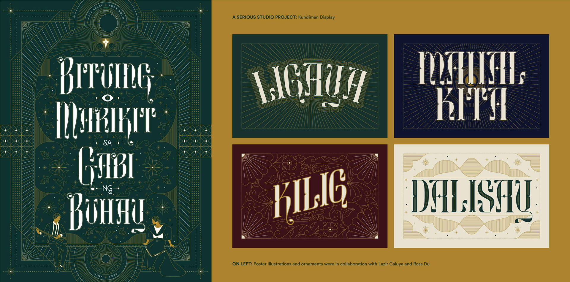
Coming full circle, a font project called Kundiman Display that was assigned to me at Serious Studio in 2019 was to represent a type exhibit called Tipong Filipino (Filipino Type), and was inspired by music. In this case it was inspired by the Kundiman, a traditional means of serenade in the Philippines. I wrote an article about it for Serious Studio’s publication The Serious Review. This excerpt describes my thought process:
‘The kundiman is a traditional means of serenade in the Philippines, a humble profession of love with an admirable willingness to go all in and all out. Said to be a contraction of the Tagalog words Kung Hindi Man (if it’s not meant to be), this generous vulnerability has produced painfully poetic (…). Written as if for a lover but dedicated to the country, there is beauty in knowing that revolution can come in the form of romance; that war can be waged with words of wisdom; that love is triumphant over hatred and deceit. That is what we wanted to do. That is what we wanted it to feel. We wanted to fight back with beauty.’
The typeface was inspired by a Filipino type found particularly in Filipino sheet music covers:
‘The letterforms were inspired by a trip to Calvo Museum, where an archive of kundiman and Filipino sheet music covers are displayed behind a glass wall. They form an array of beautiful Tagalog-titled words set in stylized letters and accompanied by illustrations. Contrasts between sharp, heavy strokes and thin, delicate swooshing lines create tension and release within each letter. The stylish intricacy of the letters and the details of the sheet music cover designs call for slow reading and viewing, allowing the viewer to take their time to appreciate the details and intention behind each line, curve, and shape. It was noticeable how each cover was designed with care. They demand the same attention as a kundiman song .’
In summary:
‘Taking cues from this beautiful genre of Filipino love songs, Kundiman Display is characterized by romantic swashes, delicate ornamentality, and graceful intricacies. We envisioned our work as a love letter to the Philippines — an expression of hope and desire for a country that deserves more.’
Type fascinates me because of its ability to express the power of words. You can explore the bounds of readability and legibility through play and experimentation. A quick Google search (which means that this claim may need a fact check!): It is said that we speak on average at least 7,000 words a day. To make someone stop in their tracks and admire something even just for a few seconds is something that I keep aspiring to.
I believe that now more than ever, attention is precious. I aspire for my type work to feel like a hug, a warm ray of golden sunshine, a peek of the blue sky, or any other sources of relief. I want it to be able to sing, dance or laugh with a person the moment that they need it. It’s quite cheesy, I know! But these aspirations allow me to play and create my work, which is very important to me.
Let’s talk about your experience working as a designer and lecturer in the Philippines. What is the creative industry like, and are there things you would like to see change?
This is a topic that I love talking about! Our local creative industry is blooming. It is a wonderful privilege for me to be surrounded by a community of such talented creatives with different skillsets, media and specialisms. But the distinct thing I appreciate most about our local creative industry is how supportive and nurturing everybody is.
“We have an intimate community of such good-natured and talented creatives.”
In recent months, during such difficult times in the Philippines, I have seen various acts of generosity and kindness in the form of creativity. When the studio of our local riso and design studio, Bad Student , got flooded by Typhoon Ulysses, their printers, and a lot of their physical equipment were damaged. Different creative fundraisers popped up to help them rebuild their studio, using these funds to also donate to other communities that needed rebuilding. It felt like community commerce where everybody was supporting each other in whatever way they could to donate and give back. With support, Pau and Dyam, the founders, have got back on their feet and now continue their vision of putting the Philippines on the world map when it comes to riso and design. In response to everyone’s kindness, they even held online risograph workshops, as partial fundraisers to help rebuild their studio and a way of giving back to people who have helped them..
Another initiative and community I admire is Type63 (63 being the country code for the Philippines) created by the talented and generous type designer, Jo Malinis. Type63 is an example of what an inclusive, supportive and localized design scene can look like. Currently, it is a social media platform featuring Filipino designers of all ages, genders and locations. To give context, the Philippines are an archipelago of more than 7,000 islands, with 500 years of a colonial history, and a thousand years of rich pre-colonial past. Given this halo-halo culture (halo-halo-mix-mix in English-is a colorfull Filipino iced dessert that is a combination of various sweets and jellies), we find ourselves asking what is the Filipino identity and aesthetic all about? I think that we uncover bits and pieces of our identity as we create and express what Filipino-ness means to us.
“Perhaps we are not one culture with a single defined identity, but are many cultures in one. Perhaps our beauty is in our diversity.”
Type63 contributes to collating and showcasing how we express our identity as Filipinos through the work we create. This means we can find more connections with each other as creatives. I truly believe that the Filipino talent is world-class and having this platform will amplify our abilities to the world.
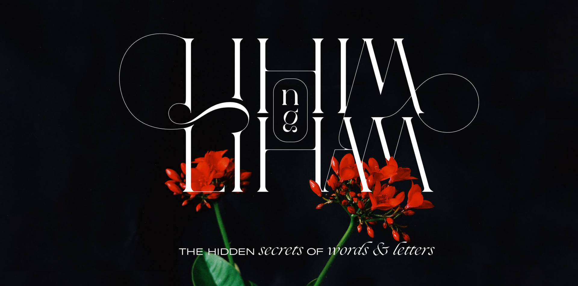
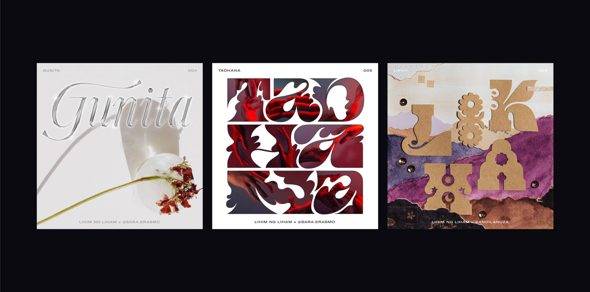
Your project Lihim ng Liham is a beautiful tribute to Filipino culture and language. What inspired you to start it, and can you tell us a bit more about it?
When it comes to pursuing personal projects, I tend to put together things that inspire me separately: **Lihim ng Liham** combines my interest in type, collaboration and community, and the power of words. Last year whilst adapting to the new normal of the pandemic, I had a greater urge to create, be with people, and reflect. I think that together these things led me to come up with this project.
In Tagalog, Lihim is secret, while Liham is a handwritten love letter. Lihim ng Liham then means “the secret of love letters” so the project is about “the hidden secrets of Filipino words & letters.” It was as if they are literally love letters to the Philippines. I fell in love with the. There seems to have been a slow decline in appreciation of Filipino language, and it pains me that there may come a time when some languages will possibly die out. The project came from a desire to preserve Filipino words’. I wanted to define what these words mean personally to me or to my collaborator. In a way, I want it to be a visual and even a multi-sensory dictionary from which people gain a better understanding of how meaningfully a Filipino word is constructed. We define the meaning of these words through our art, and the way that we articulate them in our own words.
The collaborative aspect is a very big part of it. I want to collaborate with different forms of creativity, not necessarily limited to visual design. There might be a way to collaborate with poets, dancers, musicians, architects, ceramicists maybe even researchers or academics! What is important is a shared interest in the Filipino words that connects us. Creativity is a language and I want to be able to express meaningful Filipino words in unexpected ways.
“I enjoy collaborating with other creators it’s a spontaneous way of getting to know one another. It also teaches me a lot about respecting the styles and ways of working and thinking of others.”
Every collaboration is different, and it fascinates me that we work on the same words, yet express them in our own way. And yet putting together our distinct interpretations they become unified into one cohesive artwork that evolves and transcends the individual work we do. There’s something amazing and magical about that!
Right now, my words are still limited to Tagalog words, but Tagalog is just one of the Filipino languages. Eventually I want to include other Filipino languages . In a way, the project should become a learning ground for me to understand how people define words that are meaningful to them in their own Filipino dialects/languages.
I love the potential of this project to evolve over time and take shape in unexpected ways. It’s a long-term project that doesn’t have a strict timeline, it just gets added to when there’s a new idea to explore. I like keeping this Lihim ng Liham space sacred for me and my creative process.
If you could go back to the beginning and start your career again what would tell your younger self?
Just like the things you like, Kookie! Creativity is not something to be kept aside, instead it will stay with you right by your side. As you grow older, try to remain young and stay in touch with your inner child. Trust me, joy, lightness, wonder and play will be your tools for growing up.
Where do you see yourself in 5 years’ time?
The only thing that I want to be sure about is that I will still be creating and making in some way or form. I want to keep pushing for design education and recognition in the Philippines. I want to contribute to instilling a sense of pride in being a Filipino creative. I would like to create parks, playgrounds and spaces that encourage a sense of play, safety and belongingness. I want to create storybooks that communicate to both children and adults alike, driven by my interest in type, brand identity and user experience design.
All in all, I want to provide experiences for the public to help them appreciate how design and creativity can be applied in their daily lives.
Your top 3 inspo picks:
- Sara Erasmo – I admire her eye for photography of the daily and mundane. She makes ordinary objects and surroundings look so beautiful, magical and surreal. I can sense her emotions in the photos that she takes.
- Therese Luna – I love her use of type, colors and illustrations in her graphic design work. There is a deliciously dreamy energy to it that I can’t help but admire!
- Andi Lanuza – I love that she is able to incorporate her graphic design skills, her photographic eye,and her craftiness to come up with such beautifully distinct and textured collages. The volume and depth that she is able to bring out in her work is wonderful.