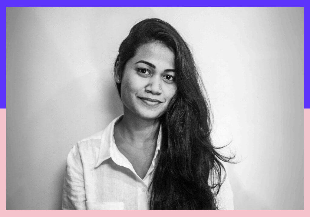
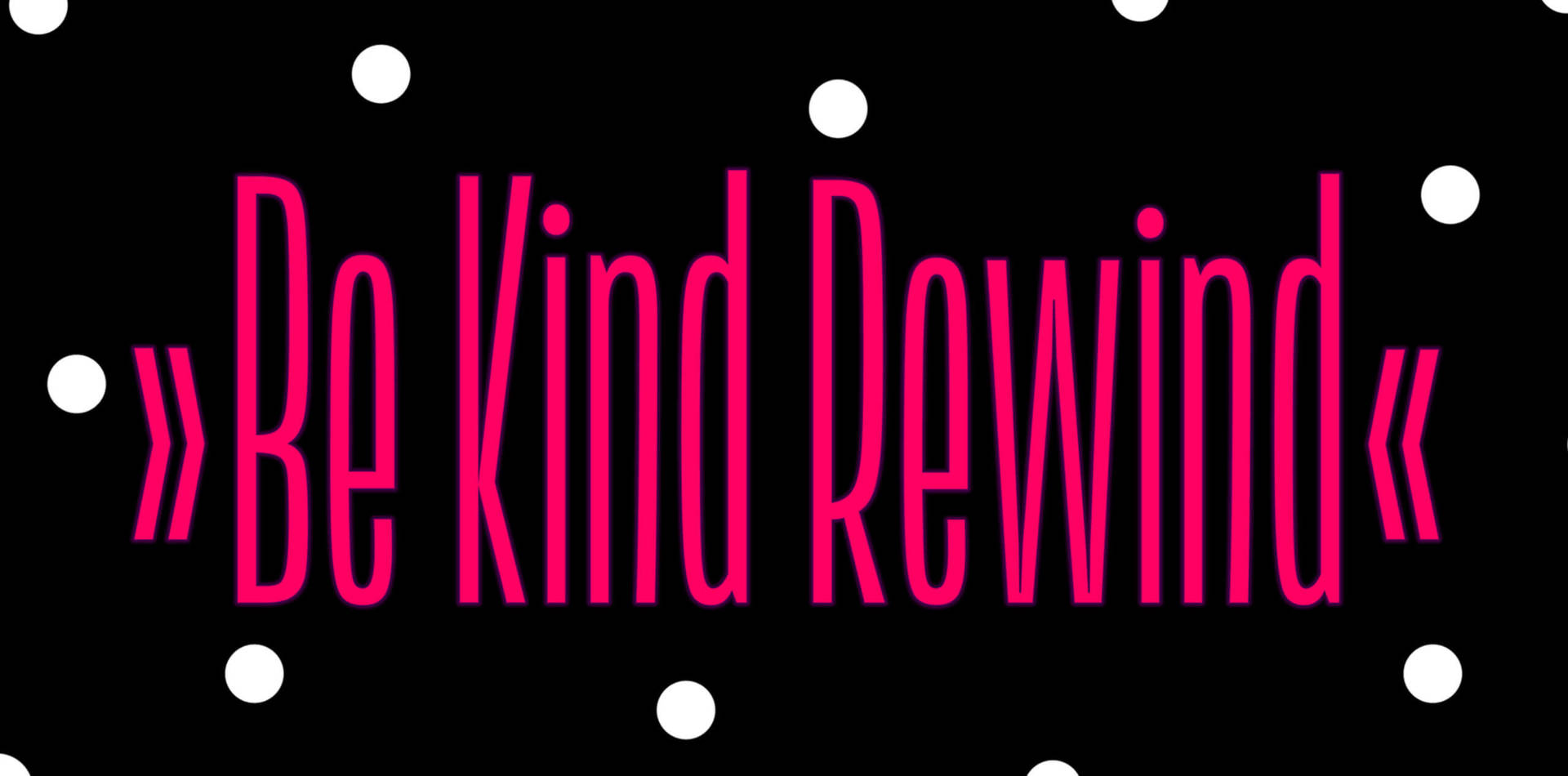
Kimya Gandhi is a type designer from Mumbai with a passion for Indic fonts. After graduating with a degree in Communication Design from the National Institute of Fashion Technology in New Delhi, she did a Masters in Visual Communication at the Industrial Design Centre at IIT Bombay before moving to Germany shortly afterwards to intern at Linotype and pursue her passion for type design. Kimya subsequently won a scholarship to study on the renowned Typeface Design Intensive (TDi) course at the University of Reading and freelanced at several type foundries before joining as partner at the Mota Italic Type Foundry with her husband Rob Keller in 2014. One of Kimya’s most recent typeface designs ‘Lini’ has received a Certificate of Excellence from the Type Directors Club (TDC67) and is exclusively available from Mota Italic.
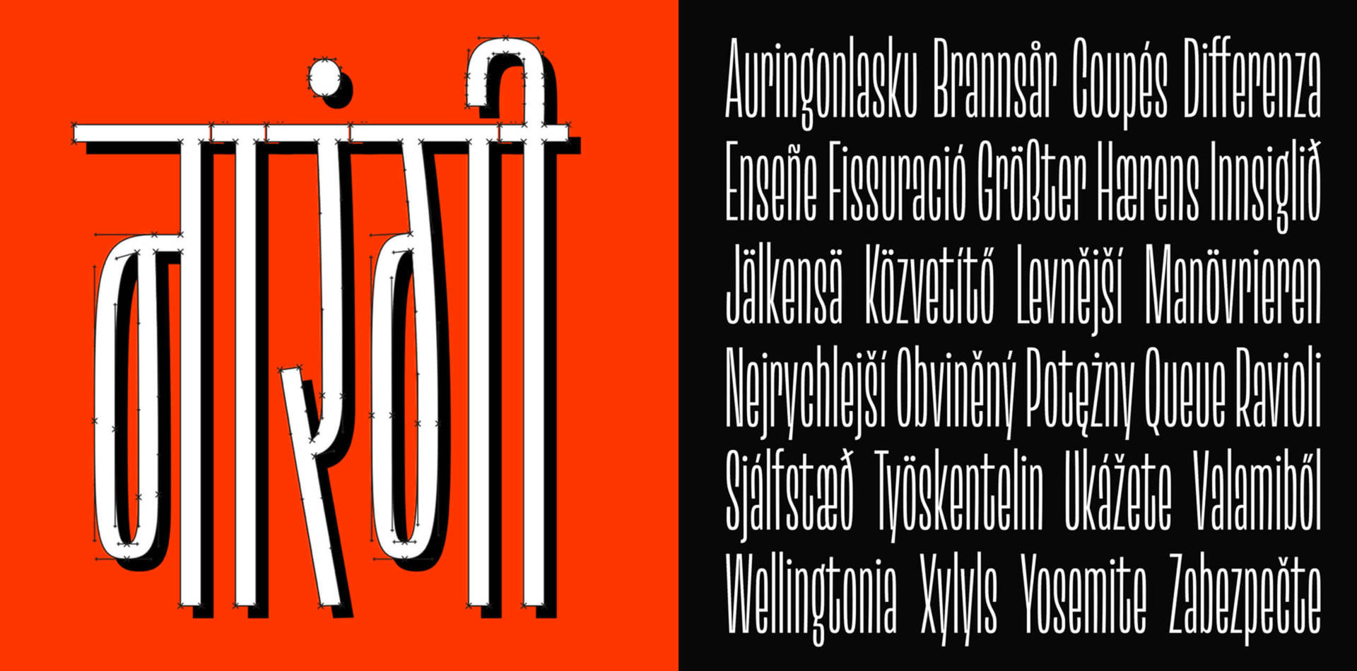
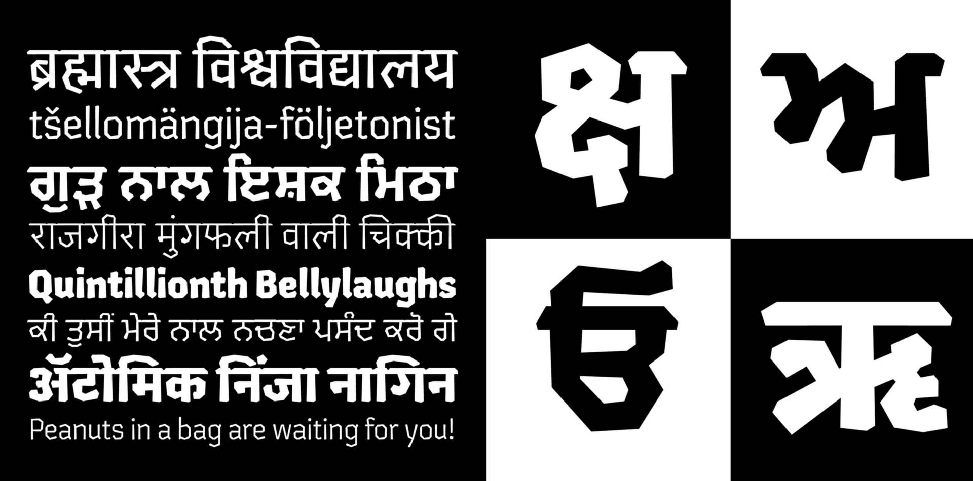
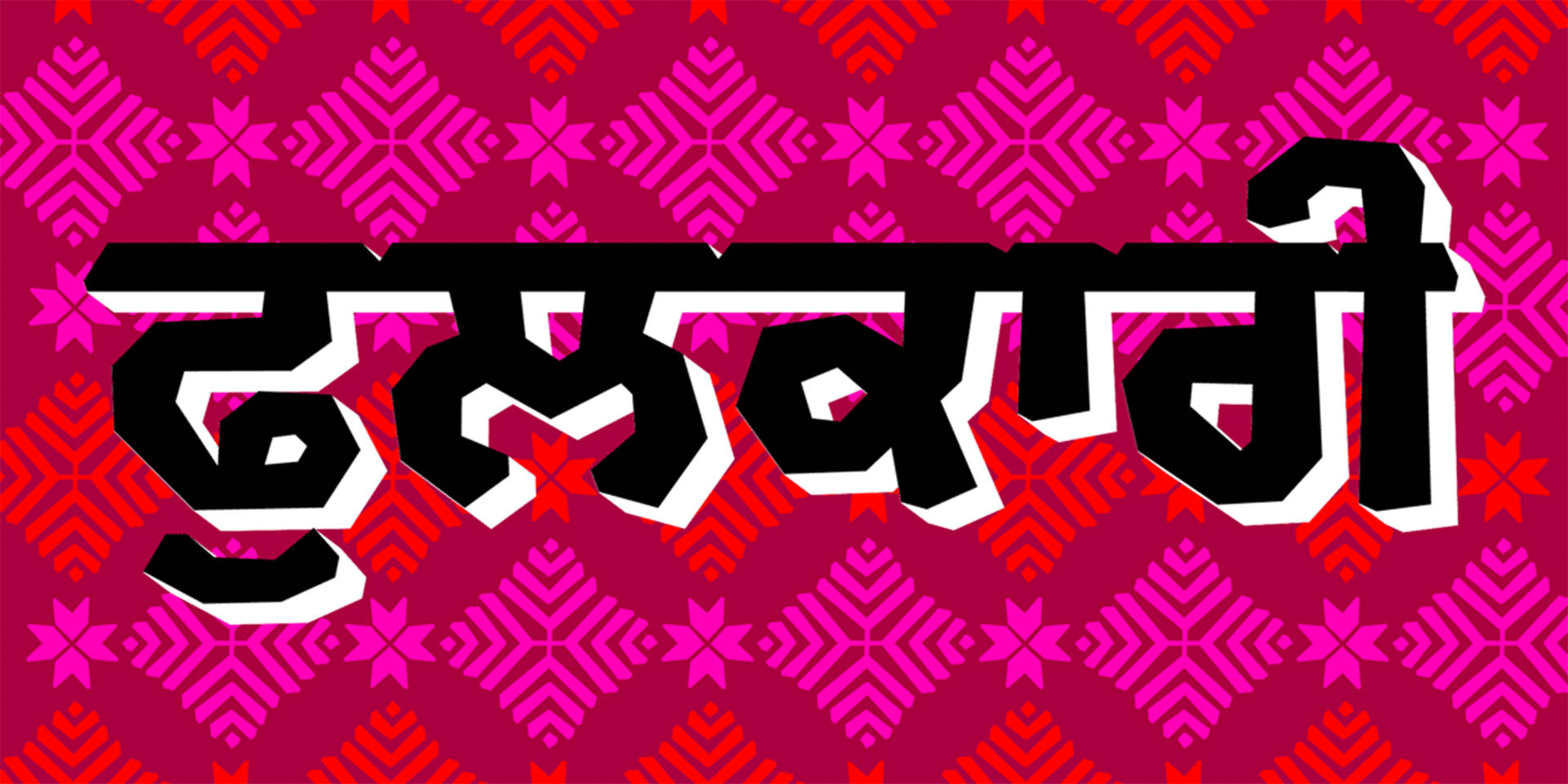
Specialising in designing Devanagari typefaces, Kimya draws her inspiration from India’s rich and diverse visual landscape. As she tells us, “travelling across India and walking through local markets has been my favourite and most inspiring way to familiarise myself with a script”. Her large archive of images collected from her trips often sparks ideas for new projects that celebrate the beautiful and decorative features of Indian letterforms. She loves exploring different ways to enhance the functionality of typefaces and always tries to find new directions for showcasing Indian graphic design. Describing her approach Kimya tells us, “I mostly draw Devanagari typefaces because, unlike Latin, there isn’t yet as much diversity or range . If there is a need for a particular style, – for example, a text face required for really small typesetting or a bold condensed design for headlines and posters – this becomes the context and inspiration for my work.”
Kimya feels that everyone has a role to play in encouraging greater diversity and inclusion in the field of type design. However, she believes that by addressing the issues at a humanitarian level, we may start to see changes within the industry: “I think that when we encourage diversity and inclusion in society, it finds its way into our design practice as well. It’s important we think about this on a humanitarian level and not just as a particular field of design. This can range from speaking up against discrimination, to giving silent support to someone in need, to collaborating on projects with under-represented identities, to sharing the work of such designers, or to just being open to hearing about someone else’s lived experience.”

We caught up with Kimya to find out more about co-running Mota Italic and specialising in typeface design and hearing her advice for women considering a career in the type industry today.
What first drew you to type design and made you want to specialise in this area?
We had typography modules during my graduate studies that I enjoyed a lot. At the time I wasn’t aware that type design was a career option, but the more I explored this aspect of design, the more fascinated I became by the vastness of the field. During my Masters, I was introduced to various Indian scripts and saw the diversity of beautiful letterforms from different parts of the country. I became completely obsessed! The lack of standardised Indian fonts at the time was another reason I decided to focus on font design, as I saw a growing need to create a better range of Indic fonts.
Describe your career path. How you got to where you are now?
After graduating in 2008, I was very keen on exploring type design in more depth and I researched Masters courses, only to find that they were all outside of India and extremely expensive! At the time, there weren’t many opportunities to work in the field of typeface design in India, so I couldn’t justify the expense and saw little hope of being able to repay the big loan I would need to study abroad. I decided to do my Masters in Visual Communication at the Industrial Design Centre at IIT Bombay instead, where I designed my first Devanagari font as part of my final year project and fell in love with the process! After completing the course, I had to decide whether to take up a decent paying job as a visual designer at an IT company, or apply for an internship at Linotype in Germany in order to pursue my type design passion.
The decision to travel to Germany changed the course of my career and has led me to where I am now. It was exciting for me to meet other type designers and this really opened up new career avenues for me at the time. I was offered a scholarship to attend the Typeface Design Intensive (TDi) course at the University of Reading, and things started to move in the right direction. I began freelancing and designing Devanagari fonts and collaborating with other type designers. I also met my partner Rob Keller, and we’ve been working together creating custom and retail typefaces for our foundry ever since!
Can you tell us about how your partnership with Rob Keller came about at Mota Italic?
I met Rob at a Thanksgiving party at a fellow type designer’s home. As part of his MA in Typeface Design at Reading, he’d designed a Devanagari typeface and so we got to talking about his project and his interest in Indic scripts. Later on, he asked if I would like to collaborate on a Devanagari font project and I started to work with him on a freelance basis. We became good friends and to make a long story short, Rob decided to move to India and we got married in 2014. Along with sharing our lives we share a passion for letters, and together we run the type foundry Mota Italic.
What is your role at Mota Italic and what does your day-to-day typically involve?
We divide our time between working on customer client projects and retail typefaces that we license from our website. Rob and I collaborate on most projects, I usually design the Devanagari while Rob works on the Latin, depending on the project. Most of the day is spent drawing letters, spacing, kerning and testing them. We both also enjoy creating products and the more tactile applications of our fonts. Over the years we have designed many products to accompany our typefaces. When living in Mumbai, we loved experimenting with different print mediums such as, screen printing, embossing, foiling – it’s a great way to create something that gives us a break from sitting in front of the screen and also an opportunity to work with colours and paper which is always exciting.
Where do you get your inspiration from for your typefaces and how do you approach a new design project?
India has a rich visual landscape with a diversity of scripts that are reflected through many media, especially hand drawn letters on shop fronts and apartment buildings. Travelling across India, walking through local markets has been my favourite way and the most inspiring way to familiarise myself with a script. Rob and I have made many of these trips, taking pictures of letters; and over time we have built a vast collection of images. I enjoy drawing display typefaces a lot and looking through these images sometimes sparks an idea for a project. The other factor in deciding what to design is rooted in function. I mostly draw Devanagari typefaces because, unlike Latin, there isn’t as much diversity or range as yet. If there is a need for a particular style, for example, a text face required for really small typesetting or a bold condensed design for headlines and posters, this becomes the context and inspiration for my work. Design is about problem solving and I believe in investing thought into the purpose of my work and the space in which it will be used. Having said that, I sometimes just like to draw what I think looks nice, so my approach involves a mix of both!
Tell us about a standout/favourite typeface that you’ve worked on, the process you went through and why it’s important to you.
Every project I’ve worked on has been unique and has taught me something new. If I had to name a standout project, I think it would be the typeface Maku — this is a stylized version of my handwriting, and I had a great time working on it. This project opened up a new approach to designing typefaces for me and that’s why it’s special. In my academic years I studied mostly western design principles and history and I always found a disconnect between the classroom exercises and the context of the Indian visual landscape and demographic. When designing Maku, I was thinking about celebrating the Indian letterforms and adding contextual characters to enrich the typeface for beautiful vernacular typography. I added swashes and a lot of Indian inspired ‘emojis’ to showcase Indian iconography. Since then, I consider deeply which features will most enhance the functionality of my typefaces and will encourage Indian designers to explore new and unique directions to Indian graphic design.
How do you maintain a balance between working on creatively satisfying projects and profitability?
Early on in our professional practice, Rob and I made choices about the scale and direction of our company. We thought about the lifestyle we would like to maintain and then we worked towards achieving that. This has enabled us to stay completely independent while being flexible to expand and collaborate when projects require that. It also helps us focus on the kind of projects we’d like to get involved with rather than just gathering work in the never-ending quest of ‘growing bigger’. By doing this, we can balance between projects that are profitable and creatively satisfying. I think that I’m incredibly lucky to work on projects that I feel passionate about and that pay my bills at the same time!
Has being a woman impacted your career?
I have always thought of myself as a typeface designer first rather than as a woman type designer. I hope to be recognized by virtue of the letters I draw. I grew up in a home where I was encouraged to follow my passion and that gave me the confidence to believe in myself and my decision to pursue a career in this relatively unknown field. In the course of doing so, I personally haven’t experienced any discrimination and being a woman has not had any negative impact on my career. I wish this was the case for everyone, but sadly I am very aware of experiences of other women and I find it unacceptable and appalling that anyone has to face difficulties because of one’s gender. Design is a skill-based, problem-solving vocation and being of a particular gender should not give any absolute advantage. I believe that every person brings to design their individual thoughts and experiences and builds their own unique language of communication. We should be able to respect and celebrate this diversity.
How do you think we can encourage greater diversity and inclusion across the type design industry?
I believe what surrounds us at a given point in time, our culture, is reflected in its arts, design and literature. However, there are many underrepresented communities and identities, that have suffered historically, and there is no one answer to how decades of discrimination can be overcome and corrected. The type design industry is part of a larger system, and I think, when we encourage diversity and inclusion in society, it finds its way into design practice as well. I think it’s important that we reflect on this on a humanitarian level and not just as a particular field of design. So, I believe it is down to each one of us to think about this and understand our individual role in spreading togetherness and inclusion. This responsibility can range from speaking up against discrimination, to silently supporting someone in need, collaborating on projects with underrepresented identities, sharing the work of such designers, or just being open to hearing about someone else’s lived experience.
Do you have any words of advice for women considering a career in type design today?
- When I was student hoping to explore a career in type design, I told myself to give it my best effort, and not worry too much about the end result. I was keen on figuring out if I liked doing what I do, meeting other designers, attending conferences and being a part of the community. I was hopeful and enthusiastic, and I think that kept me going. It still does!
- Type design cannot give instant gratification. Making a (good) typeface takes time, effort, patience and passion. I think these values extend to life in general.
- I think it’s important to work hard but also be kind to oneself when necessary, to believe in yourself but also be empathetic towards others, and mainly be honest towards your craft.
- The only way to figure out if you like designing typefaces, is by doing it!
Can you recommend three creative women currently working in design whose work you find inspiring.
Here are names of some women I admire a lot for their work, sorry I couldn’t pick just three!
- Sahar Afshar
- Inga Plönnings
- Noopur Datye
- Maithili Shingre
- Anna Fahrmaier
- Alice Savoie
- Elizabeth Carey Smith
- Sulekha Rajkumar
- Shani Avni
Follow:
Visit:
Article by Helen Tong
Shillington graduate Helen Tong is one of our amazing DesignbyWomen collaborators. This article forms part of series of features, written by Helen, focused on celebrating the work created by creative women of colour.