
The Imbalance typeface was created by graphic designer, and recent graduate, Beverley Arthur as part of her final major project during a degree at Birmingham City University. A fascination with typefaces was developed during her course and Beverley wanted to take the opportunity investigate the gender imbalance for women she perceived in the world of type design and typography in her research.
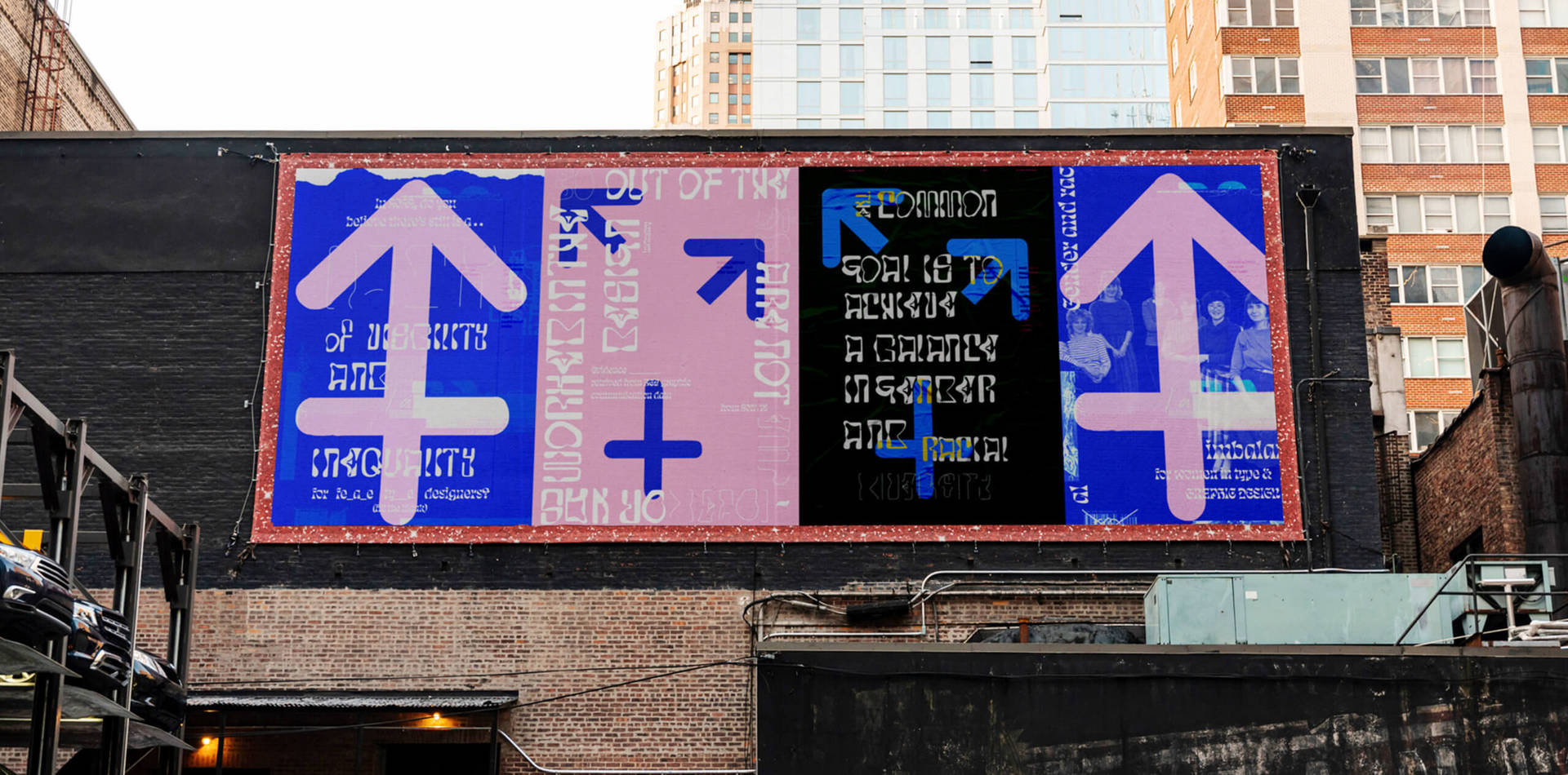
Setting out to explore the historic and current lack of women-type designer representation, Beverley explored ways to visually represent the imbalance and how might this be given graphic expression through distortion. The final typeface is constructed of three different weights that each convey a decade in typographic history and highlights how women type designers’ recognition and visibility were seen at the time: the light typeface (for the past), regular typeface (the 2000s), and Bold typeface (for the present today).

We talked with Beverley to find out more about the process of creating her first typefaces, what she discovered about gender inequality in the field of typography and typeface design through her research and expressing the concept of imbalance through her type design practice.
We love the Imbalance typeface you’ve created! Where did the idea for the project initially come from?
The idea came initially from the thought of creating a font. I have been a fan of typography since I was introduced to it in college and have used various typefaces. This idea was related to the topic of gender imbalance in the type industry. By using this font, I could message to various platforms and media. Through my research, I have come across many great font designs, but one in particular was inspirational for this project, namely that of Daniel Coull and Eino Korkala. Together the pair created an incredible project called Climate Crisis Font. The font was communicated by shrinks, in such a way as to mimic real data about the shrinkage of Arctic Sea ice over several decades (71 years). The two designers responded to the newspaper Sanomat to visualize the effects of climate change. It made me think that this idea offered parallels with female-type designer representation and visibility over the years. How might this be given graphic expression? I knew for sure this project would be a challenging task but also an exciting one.
“…this idea offered parallels with female-type designer representation and visibility over the years. How might this be given graphic expression? I knew for sure this project would be a challenging task but also an exciting one.”

What did you discover about women working in type design from your research and how did this feed into the typeface design?
I found some interesting research and stories about women. The design industry was mainly populated by males in the 20s – 90s. Males had the privilege of being educated in academic schools and working in high-occupation positions.
Women did not have any rights to these privileges until the twentieth century. Females worked in the design industry but were largely invisible. Women were hired as office assistants for subordinate roles in small agency factories; hired to carry out laborious grunt work instead of client-facing and big picture thinking. For example, non-unionized young women were hired to typeset or clean metal fonts– forms of work essential to production yet undervalued.
This statement from Na Kim, a graphic designer on Readymag (2019), is typical: “Women would not be the ones to design a book cover, for instance, they would be the ones to layout the text”.
Today there has been changes and female design practitioners impact the workplace in different ways from before. Universities show the level of higher education participation in design subjects for young women has reached 56.3%, compared to only 44.1% for young men. This demonstrates that there have been significant inroads in the intake of females enrolling in high education and achieving academically. However, the data suggests that there is a lack of employability in agencies and companies when set against enrolment in higher education. Why? For example, the data from Birmingham City University Graduate results in 2018/19 shows eighteen out of thirty females are employed or worked in the design sector set against twenty-seven out of thirty male counterparts, which is a significantly larger number.
However, I will say that today women and their work have been more recognised by seeing or hearing female-led empowerment networks on social media, word of mouth, and design functions. These places are a space for females to join and support a community, to have or create new open dialogue and opportunities with females, minorities, males, and the industry overall. These engagements make for open discussions, questions, and social hangouts.
“I will say that today women and their work have been more recognised by seeing or hearing female-led empowerment networks on social media, word of mouth, and design functions. These places are a space for females to join and support a community, to have or create new open dialogue and opportunities with females, minorities, males, and the industry overall.”
Graphic Designer Sahara Jones and Senior Designer at Siegel & Gale Helen Tong‘s statements for me say it the best. Sahara tell us, “I think it boils down to people understanding the importance of equal opportunities and building diverse workforces from entry to senior-level positions. I don’t think it should be an afterthought.”
Helen Tong: “Once we have that mindset, I think different decisions will be made about who is hired and the opportunities they are given to progress within the role and/or the company. This contribution to investment will be used to build change in systemic practices and discrimination.”


Can you tell us about the process you went through creating your own typeface?
There were different stages to this project 1. learning how to make a typeface, 2. creating the typefaces, 3. feedback from target audience, 4. using my font in a campaign.
I started creating strategies/ visual mood boards inspired by Climate Crisis Font. To communicate visually the timeline (90s and the present) I decided to construct three different weights that convey each decade and which shows how female type designers’ recognition and visibility were seen. With each of these three weights will be a font family. Each typeface will represent the light typeface (for the past) / regular typeface (the 2000s), and Bold typeface (for the present today). I randomly selected a thick, bold typeface on the internet as a reference point and picked ideas from my lightweight mood board. The concept of imbalance was communicated through various styles that display dots, un-complete, or cut-off letters. This is done by manipulating and abstracting the letterform around connected corners. I transitioned from lightweight to regular and bold. Reviewing back to the font reference for the outline I played with the style in various ways to create negative spaces by mis-mantle or manipulating the letter itself by adding weight to represent gender inequality.
“The concept of imbalance was communicated through various styles that display dots, un-complete, or cut-off letters. This is done by manipulating and abstracting the letterform around connected corners.”
For each weight and letterform, I looked back and crafted again. As I don’t have much experience designing a font I’m always looking for attention to detail, always analysing, and getting others around me to offer feedback when they can. I will say that having feedback from type and graphic designers Fiona Clark and Tommy Wildlik and many more did help improve my lettering. It helped in making me attend more to legibility, noticing how I needed to use the letters in an ascender and the descender layout format improved things massively.
I am happy and surprised by my outcome, especially given that it’s my first time designing a typeface. Overall, I have learned new things and overcome challenges. In the future, I plan to be involved in more typeface projects!

Finally, could you tell us a bit about your journey in design so far and what’s next for you?
Well as a designer my journey has been very interesting over the years. This year in July I finished my three-year bachelor’s degree in graphic design at Birmingham City University. At the end of my university experience, I will say I did push myself to deepen my ideas and creativity in creating ambitious projects.
While at university, I had the opportunity to freelance with clients and collaborate on some awesome projects. Right now, I’m focusing on myself and participating and collaborating on small projects on the side. While searching for an exciting internship or junior graphic designer position.