For her final thesis project, NYC-based multi-disciplinary designer Anna Sing was initially stuck for ideas. Wanting something lighthearted to alleviate anxiety during the pandemic and taking comfort from her houseplant collection, she decided to make four beautifully crafted typefaces inspired by the history of houseplants. With no previous experience in type design, she reached out to other designers in the field and managed to secure graphic and typeface designer Leah Maldonado as a mentor for her first typeface, Prune. She also relentlessly scoured online resources searching for information, asked friends for advice on using Glyphs and heavily referenced Designing Type by Karen Cheng, which she now sees as “a bible for type design” with the project culminating in setting up her online type foundry Greenhouse. Anna’s advice for anyone who finds the prospect of designing their own typeface daunting is, “just start exploring, make mistakes, have fun and most importantly trust in yourself!”

We talked to Anna to find out more about her experiences creating her first four typefaces as a complete beginner, the most satisfying and challenging parts of the project process and her go to resources for anyone thinking about embarking on making their own typeface.
Where did the idea for creating typefaces inspired by houseplants come from?
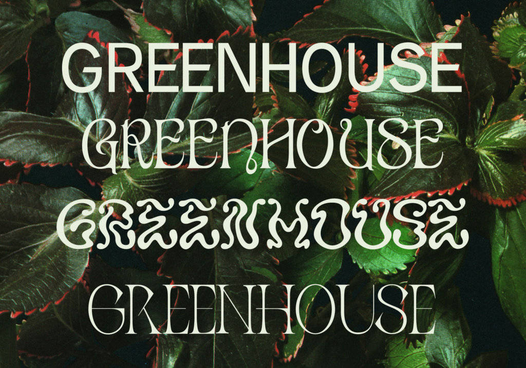
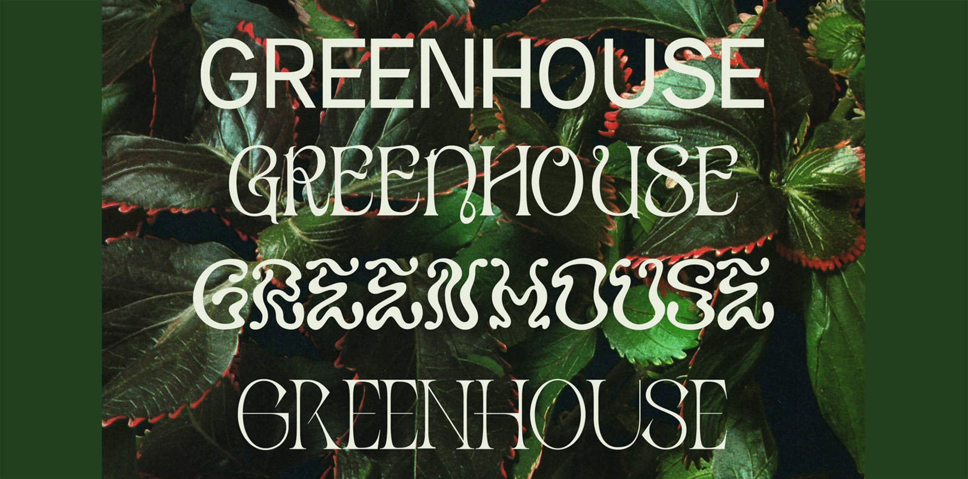
Greenhouse Type Foundry, started off last year as my college senior thesis project. For my final project in design school, initially I wanted to make a typeface but didn’t know what about. My last year in school was in the middle of the pandemic and I was in a big creative rut. At that point, all my classes were online, and I hadn’t been in a studio setting for a year. A lot of my professors were pushing for projects with deep social meaning due to the pandemic climate however, I knew that I needed to work on something light-hearted to keep my creative energy high.
My thesis needed to be fun but most importantly something creatively satisfying for me. I was spending most of my time outside in parks and filling my apartment with houseplants to keep myself sane. I remember looking at some plant cuttings above my kitchen sink and thinking how I didn’t know anything about the history of houseplants. Houseplants were trendy again, but when did they first become popular? Did a houseplant typeface already exist? Could there be a connection between houseplants and typography or the digital world we live in now?
“It was the perfect topic for me that reignited my creative energy.”
How did you learn how to create typefaces from being a complete beginner?
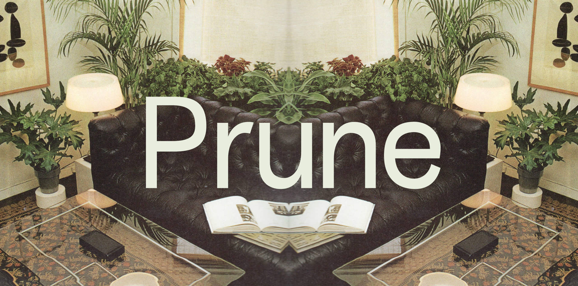
I didn’t have any classes in school based on type design, so in a way I had to create my own curriculum. There was no way I was going to teach myself type design well alone, so I reached out to many different designers to guide me. My first teacher was my best friend and fellow designer Ben Zerbo. They had just made their own typeface, Type High, a year prior to mine so they taught me the basics of each letterform, where the anchor points go, how to use Glyphs, etc. Leah Maldonado was my second teacher who furthered my knowledge of Glyphs and critiqued my first two typefaces Prune and Aureum. I also referenced Designing Type by Karen Cheng many many times—that book is like a bible for type design.
“After my ‘training’ I realized that type design is one big puzzle. Once you have certain letterforms down, the rest becomes pretty easy.”
Can you tell us about the process you went through and what were the most creatively satisfying aspects of undertaking the project?
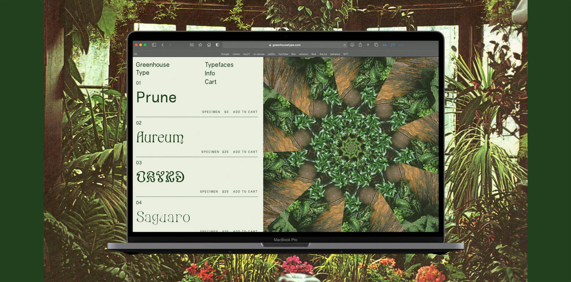
There were four phases to this project: learning how to make a typeface, creating the typefaces, branding the typefaces, then creating the website. The initial learning part was the most time consuming as I was starting from zero, but the people who supported my learning made that part much easier. Each typeface had its own creative process, but all of them were inspired by things I found at Half Price Books. I always find the most inspiration from printed ephemera. Inspiration is endless online but the act of physically searching through paper gets me excited and is an extremely important part of my creative process. Half used bookstores are my safe haven.
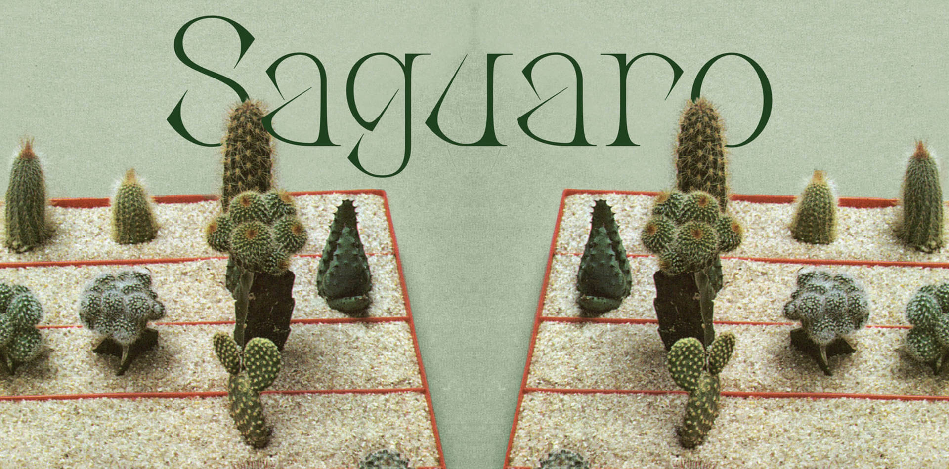
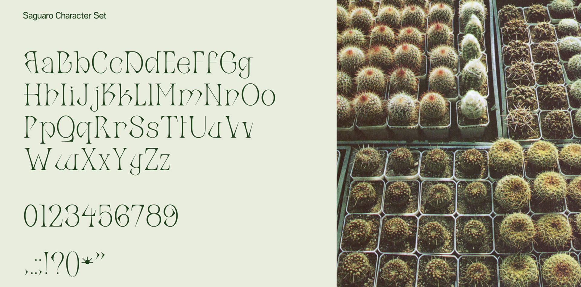
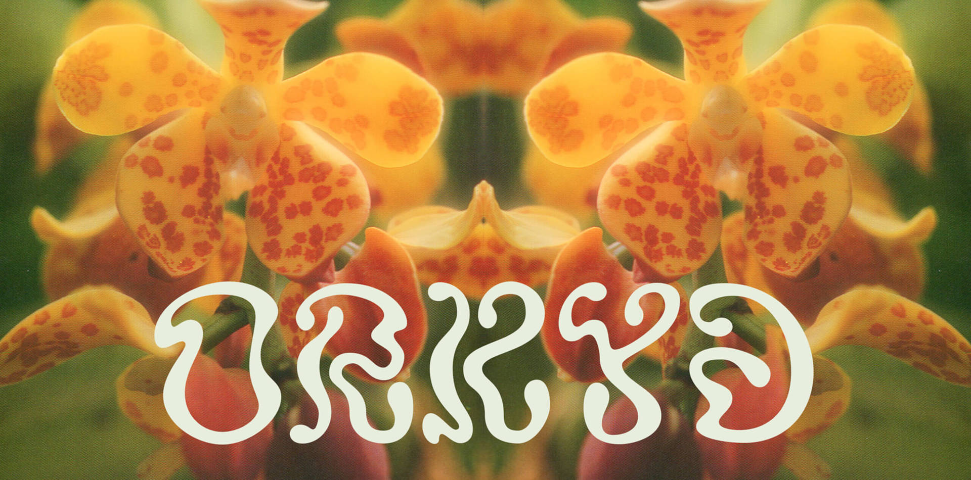
I spent hours in the gardening section looking at different types of plants, the visual language used, and reading about their history. I found countless books that I referenced for each typeface. Aureum was inspired by the history I discovered in the book Potted History by Catherine Horwood. A six hundred and something page encyclopaedia of orchids was my reference for Orkyd’s letterforms and a houseplant encyclopaedia collection from Time Magazine published in the 1970s was filled with houseplant care knowledge that I used in my type specimens.
All the imagery I used in Greenhouse Type were scanned images that I found in Half Price Books. They had the vintage aesthetic that perfectly referenced the part of history I wanted to explore in my project. After I found all these books, the rest of the process evolved naturally. It was super rewarding to see everything come together in the end through my foundry website. I had made all the typefaces, found all the imagery, created every single bit on my own—it was the best project I could have ended college with.
“Inspiration is endless online but the act of physically searching through paper gets me excited and is an extremely important part of my creative process. Half used bookstores are my safe haven.”
What challenges did you face and how did you overcome them?
It was challenging in school to get such a personal project constantly critiqued by my peers and professors. Everyone had different ideas on where the project could go or what it should look like and most of the time it wasn’t what I had originally envisioned. I really had to stick to my gut about what I wanted to make and not let others sway what I created. I didn’t fulfil certain criteria required of my thesis class or listen to people telling me what I should be doing. Sticking to my guns and pushing through the noise was hard but trusting in myself was the best thing I did!

What does the future hold for you – anymore typefaces in the works?
I’m not sure what the future holds for me! I’d love to add more plants to Greenhouse Type and expand and refine the four typefaces that have done so well. I’m currently working on a new funky 60s serif typeface, trying to add more weights to Prune and expanding the character set of Orkyd. Now that I live in NYC, I would love to get some actual type design classes under my belt too.

Finally, any advice or go to resources for people wanting to create their first typeface?
You don’t have to take a fancy thousands of dollars type design course to start dabbling in type design. Download Glyphs (or Glyphs Mini for less commitment), buy Designing Type by Karen Cheng and just start exploring. Starting is always the hardest part. The channel are.na is a great channel with resources for type design, and there are many too… Make mistakes, have fun and most importantly trust in yourself!
“Make mistakes, have fun and most importantly trust in yourself!”